
LeadIQ
LeadIQ makes sales teams more efficient at outbound prospecting by capturing and sequencing contact information with one click.
LeadIQ Pricing Page Design
$50 - $149 3 Plans
Launch Website
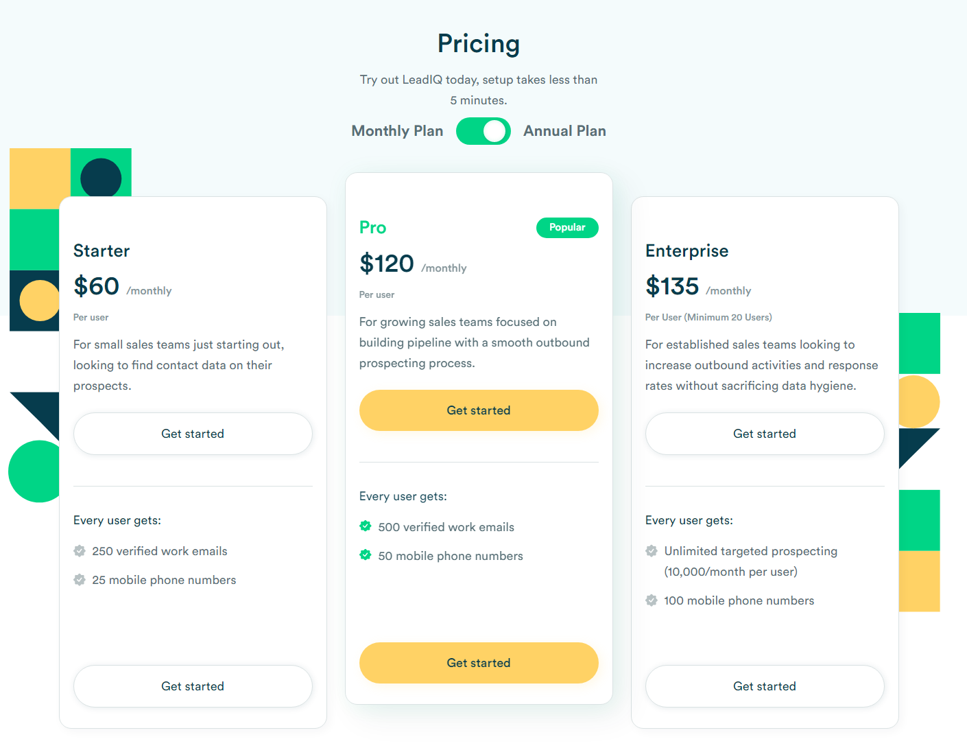
The LeadIQ pricing section is effective for several reasons:
1. Clear Hierarchy and Visual Appeal:
- Headline Focus: “Pricing” clearly labels the section.
- Tiered Structure: Three distinct pricing tiers are presented (“Starter,” a middle tier, and “Enterprise”).
- Visual Cues:
- The toggle for “Monthly Pay” and “Annual Pay” is visually clear.
- The “Get Started” buttons are prominent and consistent.
- Checkmarks and empty circles effectively indicate feature availability in the “Plans comparison” section.
- The use of color accents on the sides of the page is visually appealing.
- Layout: The layout is clean, organized, and easy to follow, with consistent formatting.
- Social Proof: The section with logos of companies that use the service adds social proof.
2. Value-Based Differentiation:
- Target Audience: The tiers cater to different user needs and business sizes.
- Feature Comparison: The “Plans comparison” table provides a clear breakdown of features across the tiers.
3. Transparent Pricing:
- Clear Pricing: The prices for each tier are clearly displayed.
- Billing Options: Both monthly and annual billing options are provided, with a visual toggle.
- Optional Addons: The “Optional addons” section provides clear pricing for additional features.
4. Addressing Different User Needs:
- Tiered Features: The varying feature availability across tiers caters to different user needs and budgets.
- Add-on Options: The add-on options allow users to customize their plan.
5. Strategic Use of Information:
- Call to Action: “Get Started” buttons are prominently placed, encouraging user engagement.
- Feature Comparison Table: The detailed comparison table helps users make informed decisions.
- Social Proof: The logos of well known companies add trust to the product.