
CDN77
70 Tbps+ CDN with global coverage across 6 continents.
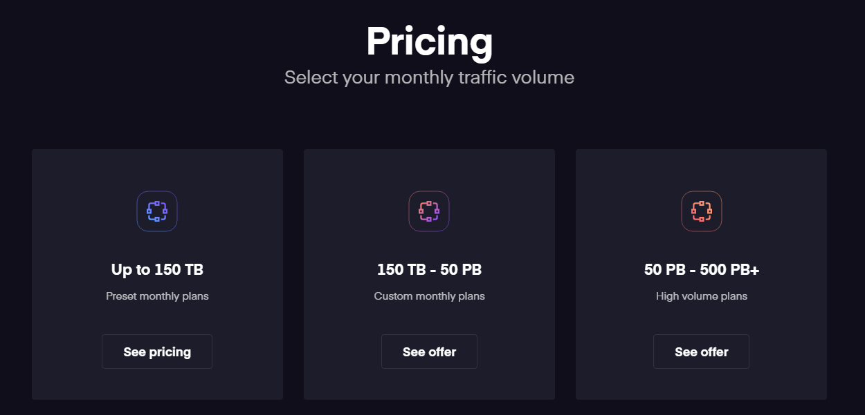
CDN77 Pricing Page Design
3 Plans
Launch Website
Accelerate your content delivery and reach your users from the edge with a 14-day free trial.
The CDN77 pricing section is effective for several reasons:
- Clear Hierarchy and Visual Appeal:
- Headline and Sub-headline: “Pricing” is straightforward, and “Select your monthly traffic volume” clearly guides the user.
- Tiered Structure: Three distinct tiers are presented, visually separated and clearly labeled based on traffic volume (Up to 150 TB, 150 TB – 50 PB, 50 PB – 500 PB+).
- Visual Cues: Each tier has a unique icon, providing a visual representation of the different volume levels.
- Call to Action: “See pricing” and “See offer” buttons are clearly visible and encourage user engagement.
- Layout: The layout is clean, modern, and minimalist, focusing on the essential information.
- Value-Based Differentiation:
- Traffic Volume Segmentation: The primary differentiator is the monthly traffic volume, which is a crucial metric for the target audience (likely businesses dealing with large amounts of data transfer).
- Plan Types: The tiers also differentiate based on plan types: “Preset monthly plans,” “Custom monthly plans,” and “High volume plans,” catering to different needs and scales.
- Implied Scalability: The progression from TB to PB clearly indicates scalability and caters to businesses with varying data requirements.
- Transparent Pricing (Partially):
- Clear Volume Ranges: The traffic volume ranges are clearly stated, allowing users to quickly identify the appropriate tier.
- “See pricing” vs. “See offer”: The difference in call-to-action suggests that the pricing for the lower volume tier is readily available, while the higher volume tiers require a custom offer, which is common for large-scale solutions.
- Addressing Different User Needs:
- Volume-Based Tiers: The tiers cater to businesses with different data transfer needs, from smaller operations to large enterprises.
- Plan Flexibility: The different plan types (preset, custom, high volume) offer flexibility and cater to various levels of customization.
- Strategic Use of Information:
- Focus on Key Metric: The emphasis on monthly traffic volume aligns with the primary concern of the target audience.
- Concise Messaging: The labels and descriptions are brief and to the point, making the information easy to digest.
- Clear Call to Action: The “See pricing” and “See offer” buttons provide clear next steps for users.
- Modern Design: The dark background and neon-accented icons give a modern and tech-forward feel, aligning with the likely target audience.