
It’s Spatial Data Science. CARTO is the world’s leading Location Intelligence platform for Data Scientists, Developers and Analysts in Enterprise.
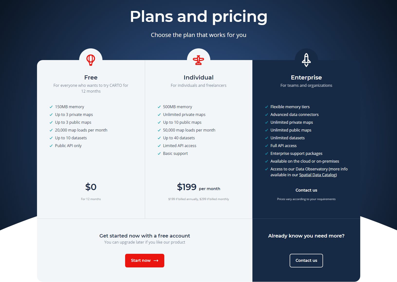
The Carto pricing section is effective for several reasons:
1. Clear Hierarchy and Visual Appeal:
- Headline Focus: “Plans and pricing” clearly states the section’s purpose. “Choose the plan that works for you” provides a user-centric approach.
- Tiered Structure: “Free,” “Individual,” and “Enterprise” tiers are clearly labeled and visually separated with distinct color backgrounds.
- Visual Cues: The use of contrasting colors for each tier helps to visually differentiate them. The “Start free” and “Contact us” buttons are also visually distinct.
- Layout: The layout is clean and organized, with clear sections for the main plan information and the detailed comparison table below.
2. Value-Based Differentiation:
- Target Audience: Each tier is targeted to different user groups (free users, individuals, enterprises).
- Feature List: While the main plan sections provide a brief overview, the “Full comparison table” offers a detailed breakdown of features, highlighting the differences between the tiers.
3. Transparent Pricing:
- Pricing Information: The “Free” tier is clearly marked as $0, and the “Individual” tier’s price is prominently displayed.
4. Addressing Different User Needs:
- Tier Names: The tier names (“Free,” “Individual,” “Enterprise”) suggest different levels of usage and organizational size.
- Feature Availability: The detailed feature comparison table allows users to see exactly which features are available in each tier, catering to specific needs.
5. Strategic Use of Information:
- Call to Action: “Get started with a free account” and “Contact us” buttons are prominently placed, encouraging user engagement.
- Other Information: The “Full comparison table” provides comprehensive information for users to make informed decisions. The “Already know you need more?” message directs users to the appropriate action.