
BuilderTrend
Buildertrend is the #1 Software for home builders, contractors & remodelers.
BuilderTrend Pricing Page Design
$50 - $149 2 Plans
Launch Website
Project management, estimating, scheduling & CRM all in 1 app. Request a demo today!
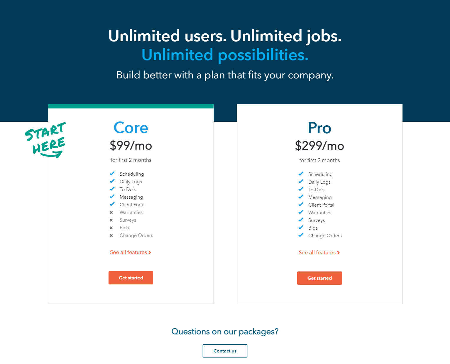
The BuilderTrend pricing section is effective for several reasons:
1. Clear Hierarchy and Visual Appeal:
- Headline Focus: “Unlimited users. Unlimited jobs. Unlimited possibilities.” immediately communicates the platform’s key benefits. “Build better with a plan that fits your company.” provides a user-centric approach.
- Tiered Structure: “Core” and “Pro” tiers are clearly labeled and visually separated.
- Visual Cues: Checkmarks and “X” symbols effectively indicate feature availability. The “Get started” buttons are visually distinct and consistent. The “START HERE” graphic adds a visual guide.
- Layout: The layout is clean and organized, with clear sections for tier names, pricing, features, and calls to action.
2. Value-Based Differentiation:
- Target Audience: The tiers cater to different user needs, with “Pro” offering more features.
- Feature List: The feature lists clearly outline the differences between the plans, highlighting the added value of the “Pro” tier.
3. Transparent Pricing:
- Pricing Information: The monthly prices are clearly displayed, with a special offer for the first two months.
4. Addressing Different User Needs:
- Tier Names: The tier names suggest different levels of features and capabilities.
- Feature Availability: The feature availability caters to different needs, with “Pro” offering more advanced functionalities.
5. Strategic Use of Information:
- Call to Action: “Get started” buttons are prominently placed, encouraging user engagement. “Contact us” provides support access.
- Other Information: The descriptions provide clear explanations of each plan’s benefits. The “+ See all features” links provide access to more detailed information. The “Questions on our packages?” prompt encourages users to seek assistance.