
Attendify
Create engaging hybrid & virtual events, mobile apps & event registration to elevate the attendee experience & put your event data to work.
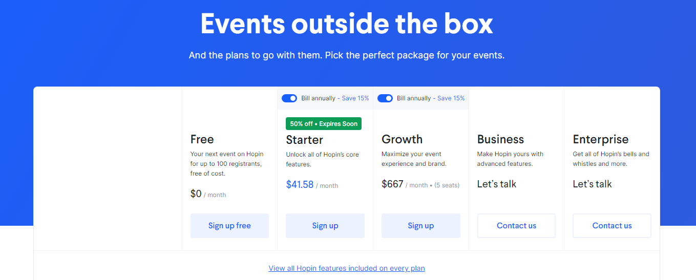
Attendify Pricing Page Design
$0 - $49 5+ Plans
Launch Website
Get started for free.
The Attendify pricing section is effective for several reasons:
- Clear Hierarchy and Visual Appeal:
- Headline and Value Proposition: “Events outside the box” is a catchy and memorable headline. The sub-headline reinforces the suitability of the plans for different event needs.
- Toggle Switch: The “Bill annually – Save 15%” toggles provide a clear incentive for annual billing and allow for easy price comparison.
- Tiered Structure: Five distinct tiers (Free, Starter, Growth, Business, Enterprise) are clearly displayed with visual separation.
- Visual Cues: The “50% off Expires Soon” banner creates a sense of urgency. Pricing is prominently displayed.
- Call to Action: “Sign up free,” “Sign up,” and “Contact us” buttons are clearly visible and encourage user engagement.
- Layout: The layout is clean, organized, and easy to scan.
- Value-Based Differentiation:
- Target Audience: Each tier description highlights the target user and their needs, progressing from free trials to enterprise-level solutions.
- Feature Progression: The descriptions clearly show the increasing functionality and complexity of each tier.
- Usage Limits: The “Free” tier includes a clear limit of 100 registrants, setting a clear boundary.
- Seat Limits: The “Growth” tier includes a specific seat limit (15 seats), clearly defining its capacity.
- Focus on Benefits: The messaging focuses on the benefits users will receive, such as core features, event maximization, branding, and advanced capabilities.
- Transparent Pricing:
- Clear Pricing: Prices are clearly displayed for the “Starter” and “Growth” tiers.
- Free Tier: The “Free” tier is prominently featured, making it an attractive option for users to try the service.
- Contact Sales: The “Contact us” option for the “Business” and “Enterprise” tiers implies custom pricing, which is appropriate for complex or enterprise-level SaaS products.
- Annual Savings: The “Bill annually – Save 15%” message clearly highlights the benefits of annual billing.
- Addressing Different User Needs:
- Tier Names: The names suggest different levels of service and functionality.
- Target Audience Descriptions: The descriptions explicitly target different customer segments based on their needs and event size.
- Usage and Seat Limits: The varying usage and seat limits cater to different event sizes and team needs.
- Strategic Use of Information:
- Call to Action: The prominent CTAs drive conversions.
- Concise Messaging: The descriptions are brief and to the point.
- Focus on Benefits: The messaging focuses on the value users will receive.
- Visual Clarity: The clean layout and consistent use of icons make the information easy to digest.
- “View all Hopin features included on every plan” Link: This link provides a path for users to explore the product in more detail.
- Limited Time Offer: The “50% off Expires Soon” banner creates a sense of urgency and encourages immediate action.