This Employee Navigator pricing section is effective for several reasons:
- Clear and Direct Headline:
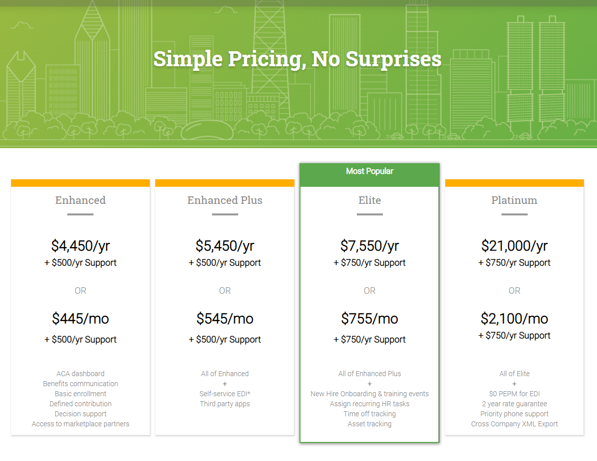
- “Simple Pricing, No Surprises” immediately sets the tone of transparency and builds trust with potential customers.
- Transparent Pricing Structure:
- Both Annual and Monthly Options: The clear presentation of both annual and monthly pricing allows customers to choose the payment schedule that best suits their needs.
- Support Costs Clearly Stated: The separate, but clearly stated, support costs (+ $500/yr or + $750/yr) provide full transparency, preventing unexpected charges.
- Tiered Structure with Feature Progression:
- Distinct Tiers: The “Enhanced,” “Enhanced Plus,” “Elite,” and “Platinum” tiers are clearly defined and visually separated, making it easy to compare options.
- “All of [Previous Tier]” Structure: This clearly indicates the progression of features and benefits across the tiers, simplifying comparisons.
- “Most Popular” Highlight:
- The “Most Popular” label on the “Elite” tier helps guide users towards a commonly chosen option, reducing decision fatigue.
- Concise Feature Descriptions:
- While not exhaustive lists, the feature descriptions provide a good overview of the key functionalities included in each tier.
- Visual Clarity:
- The layout is clean and organized, making it easy to read and understand the information.
- The use of color and visual separation helps differentiate the tiers.
- Targeting Larger Organizations:
- The pricing points and feature sets suggest that this platform is geared towards larger organizations with more complex HR needs.