The AppFolio pricing section is effective for several reasons:
1. Clear Hierarchy and Visual Appeal:
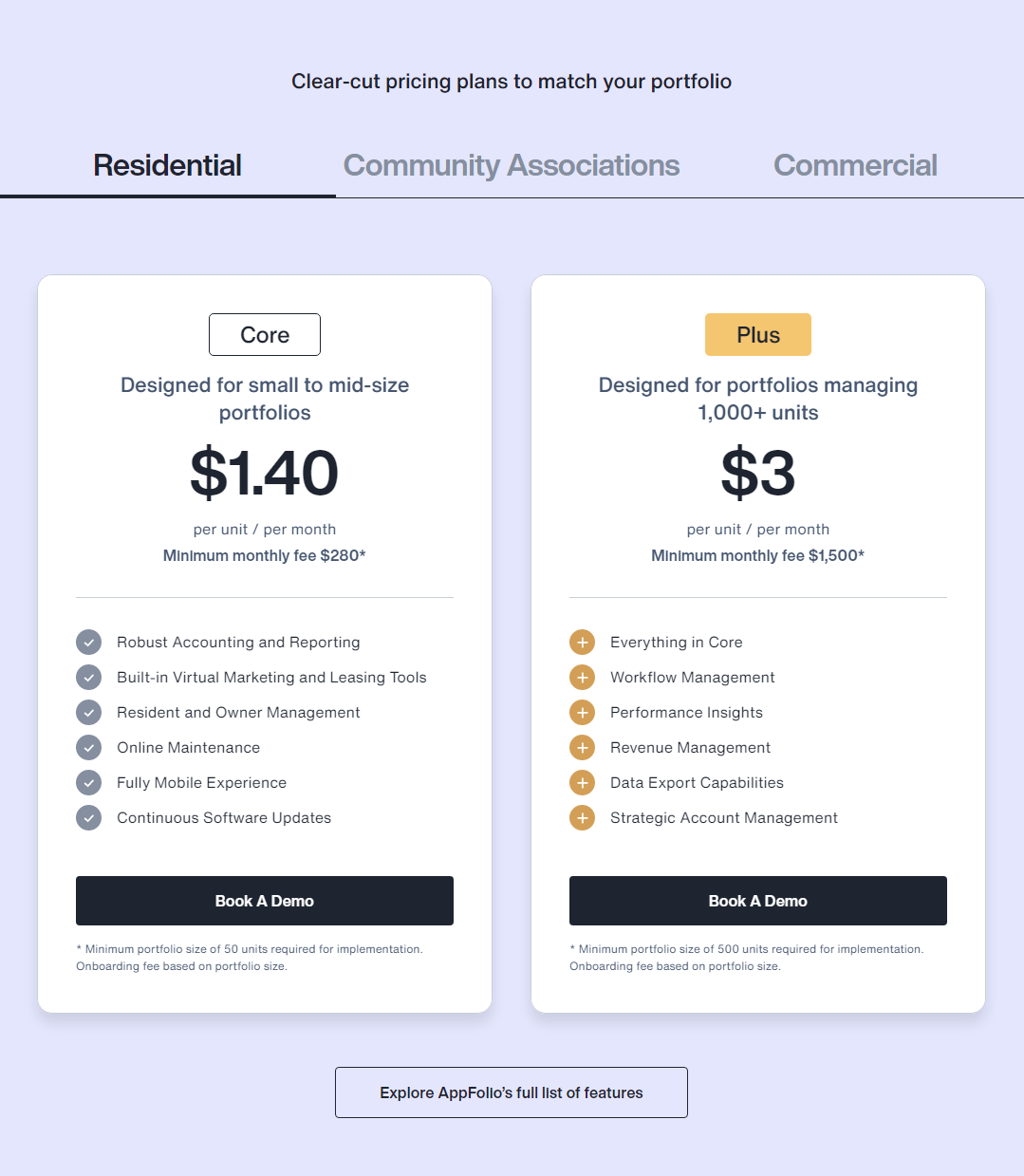
- Headline Focus: “Clear-cut pricing plans to match your portfolio” clearly states the section’s purpose.
- Tiered Structure: “Core” and “Plus” tiers are clearly labeled and visually separated.
- Visual Cues: Checkmarks and plus signs are used to indicate feature inclusion, with plus signs also indicating “everything in Core.”
- Layout: The layout is clean, organized, and easy to follow, with consistent formatting and clear spacing.
2. Value-Based Differentiation:
- Target Audience: Each tier is explicitly targeted to different portfolio sizes (small to mid-size, 1,000+ units).
- Feature List: The feature lists clearly outline the core differences between the plans, emphasizing the added value of the “Plus” plan.
3. Transparent Pricing:
- Pricing Information: The per-unit pricing and minimum monthly fees are prominently displayed.
4. Addressing Different User Needs:
- Tier Names: The tier names (“Core,” “Plus”) suggest a progression in features and capabilities.
- Feature Availability: The varying feature availability caters to different portfolio management needs.
5. Strategic Use of Information:
- Call to Action: “Book A Demo” buttons are prominently placed, encouraging user engagement.
- Other Information: The minimum portfolio size and onboarding fee information are clearly stated at the bottom of each tier. The “Explore AppFolio’s full list of features” button provides access to more detailed information.