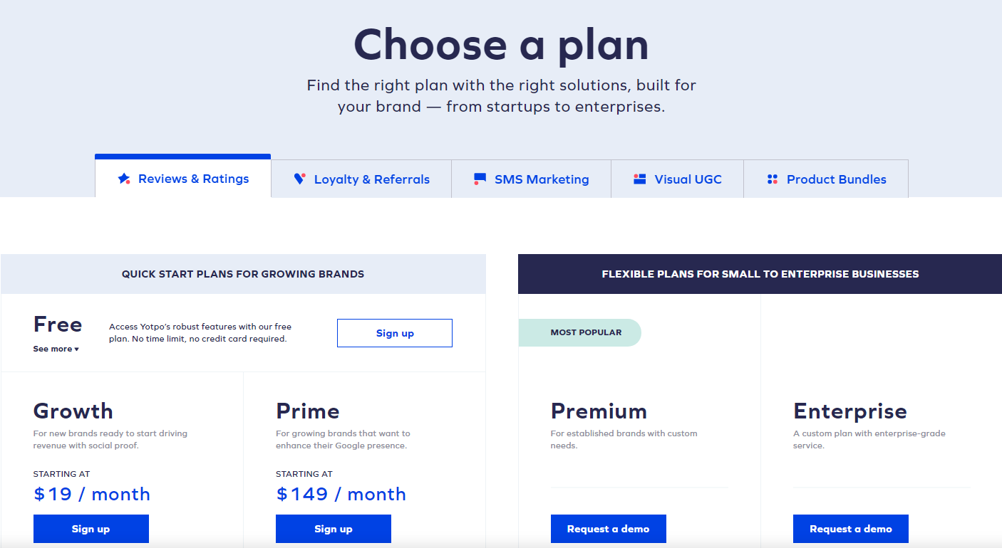
The Yotpo pricing section is effective for several reasons:
1. Clear Hierarchy and Visual Appeal:
- Headline Focus: “Choose a plan” and the descriptive subtitle clearly guide the user.
- Tiered Structure: The plans are categorized into “QUICK START PLANS FOR GROWING BRANDS” and “FLEXIBLE PLANS FOR SMALL TO ENTERPRISE BUSINESSES,” providing a clear organization.
- Visual Cues: The “MOST POPULAR” label highlights the recommended plan. The use of distinct button colors and the tabbed navigation for different product categories enhance visual clarity.
- Layout: The layout is clean and organized, with clear sections and consistent formatting.
2. Value-Based Differentiation:
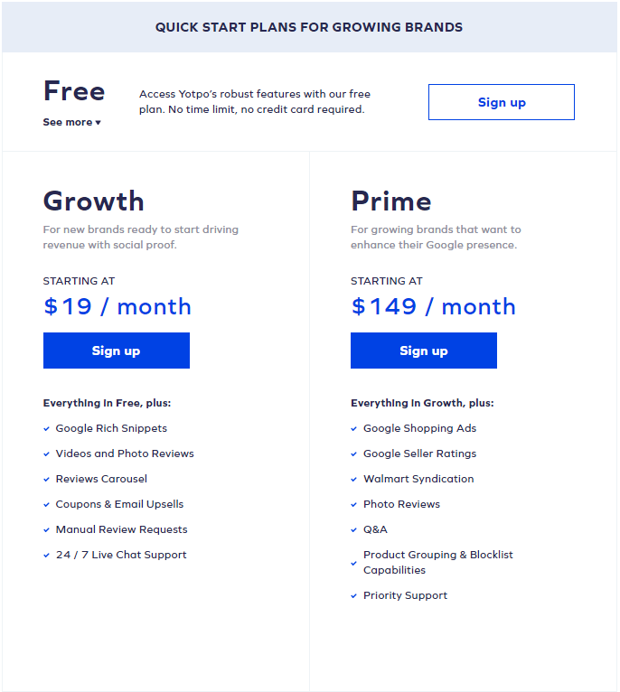
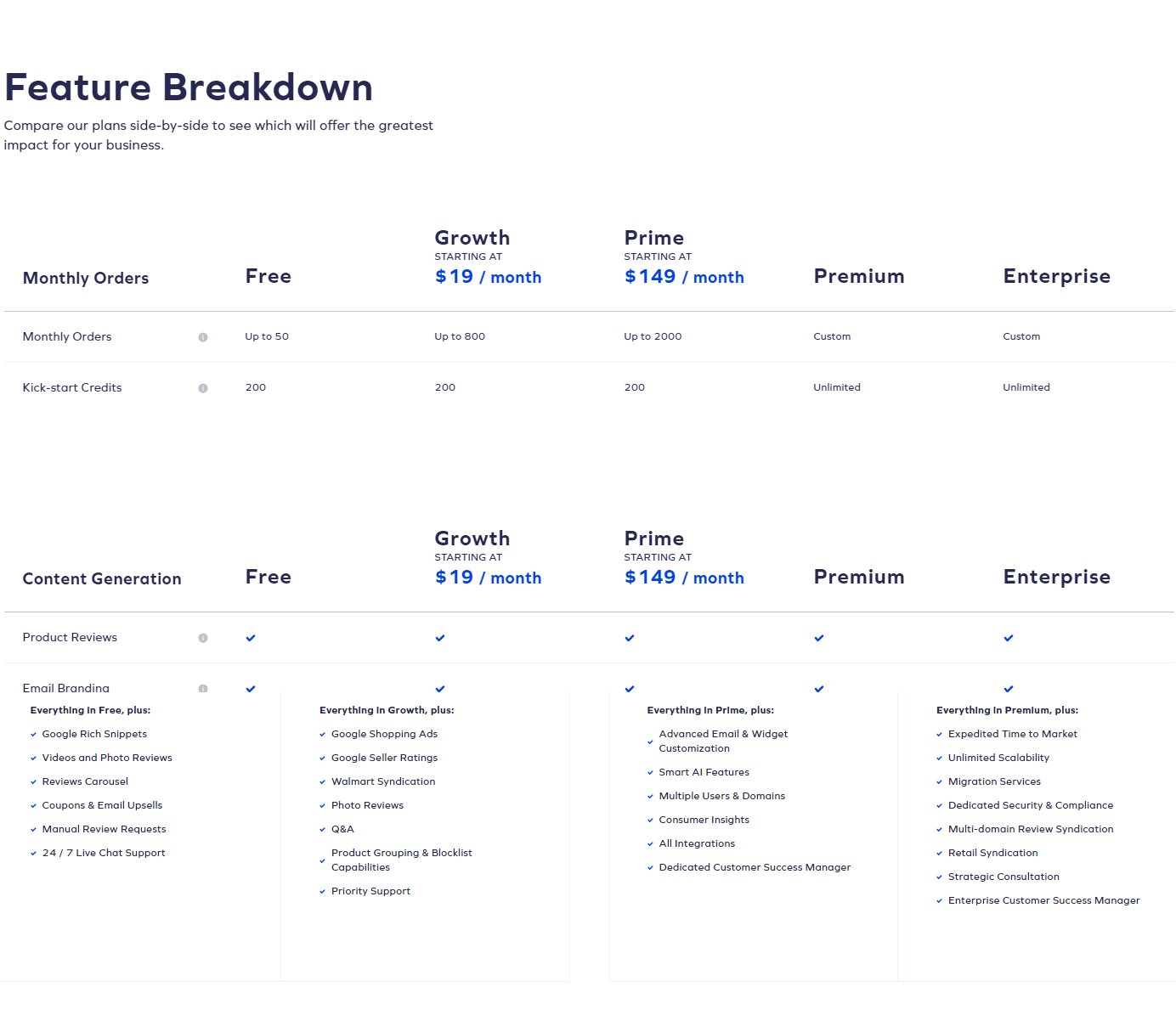
- Target Audience: Each plan is targeted to different user groups (free users, growing brands, established brands, enterprises).
- Feature List: While detailed feature lists are not directly in this view, the plan descriptions and the tabbed navigation suggest different feature sets for each category.
3. Transparent Pricing:
- Pricing Information: The “Free,” “Growth,” and “Prime” plans have clearly displayed starting prices. The “Premium” and “Enterprise” plans use “Request a demo,” suggesting customized pricing.
4. Addressing Different User Needs:
- Tier Names: The tier names suggest different levels of features and capabilities.
- Plan Categories: The categorization into “Quick Start” and “Flexible” plans caters to different business stages and needs.
5. Strategic Use of Information:
- Call to Action: “Sign up” and “Request a demo” buttons are prominently placed, encouraging user engagement.
- Other Information: The descriptions provide clear explanations of each plan’s benefits and target audience. The tabbed navigation allows users to explore different product categories.