The AppDynamics pricing section is effective for several reasons:
- Clear Hierarchy and Visual Appeal:
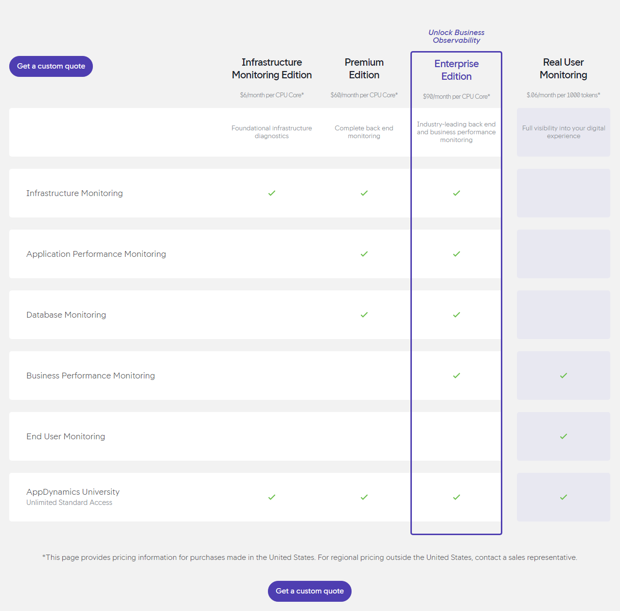
- Tiered Structure: Four distinct tiers (Infrastructure Monitoring Edition, Premium Edition, Enterprise Edition, Real User Monitoring) are clearly displayed with visual separation.
- Visual Cues: Checkmarks clearly indicate included features, making it easy to compare tiers. The “Enterprise Edition” is highlighted with a blue outline, drawing attention to it.
- Pricing Clarity: Prices are prominently displayed for each tier, with clear unit costs ($/month per CPU Core or $/month per 1000 tokens).
- Call to Action: “Get a custom quote” buttons are strategically placed at the top and bottom of the section.
- Layout: The layout is clean, organized, and easy to scan. The tabular format is effective for comparing features side-by-side.
- Value-Based Differentiation:
- Target Audience: Each tier description highlights the target user and their needs, progressing from foundational infrastructure diagnostics to full visibility into the digital experience.
- Feature Progression: The descriptions and feature list clearly show the increasing functionality and complexity of each tier.
- Focus on Benefits: The messaging focuses on the benefits users will receive, such as complete backend monitoring, industry-leading performance monitoring, and full visibility into the digital experience.
- Transparent Pricing:
- Clear Pricing: Prices are clearly displayed for each tier, with clear unit costs.
- Regional Pricing Note: The note at the bottom clarifies that the displayed pricing is for the United States, and regional pricing is available upon request.
- Addressing Different User Needs:
- Tier Names: The names suggest different levels of service and functionality.
- Target Audience Descriptions: The descriptions explicitly target different customer segments based on their needs and monitoring requirements.
- Feature Set: The features offered in each tier cater to different needs and budgets.
- Strategic Use of Information:
- Call to Action: The prominent “Get a custom quote” buttons encourage conversions.
- Highlighting Key Features: The listed features focus on the most important aspects of infrastructure and performance monitoring.
- Concise Messaging: The descriptions and feature lists are brief and to the point.
- Visual Clarity: The use of checkmarks and the tabular format makes it easy to compare features across tiers.
- Progressive Disclosure: The tiers are presented in a logical order, allowing users to gradually explore more advanced features.
- CPU Core/Token Pricing: Using CPU Core and token-based pricing is common for infrastructure monitoring tools, aligning with the target audience’s understanding.