-
Clear and Compelling Headline:
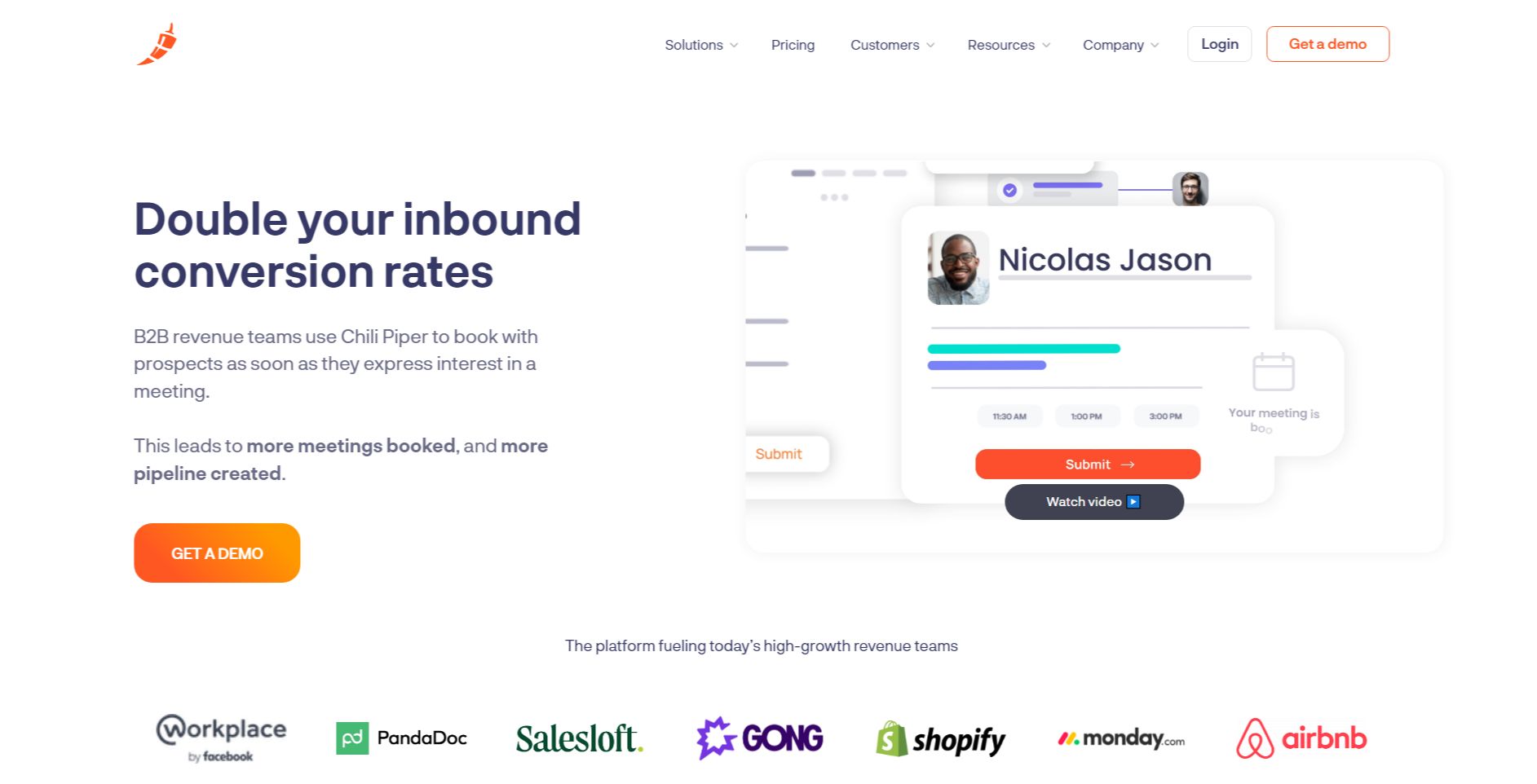
“Double your inbound conversion rates” is a strong, concise, and benefit-driven headline. It immediately grabs the attention of the target audience (sales and marketing professionals) and speaks directly to a key performance metric. It’s bold and promises a significant improvement.
-
Value Proposition:
The text below the headline explains how Chili Piper helps achieve this: “B2B revenue teams use Chili Piper to book with prospects as soon as they express interest in a meeting. This leads to more meetings booked, and more pipeline created.”
It highlights key aspects:
- Immediate booking with prospects.
- Increased meeting volume.
- Pipeline growth.
-
Strong Call-to-Action (CTA):
“GET A DEMO” is a prominent and direct CTA, encouraging immediate engagement. The “Watch Video” link serves as a secondary CTA for users who want to learn more before requesting a demo.
-
Visual Reinforcement:
- Screenshot of the Platform: The prominent screenshot of the Chili Piper platform provides a concrete example of the product in action and visually reinforces the “booking” aspect of the value proposition. The interface shown suggests scheduling and meeting management features.
- Social Proof/Client Logos: The row of recognizable company logos (Workplace by Facebook, PandaDoc, Salesloft, GONG, Shopify, monday.com, Airbnb) provides strong social proof and builds credibility. This reinforces the message that Chili Piper is a trusted solution used by leading companies.
-
Strategic Design:
- Color Palette: The use of a clean white background with a bright orange CTA button creates a modern and professional feel. The orange is consistent with Chili Piper’s branding.
- Typography: The use of clear and readable fonts ensures the information is easily digestible.
- Visual Hierarchy: The headline is the most prominent element, followed by the screenshot, the value proposition text, the CTA, and the client logos, creating a clear visual hierarchy.
-
Focus on the Target Audience:
The language and messaging are clearly targeted at B2B revenue teams, particularly those focused on inbound lead conversion and sales efficiency.
-
Unique Aspects:
- The combination of a strong headline, clear value proposition, and prominent CTA makes this a highly effective hero section.
- The screenshot of the platform provides a concrete visualization of the product and its capabilities.
- The prominent display of client logos provides powerful social proof and builds trust, especially in the B2B space.
- The “Watch Video” CTA caters to users who want to learn more before requesting a demo.