-
Clear and Compelling Headline:
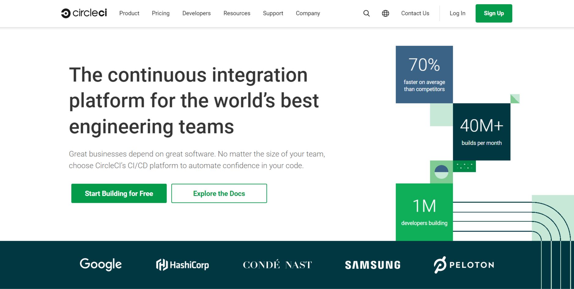
“The continuous integration platform for the world’s best engineering teams” is a strong, descriptive, and aspirational headline. It clearly communicates the core offering and targets the desired audience (engineering teams). The phrase “world’s best” adds a touch of ambition and prestige.
-
Value Proposition:
The text below the headline expands on the value proposition: “Great businesses depend on great software. No matter the size of your team, choose CircleCI’s CI/CD platform to automate confidence in your code.”
This highlights key benefits:
- Essential for building great software.
- Scalable for teams of any size.
- Automates code confidence.
The “70% faster on average than competitors” and “40M+ builds per month” statistics provide quantifiable evidence of performance and scale. The “1M developers building” adds further social proof and scale.
-
Strong Call-to-Action (CTA):
“Start Building for Free” is a clear, prominent, and action-oriented CTA. It encourages immediate engagement and lowers the barrier to entry by offering free access. “Explore the Docs” serves as a secondary CTA for users who want to learn more before trying the product.
-
Visual Reinforcement:
- Clean and Modern Design: The overall design is clean, uncluttered, and professional. The use of white space and clear typography makes the information easy to digest.
- Client Logos/Social Proof: The prominent display of recognizable company logos (Google, HashiCorp, Condé Nast, Samsung, Peloton) provides strong social proof and builds credibility. This reinforces the message that CircleCI is a trusted solution used by leading companies.
-
Strategic Design:
- Color Palette: The use of a clean white background with dark text creates a professional and trustworthy feel. The brand colors (blue and white) are used consistently.
- Typography: The use of clear and readable fonts ensures the information is easily digestible.
- Visual Hierarchy: The headline is the most prominent element, followed by the statistics, the value proposition text, the CTAs, and the client logos, creating a clear visual hierarchy.
-
Focus on the Target Audience:
The language and messaging are clearly targeted at engineering teams and developers. The emphasis on continuous integration, CI/CD, automation, and code confidence resonates with their needs and priorities.
-
Unique Aspects:
- The combination of a strong headline, clear value proposition, quantifiable performance metrics, and prominent CTAs makes this a highly effective hero section.
- The prominent display of client logos provides powerful social proof and builds trust, especially in the B2B space.
- The “Start Building for Free” CTA is compelling and encourages immediate engagement.
- The “Explore the Docs” CTA provides a valuable resource for users who want to learn more before trying the product.