-
Clear and Compelling Headline:
“Tame your work, organize your life” is a concise and relatable headline.
It speaks to a universal desire for organization and control, appealing to both personal and professional users. It’s broad enough to attract a wide audience but specific enough to suggest a solution for managing information and tasks.
-
Value Proposition:
The subheadline, “Remember everything and tackle any project with your notes, tasks, and schedule all in one place,” expands on the headline by explaining how Evernote helps achieve this organization.
It highlights key features: note-taking, task management, and scheduling, all within a unified platform.
-
Strong Call-to-Action (CTA):
“Sign up for free” is a clear, prominent, and action-oriented CTA.
It encourages immediate engagement and lowers the barrier to entry by offering a free signup.
The “Already have an account? Log in” link is a secondary CTA for existing users.
-
Visual Reinforcement:
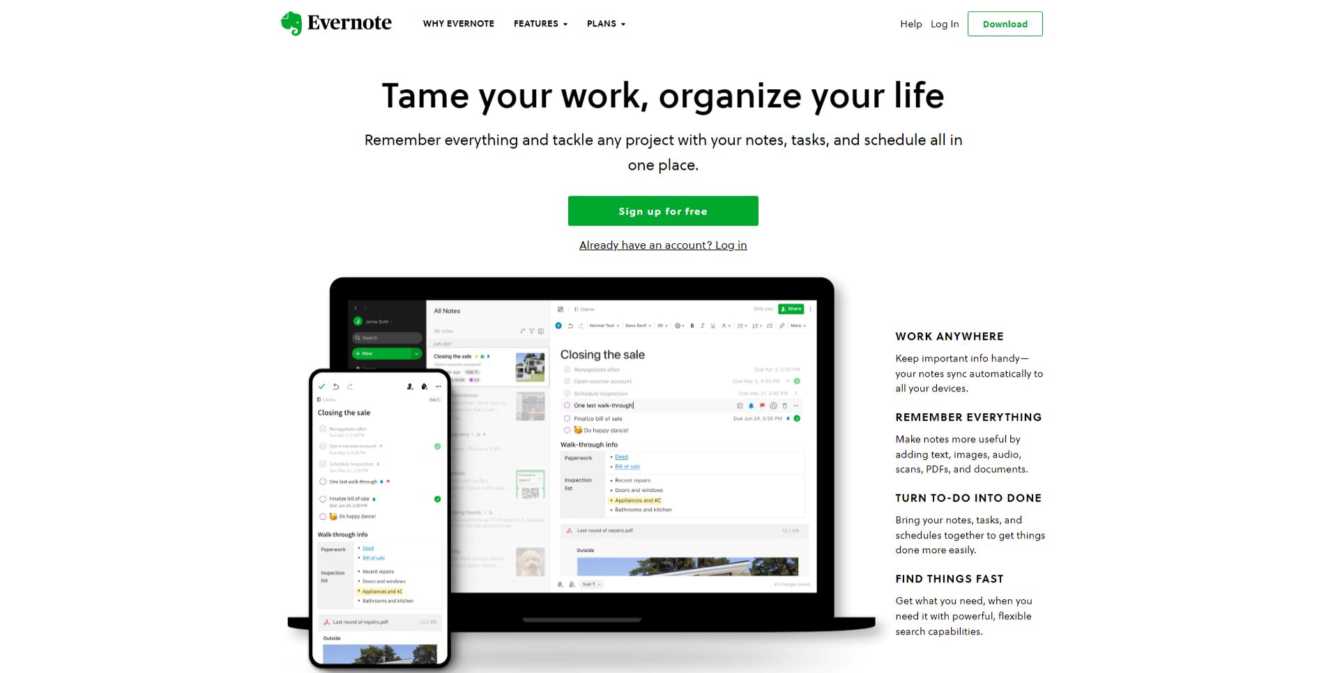
- Contextual Device Mockups: The image of a laptop and mobile phone displaying the Evernote interface provides context and visually demonstrates how the platform looks and functions across different devices. It reinforces the “work anywhere” aspect of the value proposition.
- Four Key Benefit Highlights: The four points to the right of the devices (“WORK ANYWHERE,” “REMEMBER EVERYTHING,” “TURN TO DO INTO DONE,” “FIND THINGS FAST”) break down the key benefits in a concise and easily digestible format. They act as supporting points to the main value proposition.
-
Strategic Design:
- Color Palette: The use of a clean white background with green accents (Evernote’s brand color) creates a fresh, clean, and trustworthy feel.
- Typography: The use of clear and readable fonts ensures the information is easily digestible.
- Visual Hierarchy: The headline is the most prominent element, followed by the subheadline, the device mockups, the four key benefits, and the CTA, creating a clear visual hierarchy.
-
Focus on the Target Audience:
The language and messaging are targeted at a broad audience, including students, professionals, and anyone looking for a tool to organize their information and tasks.
The emphasis on organization, productivity, and accessibility appeals to a wide range of users.
-
Unique Aspects:
- The headline’s focus on both “work” and “life” broadens the appeal of Evernote beyond just professional use cases.
- The combination of the device mockups and the four key benefit highlights effectively communicates the platform’s cross-device functionality and core features.
- The offer of a free signup lowers the barrier to entry and encourages users to try the platform.