AUTHOR

Humritha K

Humritha has spent her life using her personal and career experiences in writing articles, engaging blogs, etc. Purses B.E in CSE, written 1000+ articles in both tech and non-tech related niches. An expert in SEO Optimization and worked as HR and all related activities.

Symbolism In Graphic Design

Imagine visiting ancient caves like the ones at Ajanta & Ellora. What would happen if instead of all those exquisite carvings, you would have had to read long texts and ancient fonts? It would be cumbersome, right?! All the ancient temples, palaces, forts, buildings, and much other architecture. The way where the people lived back then and their technology is all known to us because of symbolism. They pictured their daily life tasks and inventions on walls, stones, pillars, etc. This is one of the ways we know the importance of our history and the way our ancestors lived. Other examples that depict the importance of symbolism can be found in our school textbooks. Can you even picture preaching toddlers without picture books?  Art and symbols work in areas where language will never be able to work. You visit a different state where you can’t speak the native language. But if you depict the exact symbols then the whole journey becomes smooth and easy. Graphic designing is the technology that allows communication or transport of messages via creative visuals and depictions. It is a heck of a lot of creative industry. Graphic designers work consistently to represent various things easily with creative pictures and symbols. So what is the importance of symbolism in the graphic design industry you ask? Well, allow me to throw shade on the same!  Importance of symbolism in daily life Symbols are the soul of graphic designing. Without a proper symbol, it would be a complex process to describe or represent a particular thing. The reason why you need an appropriate symbol is that every symbol has a hidden meaning within it. Not every moon symbol will represent something related to the external universe. Sometimes, the moon can be used to symbolize the beauty of a person, while other times it can be used to signify the lonely state of a depressed person. Similarly, a heart isn’t always a recognition of love. A heart symbol can also signify a human organ and can be used in hospitals to generate banners and placards for tips to maintain a healthy heart. Stars are celestial bodies that everyone loves to adore. They are positive and shining entities. So next time you hold a farewell party for your seniors you can surely get some invitations with stars on them. You see the whole mood of the situation changes with a symbol that suits the situation best. Plain and boring cards can be made into elegant and classic ones with the right choice of symbols. A graphic symbol of a skull or fire symbolizes danger. You can understand the importance of symbols by reminiscing the events from everyday life. If you are stuck in any dangerous or vulnerable situation the first thing that pops up in your mind is to look for safety measures. A first aid box is well known to everyone because of the red-colored plus symbol it has on it.  Importance of symbolism in brand promotions The benefits of symbolism aren’t only restricted to daily life representations. They are needed on a much bigger scale by industrialists to promote their brands. Be it a small online business or a large-scale industry. Everyone has their company name and a logo for the same. This logo symbolizes their brand. Every brand is unique because of the symbols and logos they carry. Today, in a constantly ergonomic world, running a business is becoming difficult every day. Even the smallest business owners have to face competition when it comes to stuff like packaging and brand labels and themes of logos.  Gone are the days when people didn’t heed much attention to the packagings. Now, the cute and more unique is your packing the more likely it is that your stuff is gonna sell. Of course, the product quality matters equally. You can imagine the importance of brand logos when you start thinking of brands like Reebok, Adidas, Nike, and Puma. Every brand has a specific logo that allows them to stand apart from the crowd. Even the brand symbols symbolize some or the other meaning. Creating a brand logo requires knowledge of symbolism and the importance of symbols. You can randomly create a symbol. There isn’t much big deal in it. But, creating a symbol that leaves the customers awestruck as to what the meaning of the symbol might be. This is quite appealing and intriguing in itself. This promotes curiosity in the customer’s mind and attracts them towards the brand.  Inspiration to create a symbol: Where do we get that? Inspiration to create something useful or creative can come from almost anywhere. There isn’t a law or a jurisdiction that must be followed while generating a symbol. The vintage era is a lot of inspiration. The beauty of nature also largely has an influence. The kitchen & the shapes of geometry have also got a significant amount of influence on the symbols.  Conclusion  In the end, I would like to sum up the importance of symbolizing as an integral process that started from the dawn of human civilization and will last till doomsday. Symbolism, also an ancient thing as it was used by our ancestors. We still linked to histories from centuries ago only on the basis of carvings and symbols. In the modern era, symbols have gained importance in terms of safety, brand promotion, education, decoration, and many other areas. However, we can’t ignore the fact that symbolism makes the understanding process a lot easier and faster. Similarly, sometimes the instructions on certain types of equipment like fire extinguishers may be printed in very small fonts. In cases of emergency, all you do just to follow the symbols printed on them. Clearly, this is the sole meaning of a graphic symbol. To translate the meaning of a particular thing or term via pictures and symbols. This makes it easier for everyone be it literate or illiterate to understand the basic things easily.   

Read More »

Guide For Online Marketers For Outsourcing Designers

In today’s fast-paced world, outsourcing designers considered as the best way to improve your business. Immense production and purchase of goods and services have given a major boost. To worldwide economic globalization, which has ensured the flow of economic assets from place to place. In simple words, the flow of money and growth in globalization from country to country.  That’s taking place rapidly through an important part present in every growing economy. That important part is none other than marketing. The basic marketing functions as the sale and purchase of goods and services across regions, in a layman language. Yet, there is more in marketing than just the exchange of entities with money. The days of mere production and sale of commodities are over, this is a modern era. With the introduction of electronic media such as the internet and the World Wide Web (WWW), marketing has seen a vast expanse covering an entire continent, and gradually the entire world. This has mainly taken place due to the shifting of the entire marketing process online, giving rise to a new term of online marketing. There has been increasing growth in the number of marketers, be it individual or industry, taking to online marketing as the best place to conduct all their economic activities with buyers situated at any place across the world. The situation is easy for the buyers as well, where a buyer can order his requirements without the need to visit the seller physically. It is because of this, online marketing witnesses a huge amount of transactions daily. Introduction To Outsourcing Designers With the mounting pressure of increasing production of services to manifold owing to increasing demand, industries and organizations find it nearly impossible to conduct recruitments of new employees, who have to be paid their salaries and benefits now and then, incurring heavy losses. To prevent these losses and boast production and continue to survive the market competition. Industries and organizations have devised a new trick up their sleeves, by making use of outsourcing. Outsourcing also simply defined as a business practice of delegating tasks that form a part of designs and production to other parties or organizations that can perform them better, faster, and most importantly, cheaper.  Outsourcing designers has become an essential part for every online marketer, where the organizations referred to are hired temporarily, and not as permanent employees of the organization. This can be understood by considering the case of designers that play a major role in every industry. Industries require designers in various roles like company logo designers, company good package designers, and software designers. Now, with growing requirements for a company’s production and sale quotient, the company requires good quality logos to represent the brand, as well as good quality packaging to attract buyers.  Outsourcing Designers Consider a company X, which, on a sale of Rs 100000. Earns a gross profit of Rs 100000 by providing logo and package design services to other companies. We can consider two cases where a company tries to finance designers for the given project –  The first solution would recruit a full-time designer employee at a base pay of Rs 60000 for 40 hours of work and emoluments and benefits provided by the company. Reducing the profit margin to roughly Rs 20000- Rs 30000 from a whopping Rs 100000. Further, at a permanent position, the company would have to consistently pay the employee, his salary at regular months, leading to losses to the company. The second solution would be the company hiring external specialists called freelancers to produce designs for them for Rs 50 per hour, Rs 1600 per week, and ultimately Rs 82000 approx per year, which would be quite less than what was being paid to the regular employee, thus saving the profit margins and getting chunks of work completed without the need to hire workers at a permanent position.  The Second Case The designing work that is given to the party that is not a part of the company, but some other organization to finish the work efficiently and at low costs, is what’s called outsourcing. Outsourcing may be considered as a realistic yet typical move when a business developed. Outsourcing doesn’t mean that there would be a drop in the quality of work that the clients would receive since freelancers can provide the same quality of work, which was provided by the full-time employees.  Companies have been searching for freelancers to simplify their work through various means like the most popular are, freelance websites that recommend freelancers to companies based on their actual design requirements and skillsets. If the requirement matches, the company hires those freelancers on a particular pay scale till the completion of the project. And after the completion, the freelancers can join other organizations and work on their projects. After they leave the previous one where they worked. In simple words, a permanently employed designer may prove a much costly asset, as compared to a temporarily employed freelancer. Advantages Of Outsourcing Designers Organizations have special marketing agencies within them to help produce good quality designs and expand this production as a fully-fledged service. Yet, the question that arises here is that, would outsourcing designers still be beneficial for the organization? Even after the production of good designs at home, would the purpose of outsourcing still work? The answer is yes. Outsourcing designers can prove beneficial in the following ways –  A variety in the specialization A real market agency keeps a track of every minor requirement that could make a difference. In its production capabilities and qualities. In this case, an employee with a single skill won’t be able to make any difference. Instead, multi-specialization roles would be required to satiate the requirement, which is possible if we consider hiring freelance designers since each freelance would be equipped with a different skill set at a set cost, rather than paying a single employee an increased salary for multitasking. The company must hire such freelancers who focus on a particular area and design completely as per the client’s requirements. Increased chances of creativity The most important niche that every

Read More »

The Ultimate Guide For Your Landing Page Optimization

What Exactly Is Landing Page Optimization?  Landing page optimization is a point of arrival advancement alludes to the way toward upgrading or improving every component on your greeting page to build transformations. Rather than overhauling the whole page dependent on a hunch, you use information and narrative proof.  The most awesome thing in Landing Page Optimization?  You can gather data before your presentation page at any point goes live. Studying your crowd, for example, will help you better comprehend what they expect and like. Notwithstanding, you will not make the ideal presentation page from the very first moment. All things being equal, you push the page live, at that point cause changes as you to examine the information and notice your transformation rate.  Stage 0: Really comprehend your objective market  Do this: Really become acquainted with your market. Lead studies and meetings to comprehend your client’s trouble spots. In the event that you have any current duplicate, use Wynter for informing testing. For additional credit, make a rundown of websites they’re presented to, and assemble an image of what their “normal” online experience is. Pose inquiries, for example,  Who right? Educate me concerning your age, work, position in your organization, and so on  What are you utilizing our item for?  How is your life better on account of it?  Do you think about any other options? Why?  (Note: Of course if you’re a startup, you’ll need to utilize client improvement inquiries for your page to reverberate with future traffic.) These inquiries assist you with uncovering patterns inside your market and disclose to you things examination alone can’t.  Stage 1: Set up significant examination  You’ll never get the full story on your greeting page movement. You’ll wind up discarding cash and speculating what to do straightaway. Take the time. Figure out how to decipher your investigation information and capitalize on it. Your marketing spending will thank you, I guarantee.  Stage 2: Make sure your promotion’s message coordinates with the point of arrival  Do this: Check the ricochet rates on the points of arrival you’d prefer to produce more business. On the off chance that they’re excessively high and transformations are excessively low, you may have a message match issue.  To know without a doubt, take a gander at the advertisements highlighting that page that get the most elevated navigate rates.  Does your page utilize comparable language to what’s in the promotion? Do the pictures in show advertisements return on the greeting page?  In the event that you have come up short on this, your greeting pages are bound to fizzle. Why? On most occasions, messages in the promotion don’t compare straightforwardly to what’s on the page. Advertisement pictures vary from essential presentation page pictures. Advertisement features don’t relate to presentation page features and the page, as a rule, isn’t what the client expected when they tapped the ad. They will land on the page and feel ungrounded. Where’s the feature that gotten their attention? At the least, have you embedded the watchword they were looking for in some conspicuous put on the page?  No? This is the aftereffect of sluggish change streamlining. Rather than making one page and tossing different, approximately focused on advertisements at it, make a small bunch of exceptionally focused on points of arrival that attention on the very close gathering of watchwords.  Stage 3: Evaluate your point of arrival’s initial feeling  Quest for your greeting page’s the essential watchword and snap on the pages your essential rivals are making. The thought isn’t to duplicate what contenders are doing (they don’t actually know either), however, to find out about the initial feeling they’re attempting to make. Obviously, it just requires 0.013 seconds for your cerebrum to recognize a picture, and 0.05 seconds for guests to frame an assessment on your presentation landing page optimization.  Stage 4: Does your page have passionate reverberation? Use client improvement methods found in this post to assemble a profile of your optimal purchaser personas. In particular, we’re searching for signs to tell us which enthusiastic triggers will resound the most for guests to the landing page optimization. This goes inseparably with initial feelings, yet it’s significant we make a reasonable differentiation between the two. On the off chance that initial feelings start by guaranteeing everything is in a recognizable area, enthusiastic reverberation is tied in with improving these components to make a temperament, snare the guest, and draw them more profound into the page.  Feelings like bliss, delight, stun, repulsiveness, assumption, eliteness and shock are only a little piece of what you could be planning for. Solely after you’ve picked the mindset of the page do you see things like tones, text styles, photography, and video. Decide how you will adjust these components to help the temperament of the point of arrival. Don’t simply self-assertively pick tones and textual styles for inspiring a specific feeling. Blue doesn’t naturally rise to trust, and red isn’t generally irate. How every component plays with and upholds each other is the thing that truly decides the general state of mind of the landing page optimization. Stage 5: Craft a reasonable and convincing incentive  Do this: Ask if your offer…  Straightforwardly tends to who your client is (e.g., Stripe = online installment preparing for web organizations)  States what your item does (e.g., Markitekt, the adaptation of CXL from quite a while past = we make websites sell)  Explains why you’re interesting (e.g., Zoom = interchanges suite for gatherings and talk that ‘simply works’)  Shows the end advantage of utilizing it (e.g., Airbnb = book interesting spots to remain and activities)  Since your landing page optimization is stacked and an initial feeling has been made, your guest subliminally chooses if the page merits perusing.  Stage 6: How will pictures build up the message?  Select, plan, or catch pictures that support the temperament of the page and talk straightforwardly to your objective market. Pictures can likewise be utilized to “hack” our common survey designs, and direct our eyes where to look next by adhering

Read More »

How to make the best out of infographics?

Infographics are the manifestation of representing complex data in a graphical way. It provides a fun way to learn more about a subject that has not been read much. The knowledge base is also another factor that makes them a perfect marketer. Few tips for making out the best of the infographics are: Use the best data When creating information a lot of people focus on design. But if the data used is not interesting or helpful then it is not clear how good the infographic information is. Knowledge base should grow on information that is also good. An easy way to find data sources for your infographics is to view your blog and company. Search for a text that attracted the most tweets, +1, and likes. This social networking shows the popularity of the content and makes it more likely that your personal information will be shared. Create a Report Knowledge is the essence of history. Each section of the material should be distributed from one region to another in a logical order. Design a presentation that demonstrates how a report can be made. Use Illustrations Instead of Graphs and Charts When designing your infographic basically illustrate more than diagrams and diagrams. A recent survey by Quick Sprout showed that infographics and photos get 72.8% more Facebook interest than those with photos and graphics. Also according to the infographic community visually, 53% of this information population has no data at all. Before using any screensaver, make sure that no royalties are paid. Distributed information containing images you do not have copyright can lead you to serious problems. Use Story blocks to get a good, unique picture for your letter. Select Appropriate Authorization Market experts suggest that the ideal width for an infographic is 735 pixels. This creates an infographic that will go out but is not so wide that it will need to be adjusted. It is also good to keep the material under 5000 pixels. If you go longer than this, you may miss the attention of the reader. Keep It Simple In order to make your knowledge more relevant, you need to keep the application as simple as possible. Stay the same for all images, photos, and illustrations used in the infographic. For example, if you are using a space subject, then the whole article will be used in all infographics. You need to use the forming limit and the text symbol you are using. Use a Translator The obvious is the key to effective infographic information. One way to accomplish this is to use a focal point that clearly reflects the infographic information. Branching from this infographic can be other important data that helps explain the story you want to tell. Make it a Sharing Want to make sharing your information as easy as possible. Add a social sharing button to your page for the most important social networks including Pinterest, Facebook, Twitter, Reddit, and LinkedIn. It can also include an action call at the bottom of the infographic, which reminds the reader to share it with friends, family, and colleagues. Perfect material knowledge for violating internet modeling. Knowledge content can quickly capture the attention of your audience. The content-based content management system is highly scalable which makes them the perfect platform for a website. Learn how to make an infographic, and review our template templates. Create your message for your audience Gaining knowledge is the battlefield to produce knowledge. One way to get a great infographic view is to find out what your audience wants. The best information, attention, and multiple diseases, are meeting your audience where they need it. One mistake that I have seen people make when creating information is that they try to pick something that is more popular than appealing to their audience. Keep it focused The simplest thing, discussed above, eventually turns the focus. Don’t make your knowledge base a source of knowledge and numbers. Make it deep and focus on one topic. Infographics are not an attempt to gather all the data you can. Instead, the infographic is designed to give a single point, focus. Make it easy to watch Sometimes descriptive information is lost in its processing. The designer makes it bigger, and then the designer will reduce it. In the process, reading the book was lost. Most infographics have many font sizes. Make sure your little script can be found online without much hassle. Create a deadly theme Your infographic topic is very important. This post is the same as the big blog article. Cognitive material does not receive any attention if it does not have a large textual basis. Good news will have the following features: They explain infographic They are user-friendly. They are short to understand clearly. The 70 characters are pretty long. Focus on the process The greatest power of an infographic is that it can be multiplied and comprehensible. Knowledge transfer is as good news. It has the ability to convey an idea to you by moving you from one side to the other, systematically and seamlessly. The fruit is all connected and preserved. It may be possible to move the viewer through a thought process. But some material knowledge falls here. Instead of diverting the viewer from the imagination, they throw in a lot of information in the form of pictures. Wrapping Up When you create an infographic, do it by creating a pattern. The system will help the user pay attention and convince you of the information you are taking. Even when viewed from a distance, this geography has a clear pattern. Each section has a different number, theme, and color scheme. It is a humorous book that helps us read the passage correctly. Each of the visual cues works to create a more powerful force.

Read More »
risks for your website trending in the industry

What are the Risks for Your Website?

Unsatisfactory treatment results to risks for your website from a failed failure to assess reliability. It can happen when you submit incorrect data to the SQL server (SQL injection), the browser (XSS), the LDAP server (LDAP injection), or anywhere else. The problem here is that the attacker can breach commands given to these users, resulting in data loss and navigating client browsers. Risks For Your Website 1: Injection Flaws Anything your application receives from unreliable sources will be resolved, preferably as a cleanup. You should not use a cloud, where access to that capacity is difficult and often easy to navigate. Antivirus software and products provide stellar examples of falling blacklists. Matching terminals do not work. Preventions The good news is that protection is the “only” term of careful evaluation of your admission and thinking about whether the admission can be trusted. But the bad news is that all quotes need to be clarified unless they can be trusted (but the phrase “never say” does not come to mind here). For example, in a system with 1,000 inputs, you will be able to answer 999 of them are incomplete, while this still has a field that can be treated as Achilles cures to slow down your system. But you might think that putting SQL results in the next question is a good idea, as a trusted database, but if not a roundup, the entry is from inexperienced guys. This is called Second SQL Injection Process if you are interested. Since filters are difficult to perform well (like crypto), my usual advice is to rely on your system’s filtering functionality: they have proven to work and are thoroughly evaluated. If you do not use the system, you need to think hard about not using them logically in your server security mode. Risks For Your Website 2: Broken Screening / Authentication This is a summary of the many problems that can occur during a broken test, but not all of them come from the same root cause. The URL may contain a copy of the session and assigned to a text translator and another person. The password may not be encrypted or stored or passed on. The ids time can be quite visible, so getting a response is useless. Repair time is possible. Time hijacking may be possible, timeouts are not implemented right or using HTTP (no SSL security), etc. Prevention The easiest way to avoid this web security problem is to use a  framework system. You can do this correctly, but the first is simple. If you want to translate your own code, insult it a lot and teach yourself what the traps are. Risks For Your Website 3: Cross-Site Scripting (XSS) This is a complete sanitization failure (which is a special case of common error # 1). Your attacker provides your web application JavaScript with tags and entries. When this user gets his or her subscription back, the user’s browser will do it. It can be as simple as clicking a link and getting the user to click on it, or it can be even worse. On the load, page run a page that, for example, can be used to post your cookie and the attacker. Prevention There is a simple web security solution: restore HTML tags to the client. This has the added benefit of defending the HTML blockchain, a similar attack in which the attacker inserts explicit HTML content (such as an image or invisible light) – not a big impact but irritating anger (“please stop it!”). Often, the workspace changes all HTML, so that <script> returned as & lt; script & gt ;. The other commonly used function of sanitization is to use regular expressions to remove HTML tags using regular words in <na>, but this is critical as most browsers will interpret broken HTML as broken. Better to convert all the characters to their escaped stage. Risks For Your Website 4: Insecure Direct Object References This is a beautiful case of reliance on an employee’s commitment and compensation for his or her insecurity. A valid directory means that the contents such as a file or database key are displayed to the user. The problem with this is that the attacker can provide this signal and, if unauthorized (or broken), the attacker can access or do the necessary thing to get out. For example, the code contains a download.php module that reads and lets the user download the file, using the CGI method to define the file name (e.g., download.php? File = something.txt). Either by mistake or due to laziness, the manufacturer removed the license from the code. The attacker can use this to download any system file that a PHP running user can access, such as the application code itself or other data stored on the server, to backup. Oh-oh. Another example is a working password based on user input to determine who our password is reset. When you click on a valid URL, the attacker can change the username field in the URL to say something like “administration”. Surprisingly, both of these examples are what I have seen happen many times “in the wild.” Preventions Properly and regularly perform user rights, then clean up those options. More often than not, all problems can be avoided by storing data internally and not relying on passing it through the client through the CGI area. Transformation times and multiple factors are appropriate for this purpose. Risks For Your Website 5: Security Error Modified web servers and applications are way more common than well-organized ones. Perhaps this is because there is no shortage of ways to do it. Examples Some examples: Use the app debug on the app. Having a registry list enabled on the server, which leaks useful information. Run older software (think WordPress plugins, old PhpMyAdmin). Having a non-essential function runs on the machine. The keys and passwords are not changed. (Do it more often than you would believe!) Disclosing incorrect information about the attackers, such as

Read More »
Branded backgrounds for your online meetings

Why Should You Have a Branded Backgrounds for Your Online Meetings

Meetings being conducted virtually has now become the new normal after the pandemic. It has now been more than a year since we have been using branded backgrounds for your online meetings for official and unofficial reasons. One main thought we always find nagging is our background. We think of being embarrassed in front of our higher authorities in case something happens by chance. We have had fun watching the online meetings gone wrong videos on all social media platforms. Kids playing football, balls hitting the camera, sudden entry of family members, a heap of laundry to be washed, and many more! It may happen to one of us anytime. What can we do about it? Why So Serious? Before we go into what to be done, you need to know the points as to why branded backgrounds are needed for your online meetings other than just being embarrassed. The background you choose to be shown plays an important role in your meeting. In virtual meetings, backgrounds amplify the distraction of your fellow members. It reduces their focus on you and the points you would like to put forth. It’s just human nature to look at what’s happening behind. So we can use backgrounds to hide things happening behind us. Zoom and other virtual meeting apps have now created the background changing option. But why branded backgrounds instead of the usual ones? Branded Background is a quick and easy tool for bringing your logo and brand to your Zoom calls. Branded Backgrounds In Online Meeting The use of branded backgrounds for your online meetings sets up the right mood for the topic you are about to review. Having an aesthetic background can calm one’s mind whereas having a beach background in a professional meeting might question your seriousness on the agenda. Once you come up with a branded background, circulate it with your colleagues so that all of you can have the same background and there will be no source of distraction. More than anything it would first allow you to focus on your meeting better without worrying about any mishappening about to take place or if your background looks weird. You wouldn’t need to check your surroundings frequently and you would always like to maintain professionalism during meetings. You wouldn’t want your supervisor to know how shabby your house is! Would you? Branded backgrounds for your online meetings would help maintain uniformity and would make you the center of focus. You wouldn’t want others to be focused on your background but want them to focus on your speech right? Having branded backgrounds for your online meetings would help overcome such disadvantages. Tips & Tricks Now that we understand better as to why branded backgrounds are necessary for online meetings, let us know how to present them well. Make sure to have proper lighting so that your fellow members can see you. Make sure that a window isn’t placed behind you since only a black silhouette could only be seen. Select a background that matches the topic of discussion. Do not choose a theme that is distractive. Choose the right background that fit your views and the atmosphere of the meeting. Choosing the logo or topic of the meeting as the branded background for your online meetings would help create a serious vibe and would also promote your company. This would create a good impression on your fellow members. You can also choose solid colors suitable to your brand color or use gradients of the same theme. Further On It would be better if you stay stationary so that your original background doesn’t seep in when you move out of focus. Sometimes some part of your image is also cut out with the background. This would have happened because your original background color would have matched with the cut-out image. To prevent this, try to choose a contrasting original background to your skin tone and dress color in the area you are seated so that only the background is replaced. A green screen is usually used for such reasons because it is the only color that doesn’t match any skin tone. But if you are to be seated in front of a green screen, make sure that you don’t wear a green dress. Choose a background color that is contrasting to your skin color. This ensures that you are seen clearly and the background will help others to focus on you. If you have a dark complexion and you choose a dark background, it becomes tough to focus on you since you are dullened. Whereas if you choose a bright background, it makes you stand out. Wrapping Up Create your virtual background at a resolution of 1920 pixels wide by 1080 pixels high. 16 x 9 is the default dimension for Zoom and other virtual meeting applications. For the best quality background, save it as a .jpg file. You can choose to blur your background slightly which would increase the viewers’ focus on you. It is also way better than the background without blur looks-wise. There are default backgrounds available to use in the apps. But you can always customize your background according to your outfit and surroundings. A few resources you could use to create custom backgrounds are Canva, Unsplash, Modsy, The Verge. These are very easy to use and can prove to be a very great help to you. When you create backgrounds according to the tips mentioned above, you would be a perfect presenter in the meeting!  

Read More »
Graphic design

How To Create A Digital Marketing Campaign

The Digital market is one of India’s fastest-growing companies based on images and content. On the other hand, graphic design is not just about photography and painting. It specializes in content marketing, communication skills, and problem-solving through images, graphics, and media. For a business, this is the most effective and efficient way to connect with customers. According to marketers, graphic design is one of the most important elements in the world of a digital marketing campaign to raise awareness and influence customer decisions. Due to the rapid growth of social media and reliance on the Internet, customers can access “likes,” “texts,” and “messages” on the web as well as on their mobile devices. You need to read or watch the video in seconds, but also with a small face; graphic design plays an important role in careful attention. We explore in-depth the concept of art and the role of art in the digital marketing world. What is graphic designing? The concept of graphic designing comes from the word “Drawing”. Drawing means that the drawings will be accurate and calculated by calculation. Graphic design is part of a business process that uses a lot of skill and training (called artists) to send a message or a piece of information or content to a group of people through image varieties, such as images, forms, symbols. , visuals, etc. The filmmaker and client are often involved in the design process, the result of which is the viewer or the buyer. The designer can use different skills, images, words, beautiful art, and page layout to get creative work without rules and functions. The designer puts up various ads such as websites, stickers, or packages, using different graphics software programs, different designs. The role of graphic design in digital marketing campaign Can see the impact of art and culture, from traditional media to full-time advertising. Everything from graphic design to packaging comes from the extensive research and experience of filmmakers in the business. The importance of graphic design and creating effective marketing campaigns is greater as companies move into digital platforms. You need to know how this impact will contribute to the success of our efforts to expand the value of your company in the competitive market today. Promotes consistent brand awareness Flexibility is important not only for your digital marketing campaign but also for the accuracy and reliability of your business. Any content you publish is an extension of your business name, or social media advertising, or packaging. The combination of colors, icons, and text elements and the design of the collection finds harmony and versatility in your brand. Because of this unity, your brand has a better brand for customers. As they interact with each other over and over again, they will remember your mark. That’s why social media is a great way to showcase your brand identity. Increase your customers conversion rates The interaction of modern consumers for the simple identification of visual objects is one of the many reasons for the inevitable change of the digital media system. These unlimited algorithms can interact with web users through digital media making digital advertising a popular marketplace. An effective graphic designer is responsible for navigating customers on your website and directing them to their CTA. Beautiful artists how to show the best on your page, including your shopping list, name, logo, and CTA button. Call someone who knows what graphics can do for you when you optimize your site, as you improve customer conversions. The benefits of graphic and digital marketing campaign The role of graphic design in digital marketing is extremely important. Every designer has an impact. Whether you’re researching the work of a publisher or a social media vendor, these experts will tell you one thing: graphic design and digital marketing campaign. That said, it is very important to choose your wisdom. Here are a few benefits of graphic design and digital marketing. Awakens Brand Name definitions are very important in digital marketing campaigns. When creating marketing materials, quality colors, textual themes, icons, and non-essential items. This is because your ad mentions your name. When you use your company’s subscription system, you also impose an image in the mind of your audience. In fact, statistics show that people are more likely to remember something different when they are introduced to the same color, pattern, and other materials used to create a few moments. Share your brand news According to a study, 63 percent of people are attracted to a certain goal. When you promote your products and services, you are not just selling them. But you also promote hunger, history, and drive behind the idea of ​​their original language. There is a reason why the company’s website has an “About Us” page. That’s because they can share stories about their brand here. People naturally stimulate their emotions. When a brand’s values ​​and standards are in line with consumers, it is likely that they will also choose those that fit their own values ​​and values. Lightly digestible People who are more relaxed present new visions during this time, especially more often than not. That said, visual media is influenced more than textual impact. Customizable Retailers may have blankets and items they can use to pull their sales. He put everything together to fix it. While there are product images that can be used for their advertising, these product photos do not make your brand known. They don’t give it the human form, and other species can use the images. However, by using personalized images, you show your audience that you need to go the extra mile to get them. In addition, by using a custom display, your communication is also at a unique level. Can set up your product but not overreact to annoying customers. Conclusion We live in a visible world. Look around you. You will likely see an image of each street, stickers, billboards or foundation icons. That shows a great image that is important if you want your business

Read More »
provide good feedback to your graphic designer

How to Provide Good Feedback To Your Graphic Designer

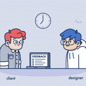
It is a general thinking that designers do not take orders. It is also suggested that clients should try not to tell the graphic designer how they can do their job. But there is always constructive good feedback to your graphic designer-client relationship. Some designers feel underrated when they do not get a dialogue with clients. There are various methods regarding how to provide good feedback to your graphic designer without hampering the way of their working. These methods will help you have a better conversation with your software designer so we can provide you with better content for your company. These ways are given below – Both of the individuals needs to be on the same page Before giving anything back you and your graphic designer must have a clear picture of the thing you are evaluating. There are many questions that you need to ask yourself and you need to have a clear picture when suggesting changes to your designer. These can include if you are looking at the whole design, or just the feel of the design or logo, if your suggestions related to an adjustment of color schemes or font choices, and most important if you have concerns related to message and branding or the images used. Always review the whole work before providing any suggestions. Keep an eye for placeholder images for content and have a clear understanding of the whole project. Bad impact – “What are your thoughts ?”, “I like it.” Good effect –  “Firstly, let us look and feel the brochure. Do you think it summaries the message you were trying to give?” “ Most of the part is great. However, there are some issues with the outer look which is an integral part of our brand. Can you take a look into this matter?” Be direct and honest Both of you are professionals, and generally, no design has all the components so perfect that you don’t want to change a thing in it. So you need to provide positive and provide good feedback to your graphic designer and not being rude to your designer is not suggested. The designer spent their time working on the design for your company. Bad way – Yeah, I guess the design will work.” Good way – “This design is in the accordance with the thought process, and I appreciate how much effort has been put in researching competitors. However, this looks way too similar to our competitors. Differentiation from them is much appreciated?” Don’t use the word “like” This is very important to not use the word “like” while providing good feedback to your designer. There is no need for you to like the design if the design achieves the business missions then it is a great design. Try to keep in mind this when you are providing input to your designer. Bad way – “I like that color!” Good: “ This font is a great choice for heading, I think it will appeal to the customers the ways the company wants.” Leave your tastes for your home Try not to have a personal bias while deciding design. Remember that alone the present and is a separate entity with its mission and needs. Try to be in accordance with the goals and needs of the company. Bad impact – “I don’t like blue color altogether. I hate blueberries.” Good way – “Although I don’t like this blue, our company stands for trust, loyalty, and security. Does this blue signifies those?” Ask questions, many of them If you are not sure then about ask about it. There are no stupid questions. However, try to constrain yourself from asking questions during presentations and provide good feedback to your graphic designer. This should be done in a space where both of you are completely comfortable having a dialogue and not answerable to anybody else. Bad impact – “….” Good way – “ What is the difference between RGB and CYMK again?” Be the problem maker, not the solver As a client, it is your responsibility to provide clear problems for your designer. The job design is to find solutions to your problems. Try not to provide solutions to them. Just simply, tell your designer about the issue regarding the design and you should trust them to fix it properly.  Try not to give perspective suggestions. Bad impact – “Can you shift the button up and to the right? And make it smaller? And silver?” Good: “I’m worried that people will get distracted by big buttons. What are your recommendations for making it more justified?” Reference the design brief as much as you can. There is nothing like excellent and provide good feedback to your graphic designer that emphasize your company goals at the same time the need of your customers. Bad feedbacks are those which are subjective and prescriptive. Bad impact – “These colors and serious photos seem very boring. Like my thinking, bright, colorful images would be appropriate here. Good way – “As per our brief, we wanted the design that will appeal more to the target audience. Working professionals who are in their 50’s and 60’s, making over $250,000 a year. I’m not sure that these images will work for them.” Do not try and comp It is very irritating when they try to design compliments and say that it is exactly what they are looking for. It is very tempting to use. But don’t use this in any case. Try to leave designing to the professionals and try to not interfere in their work. If you must, give some examples, outside designs that will provide some impression that you’d like, and explain what is the better aspect of your example. Bad way – “I made an example to give you an insight of what I’m looking for!” Good way – “Since our target market is technologically advanced and know what’s new, we would like the website to be more trendy and ‘airy’ with a

Read More »

What makes a good facebook landing page?

What is a Facebook landing page? A Facebook landing page is a special page designed to convert visitors to certain Facebook Pay Per Click (PPC) ads. These landing pages differ from other pages (such as product pages on your site) in that they are specifically designed to complement your Facebook ads. The story continues – the hook, the design, the call to action – presented to the reader when they viewed their newsletter on Facebook. A few years ago, Facebook offered landing pages on its own platform. They allowed companies to host their content for appreciation on Facebook (for which they were nicknamed “gateway”), but have not been available since 2014. When we talk about Facebook landing pages in this post, we are talking about the first page that someone sees after clicking on a Facebook ad – not to be confused with the landing pages of the platform that Facebook offered. Why do I need landing pages? Each person’s newsletter is unique. The content and pages you like, the friends you’re connected to, the groups you’ve joined affect how your newsletter is completed. Because “personalized” expectations are personalized with news and the ads they see are highly targeted, your Facebook landing page must be closely linked to your ad in order to be successful. Here are some other reasons why dedicated landing pages are good practice for all Facebook ads: Potential customers need more information Scrolling, readers, and Facebook browsers need additional features to move from ad clicks to purchases. These potential customers are in the brand awareness stage. To convert your page, ask for specific information about why they clicked on your ad. A Facebook-focused landing page with concise information and a consistent message is the best way to turn it into customers. Mobile phone users are reference users People do not turn to Facebook for in-depth reading and directed learning. They complete the time or just answer the phone for quick check-in. And since 94% of Facebook’s advertising revenue comes from mobile devices, assume that everyone who sees your ad has only five minutes or less to complete a purchase. That’s why you need to make it as easy as possible to navigate from Facebook notification to your landing page prompt. Any navigation obstacles or confusing messages risk losing your expectations and moving on. Home pages are slow and overloaded Home pages are great for potential users who know about solutions that look for specific information but can overwhelm social media visitors. (Consider everything: navigation bars, prompts, product listings, and features.) MECLABS research found that 44% of clicks generated by B2B companies lead readers to a homepage instead of a dedicated landing page. There are many companies that do not take advantage of conversion benefits. The typical visitor does not wait more than three seconds for the page to load. Most websites are full of images, scripts and other elements that make them slower than an optimized landing page. When you post a promotional comment on Facebook on your homepage, you may lose more customers than you think. How to create a high conversion landing page on Facebook? We have a short reference list of best practices on the Facebook landing page below, but there are two things you may not want to keep in mind when you start building your page: Get to know your audience. It’s no secret that Facebook has great targeting capabilities, but you can’t take advantage of it if you don’t know about your ideal prospects. Before you spend money on Facebook ads, make sure you know your audience well. Take the time to study how potential customers are looking for your solution, what words they use when describing products or services like yours, and what features or benefits they like best. Keep it permanently. When writing for a Facebook landing page, be sure to send a consistent message between the ad and your landing page. Merchants may think that children’s repetition is repetitive, but it can help reinforce your message to potential customers and make sure they are in the right place after they click. The same goes for the instructions – if someone clicks on an ad to advertise, it’s better to be the center of your landing. Facebook landing page 1.Empty the Single Sale Offer (USP) proposal. Visitors need to be able to tell directly what your product or service is right for them. Don’t go through the most important information on your page below – show it at the top of the page. 2. Strong, descriptive titles. Your title should make the reader want to know or see more. The title of the Facebook ad and of the landing must deliver the same offer. 3.Coordinated project elements. The goal here is to continue the story you started on Facebook with photos. If the images in your Facebook ad are neutral colors with pictures of smiling kids, then your Facebook page should also have neutral colors with pictures of smiling kids. 4. High-quality photos or videos. This may seem like a gift, but it might surprise you how many landing pages on Facebook use low-resolution images that scare off potential customers after they click on an ad. Be sure to use photos or videos on your landing page that show your list in the best light. 5. A special and convincing call to action. You can repeat the request on the page, but you have to ask visitors to do something special. In addition, your copy should tell them exactly what happens when they do this: for example “pick up the e-book” instead of “send” it into a form. Tips for writing compelling landing page content Know to whom you are talking Define the demographics and characteristics of the target audience so that you know their habits, what they want and need and how they speak. Your copy will be more targeted, clearer, and more direct when you target an audience, rather than a largely undefined audience. Put

Read More »

What Makes an Honest and Good Designer-Client Relationship?

This is a brief guide for both designers and clients, enabling them to form a positive work designer-client relationship and environment to make the simplest creative outcomes from the method. That’s right – it’s rarely talked about, but there’s often the question of – how does the designer-client relationship works? How can we start? Is it right down to the client – or the designer? Now no working designer-client relationship goes running an equivalent as another. People are different and they work differently. But that’s the sweetness of working with freelance designers because their skills guide you through their design process. Why do I want to understand this? Embarking upon a replacement account, particularly in a neighborhood-like design. (Which are often a quite personal process as we all have different preferences) is often difficult and time-consuming. It’s normal to possess concerns over who you’re working with and the way it’s all getting to work. So spending a tough time getting the project going together with your designer is often key to the entire process of staying on plan. First and foremost, the designer-client relationship isn’t always a simple one. The bulk of business owners say it’s all about finding the proper balance. So, if that’s the case (which I completely agree with), what ideals and values does everyone got to bring back the table to form it work? 7 Key themes: I’ve established 7 key themes that are important for the client and designer to remember of and confine mind before, during, and after the project: Clarity Trust Communication Understanding and adaptability Following the method Responsibility and feedback Keeping an open mind There are some ways to urge great work from a designer, and mostly. They’ll offer you great work regardless because that’s what they’re good at. Sometimes though, it’s also great to understand how you’ll be a far better asset towards the creative process. After all, it’s your brief, your project and I’m pretty sure, you would like it looking perfect too! Clarity There are two questions: What are you looking for? Why have you ever decided to outsource a graphic designer? There are often many reasons to figure with designers – and therefore the first port of call is to clarify your goals, expectations, and wishes. Most designers will work with you to form sure they’re the proper designer for what you’re trying to find – that they will provide you with everything you would like which your project and their design skills fit. It’s handy if you recognize what you would like, but either way, inherit the project with an open mind. So, what are your goals, and are they being accomplished? It’s okay to vary what you would like a touch mid-project as long as you’re open with the designer about your needs or potential difficulties. Then you and therefore the designer can lead an open discussion throughout the project, instead of either one among you feeling left behind. Trust Achieving (and keeping) trust is invaluable for a robust working designer client relationship, whatever industry you’re employed in. you’re trusting the designer to ascertain your vision, develop your thought process and make something that hits the nail on the top. If you don’t have trust in them, it is better not to work with them. Being clear and upfront about likes, dislikes and expectations will give everyone an excellent start line. Although there’s no problem with not being sure about what you would like, you’ll bet your designer will have a tough time deciding whether you wish something or not if you don’t tell them. Being clear from the beginning avoids any surprises and is imperative for the designer to supply tailored advice and guidance supported knowing your needs and what their skillset offers. Communication Communication: that’s talking and taking note of each other we frequently forget how important the listening part is, but without that, we’re getting nowhere. Two-way communication and feedback between both parties is significant – an open circulation of ideas, values, and goals can then be shared and discussed so that we will get to an equivalent goal with an equivalent vision in mind. So, when you’re unsure about something, just ask! That’s something designers should be doing too, an excessive amount of assumption can get a project very lost… because the funny thing with design is, is that the planning purpose and our personal opinions can become blurred. So, talking about the run-through (whether that’s with one another, a colleague, attention group, or someone outside the process) is often an ideal thanks to keeping it up the track and meet the project goals. Understanding and adaptability Some people work weekends, some work evenings, and a few don’t work traditional working hours at all! With the ever-changing work-life balance and non-traditional working hours becoming more common, it’s becoming very helpful to spotlight once we do or don’t work and once, we will or won’t be available. If possible, a minimum of avoid assuming someone works precisely the same way and times you do! We’re real people, with real work, real families, and many life commitments to balance in our schedule. If you recognize you’re employed outside the quality 9-5 otherwise you are often inaccessible for giant periods of your time, it’s probably best to start the project with this information upfront. It’s easy to plan, once you know when! For me, the planning process is a collaboration also a process. I’ve found that being flexible with one another can help to place project deadlines within the right place immediately. If you’re on an equivalent page, it’s easier to figure at an equivalent pace – no one likes to miss a deadline or run behind with a project because basic information wasn’t made clear. Following the method So this leads me straight into the importance of following the method – the project schedule and process exist for a reason. And like I said above I feel the truth design process is usually

Read More »

Color Selection And Human Psychology

For centuries, artists have controlled color to obtain specific reactions from their people. Interior designers, advertisers, and others usually choose colors because of how they think they can change people. But does color actually change human behavior? The answer is yes! The study of psychology has shown that color selection makes up an important part of the change in our mood. It also shows that when we use different colors on different occasions, such as at a wedding or an event, we tend to feel happier and have more positive emotions than when we use only one color. In the world we live in, color selection is extremely significant. Color has the power to influence one’s thoughts, behavior, and reactions. It has the ability to irritate or soothe your skin, increase or decrease your blood pressure, and reduce your appetite. Color is reflected as an effective means of communication. The colors red and green denote “stop” and “go,” respectively. This universal message is transmitted by traffic lights. Similarly, the colors used in a product, website, business card, or logo evoke strong responses. Selection of the correct color scheme It’s one of the most critical aspects of developing a popular brand. After all, these colors can be used for anything from logos to the company’s website, so they need to be chosen carefully. According to studies, most people make quick decisions about a product or company based on the colors used. During the color selection of the scheme, you should choose colors that will persuade potential customers. For example, if you’re selling a product and want to make it feel friendly, you could choose a bright color like yellow or orange. Darker shades, on the other hand, should be reserved for things that are more extreme in nature. Although there’s no clear cause-and-effect relationship between color and behavior, some assertions about colors and what they can symbolize have been made. Hot colors like red, yellow, and orange are thought to evoke enthusiastic emotions. Blue, violet, and green are examples of cool colors that can be found on the blue end of the visible light spectrum. These colors are associated with calmness, coolness, and stillness. Visible light spectrum In the visible light spectrum, red has the longest wavelength. Red which associated with dominance, influence, and strength in Western cultures. It also serves as a warning sign and arouses alertness. Red traffic lights warn drivers to be careful and come to a full stop. Snakes, for example, have a red coloration, which means they are poisonous and aggressive. Red is believed to increase metabolism and blood pressure, all of which are needed to prepare for action in an emergency. Impact of blue The color blue is aligned with harmony and peace. It’s a representation of logic, communication, and knowledge. Low stress, low temperature, and a low heart rate are all correlated with it. Blue is often related to a lack of warmth, emotional detachment, and indifference. Despite its negative meanings, blue is often chosen as the most common color in global research surveys. Blue light stimulates us to stay awake. Impact of Yellow Yellow, a vibrant color that’s the most noticeable to the naked eye. It denotes competence and is correlated with joy and niceness. Yellow is an indicator of hope and inspiration. It’s often used alongside black on-road signs, taxis, and school buses, attracting our attention and indicating caution. Yellow is also associated with anxiety, fear, and illness, which interests me more. Impact of Green The color green, associated with growth, life, health, and nature in the springtime. Green is connected with prosperity, wealth, good fortune, and finances, and it represents protection. It’s thought to have a calming and stress-relieving effect because it’s a stimulating, soothing color. Greed, envy, ignorance, and sleepiness are all negative associations with green. Impact of Orange Warmth, passion, and inspiration are all correlated with the color orange. The color orange increases hunger and thus affects appetite. It’s also thought to improve mental capacity and performance. Exposure to orange light has been shown in research to enhance memory and alertness. Fall’s main color is orange, which is also linked with summer. Orange in light shades is a very warm and welcoming color, while dark shades are associated with dishonesty. Impact of Black Black, regarded as a color of mystery, and it’s synonymous with terror, death, the unexplained, and evil in many cultures. Mixing black with another color produces various shades of the same color. It also denotes leadership, complexity, and force. Black is also linked with misery and negativity, and it reflects toughness and freedom. Impact of White White, contrasted with misery and death in eastern cultures. White is also a symbol of purity, innocence, and impotence in Western cultures. It also connotes protection, religion, and belief. Isolation, emptiness, and a feeling of inaccessibility are all negative associations with whites. Why this matter? Although you’ll start to desire an interior decorator after reading this section, these things are really incredibly important in helping you understand the why behind conversion jumps and slumps. As a bonus, it’ll help keep you from drinking the conversion rate optimization Kool-Aid that misleads numerous people. One of the explanations is that when it involves the psychology of color, there are many variables in the situation. There’s an opportunity for different people to perceive colors differently. How you perceive a particular color may have a lot to do with your personal preference, experiences from the past, cultural and gender differences, and so on. Wrapping Up Although color can influence how we feel and behave, experts have discovered that these effects are influenced by personal, cultural, and situational factors. Even though color psychology has been studied and analyzed for several years, there’s still much debate about the precise impact that color has on human psychology. Now that you’ve learned what color psychology is and what the most common color meanings are for every color, it’s time to use them in your business. While many

Read More »