Witches, goblins, and ghouls can make for some pretty amazing graphic designing projects for Halloween. While Halloween might not be top of mind when it comes to design, it’s an opportunity to do something a little different with projects. Graphic designing with Halloween themes centers around something that will be around for a short time. It might be different than the typical vibe of a brand or project and often has a theme that’s fun and friendly.
Draftss gives you unlimited access to 2 million+ pro design resources, themes, templates, photos, graphics, and more. Everything you’ll ever need in your design resource toolkit.
Adding a spooky element to a design can delight users and show that the design is new and timely. It gives users reasons to come back to your projects because they know that they will change again after the holiday. You can use holiday-themed graphic design as a trick to keep users coming back!
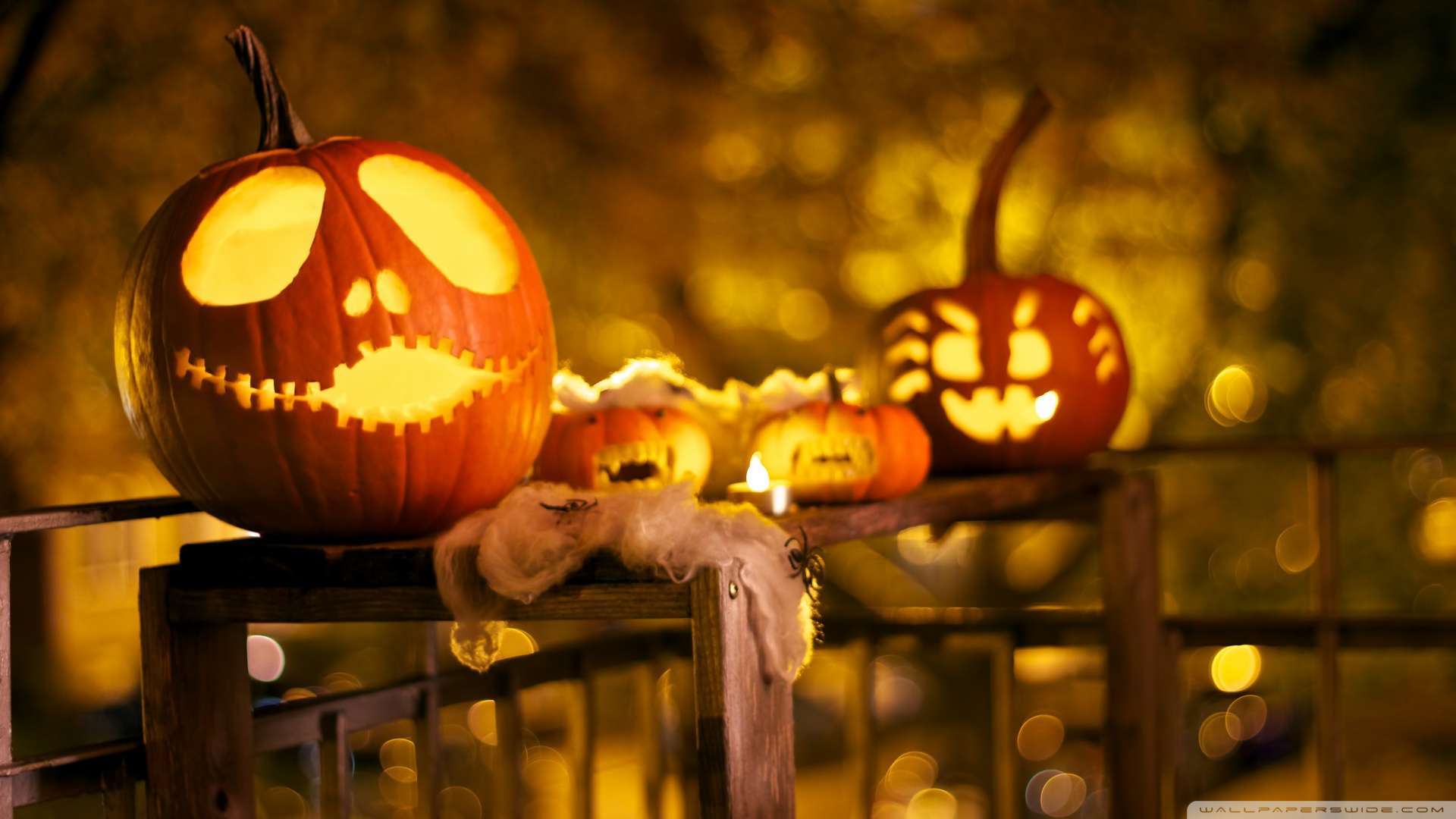
1. Add Halloween Imagery
The easiest way to create a Halloween graphic design is to substitute some of your typical imagery for something with a holiday feel.
- Add images of people in costumes.
- Create a Halloween scene for the homepage.
- Design a special animation.
- Promote a product or service with a spooky special that you can show.
2. Switch to a Seasonal Font
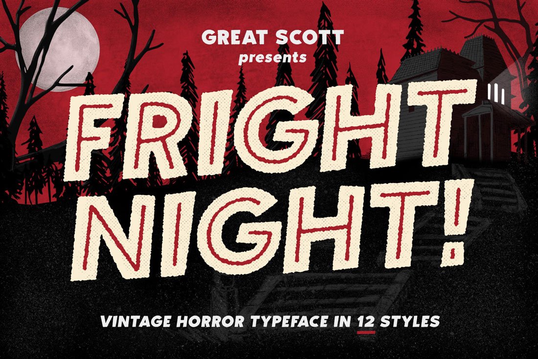
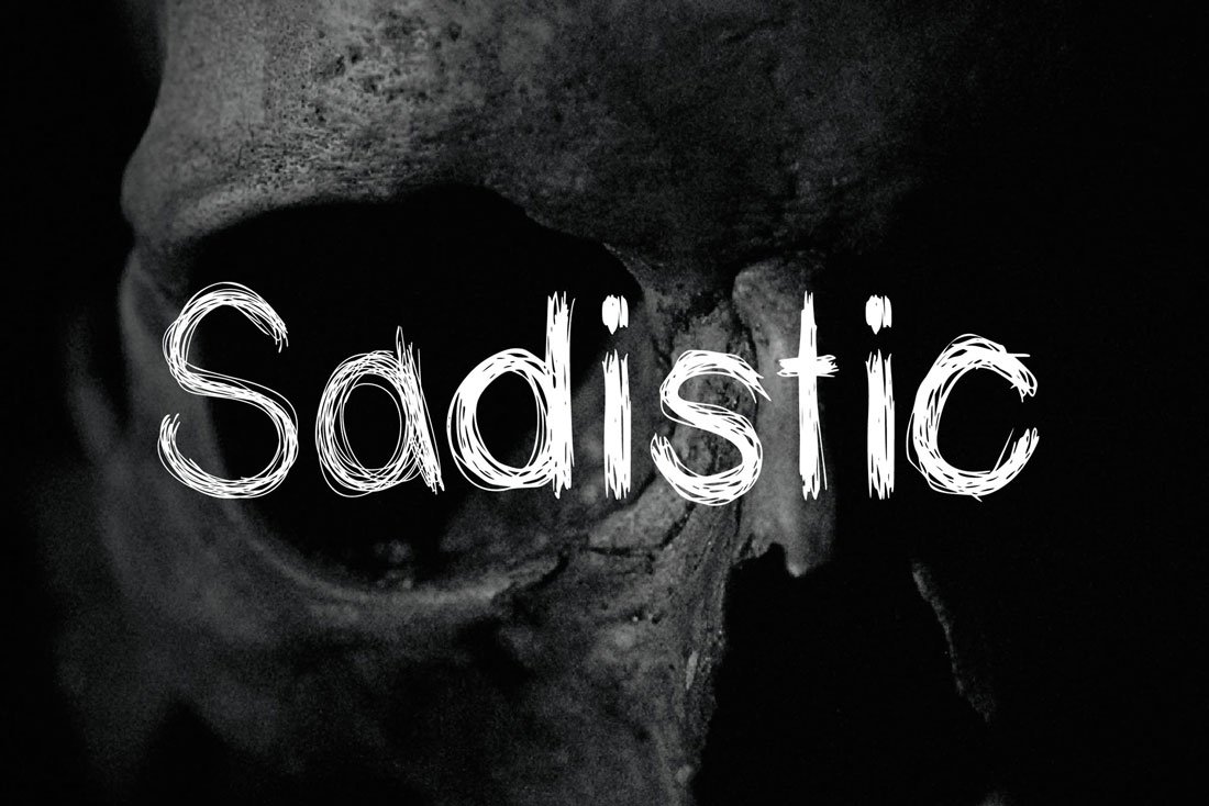
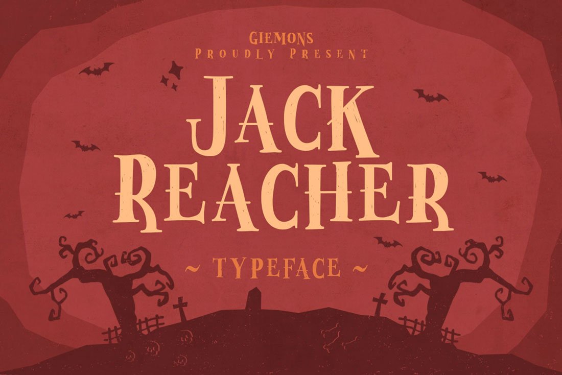
Halloween is the perfect time to use one of those crazy novelty fonts that you just can’t find another excuse for. From scratchy hand-drawn typefaces to lettering that looks like it could be ripped from a horror movie poster, a spooky font option is a less obvious way to create a Halloween scene.
If you are feeling like tricks and treats, use matching language to create a fun and unique holiday complication.
Here are three Halloween fonts that are a good starting point.
- Jack Reacher Typeface
- Fright Night
- Sadistic
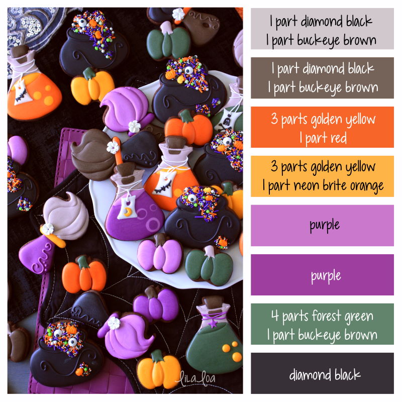
3. Mix Up Your Color Palette
Halloween provides a great opportunity to switch up a color palette for warmer, deeper hues with more jewel tones and dark schemes.
While most people jump right to bright orange, you don’t have to use a pumpkin-colored palette. Consider deeper oranges and sage greens. Purples, navy, and black are equally popular. Don’t discount a deep maroon or brighter blues or greens either.
When in doubt, opt for something that has roots in nature – fall leaves, the night sky, and the full moon, or even a green-eyed black cat.
4. Substitute Fun Icons or the Hover States
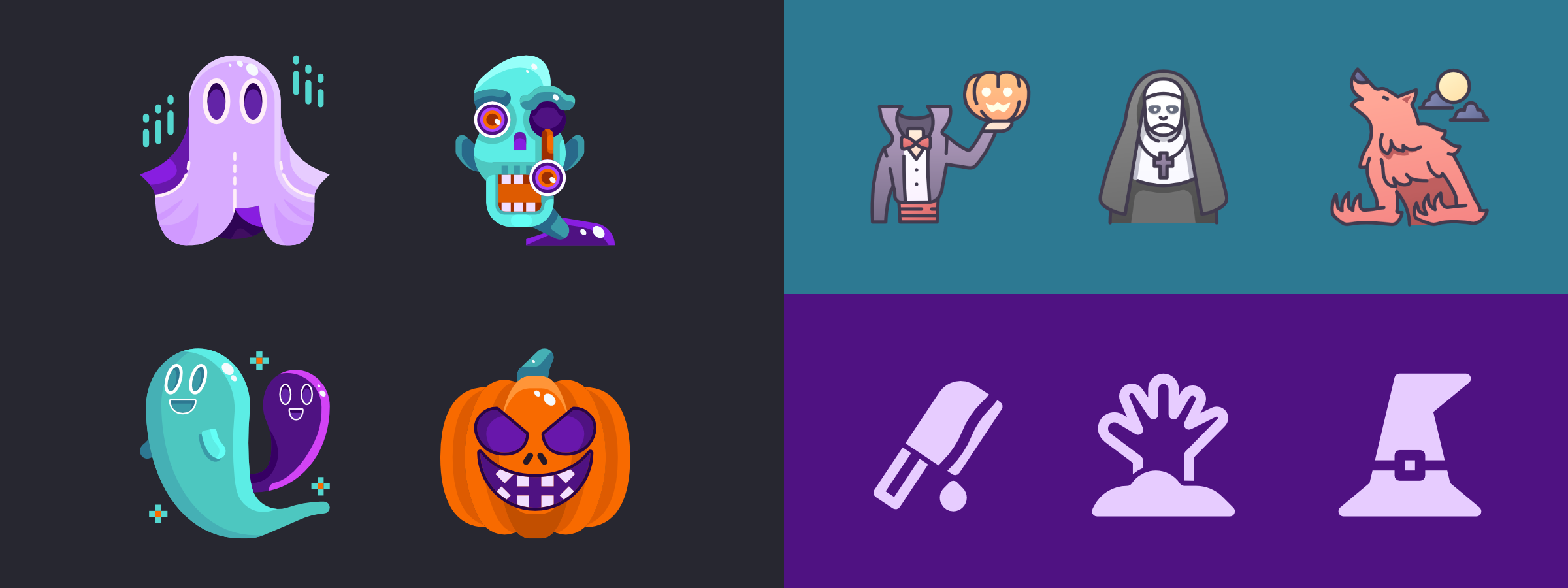
Trade some of your more common design elements for icons with a seasonal theme.
When it comes to making tweaks to your design theme for Halloween, consider adjustments to some of the smallest website elements or divots in print projects. Starting in October, switch the icons to something with a more Halloween look. Add a witch hat to the cart icon or a pumpkin to the phone button. The nice thing is that you don’t have to change every icon in the design to achieve this look. Just subbing a few small elements can create the right amount of charm.
Or surprise users with a simple hover state: Don’t change the icon itself, just adjust the hover action so that that cart magically pops into a bat or ghoul. The same idea can work on printed materials as well – just make sure not to give them out post-holiday. Trade some of your more common design elements for icons with a seasonal theme.
5. Include a spooky CTA for graphic designing and Halloween
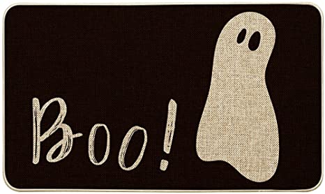
Even the smallest bits of a design can be traded for Halloween elements. Adjust the microcopy in your call to action button to include a spooky message.
Another idea? A simple pop-up that says “BOO!” and leads website visitors to complete an action. Sometimes the smallest and simplest changes can be the most effective.
6. Add a fall theme with graphic designing and Halloween
So here’s the biggest issue with a Halloween graphic design theme – it’s short-lived. Most designers don’t want to switch over to holiday elements until October. (And I don’t blame you.)
So do you want to go through all this fuss for a design change that only lasts 30 days?
Rather than an all-out light-up jack-o’-lanterns theme, try a more fall aesthetic instead. Lump Halloween, the season change, and even Thanksgiving into one design cluster. You’ll get a lot more bang for your buck and can switch it now and leave it until the end of November without feeling silly.
7. Have Fun with About Pages
Here’s my go-to Halloween graphic design trick. Have staff (or pets) dress in costumes and change their photos on the About Us page of your website. Finally, include a promo or social media campaign to drive users to this seasonal content that’s fun and interesting.
Simple, right? Now schedule that staff dress-up day!
8. Add an Animation with Graphic designing and Halloween
It might seem old-school, but a simple “Happy Halloween” banner or animation can be just the right element to create a holiday theme. Moreover, not every project is designed in a way that an all-out change can work effectively.
However, a simple animation won’t take over the design and can set a nice tone without overwhelming users.
Finally, another option is to incorporate a Halloween message or image into your homepage slider. However, if that’s the type of website design you have. This is another easy change that won’t take a lot of time or planning but can still provide a timely holiday element.
9. Create a Holiday Hero
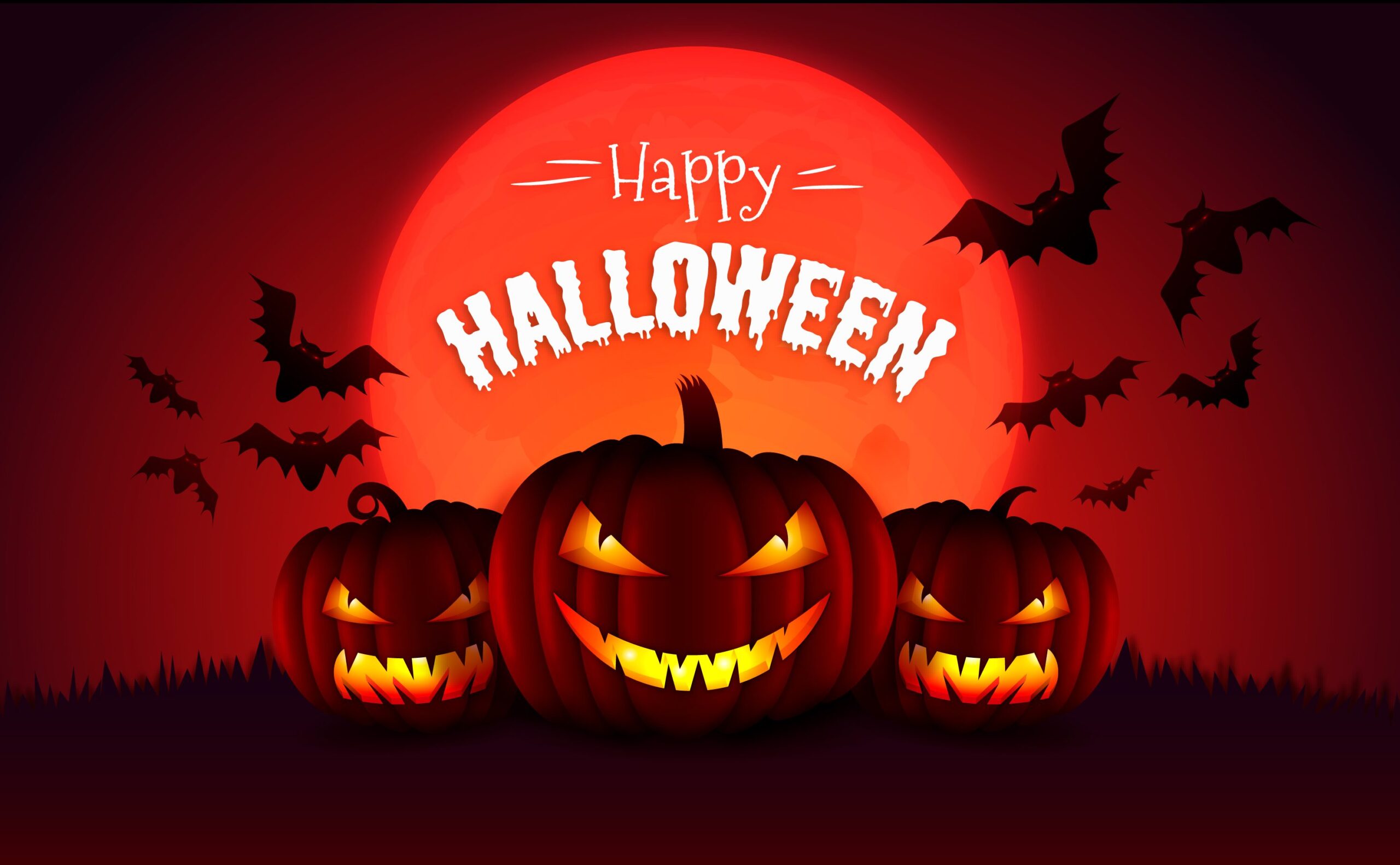
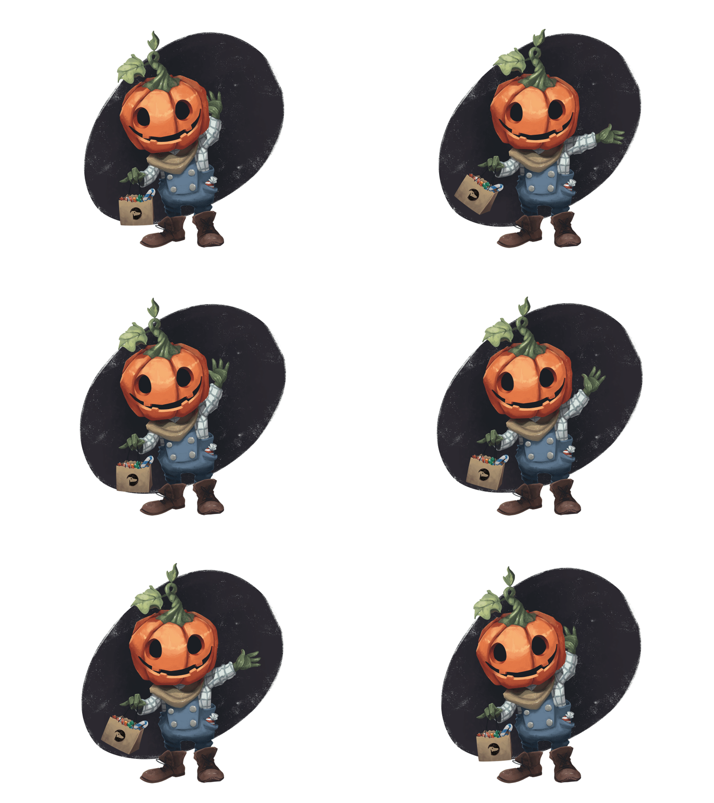
If you can go all out on your website homepage or for a printed project, do it. Use photos, videos, or illustrations to create a Halloween-themed hero header.
This is a pretty large and possibly elaborate use of space, so scale back on any other Halloween-themed ideas that you might have. However, remember one big trick in the design is enough; any type of special imagery or themed design element counts as that trick.
10. Skip the Gore in Graphic designing with Halloween
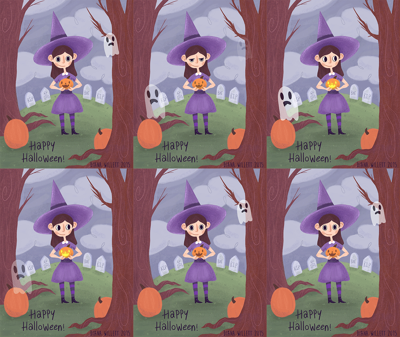
Finally, Halloween graphic design should be fun and a bit spooky. Moreover, try to avoid gory scenes.
Too much gore or horror-themed elements can turn off some users. (If you know your audience well, there might be a case for using this type of imagery, but those cases are pretty rare.)
When planning for Halloween elements, opt for more friendly characters, skip the horror movie soundtrack or blood and guts, and create something that is holiday appropriate for the entire audience.
11. Add Interactive Spooky Elements
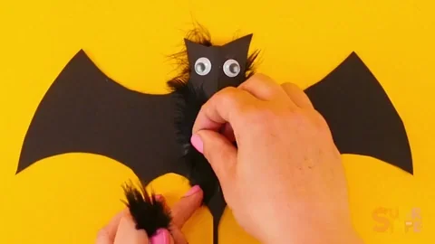
Using interactive elements can add more to effects. From clickable bats flying across the screen to a virtual haunted house tour, interactivity adds an engaging layer to your projects. Imagine users clicking on a glowing pumpkin that reveals a discount code or a hidden Halloween story. Interactive designs build excitement and keep users coming back for more treats.
12. Seasonal Packaging Design
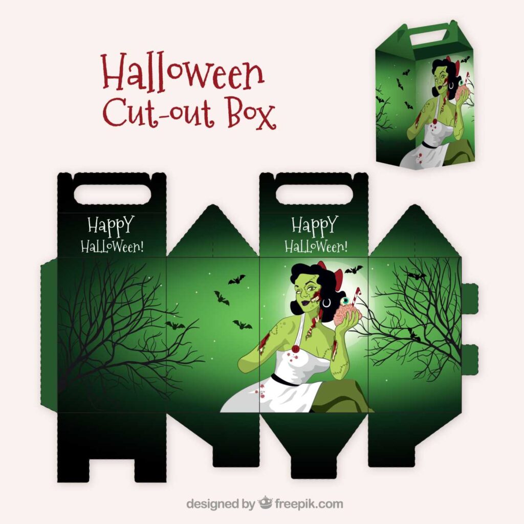
For brands offering physical products, Halloween is the perfect time to revamp packaging designs. Use spooky motifs, eerie typography (like the ones mentioned above), or even glow-in-the-dark elements to create collector-worthy packaging that aligns with the holiday. Seasonal packaging not only enhances visual appeal but also makes your product feel more festive and exclusive.
13. Transform Social Media Visuals
Social media is a prime space to embrace Halloween themes. Change profile pictures to feature pumpkins or spooky characters, design eerie Instagram story templates, or create GIFs with subtle animations of spiders, ghosts, or jack-o-lanterns. Seasonal updates make your brand relatable, fun, and shareable, encouraging higher engagement during the festive period.
Graphic designing social media posts specifically for Halloween & posting them to create support your markting efforts for halloween is highly recemmended.
14. Incorporate Halloween Storytelling
Add a narrative to your designs. For example, design a website slider that tells a spooky story as users scroll, or create an illustrated booklet about Halloween’s origins paired with your product. Storytelling in design adds depth and intrigue, leaving a lasting impression.
15. Introduce Augmented Reality (AR)
AR is an emerging trend that fits perfectly with Halloween-themed designs. Consider an AR feature where users can point their camera at your product and see it surrounded by Halloween-themed animations, such as flying witches or a haunted graveyard. This futuristic approach to seasonal design builds buzz and creates a memorable user experience. This can also work for websites where people can experience your product using AR.
16. Gamify the Experience
Create a Halloween-themed mini-game tied to your brand. Think “Find the Hidden Pumpkin” or “Escape the Haunted Maze” with rewards like discounts or freebies for winners. Gamification not only entertains but also encourages longer user interaction with your design. This helps in increasing your UX user experience & reduce your websites bounce rate. All of which is great for your SEO.
17. Blend Pop Culture with Halloween
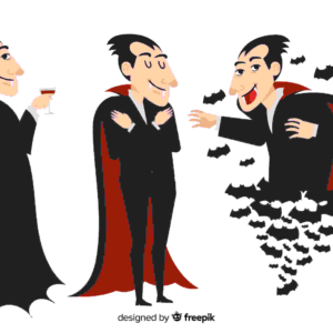
Incorporate iconic Halloween-themed pop culture references into your designs. From nostalgic movies like Hocus Pocus to legendary characters like Dracula or Frankenstein, blending recognizable elements into your projects can instantly connect with audiences.
18. Host a Halloween Design Contest
Encourage user participation by hosting a design contest. Invite your audience to create their own spooky designs, share them on social media, and tag your brand. Showcase the best entries on your platform for Halloween. This user-generated content boosts engagement while building a stronger community around your brand.
19. Integrate Spooky Email Campaigns
Don’t forget email! Add Halloween-themed banners, graphics, or even playful CTAs like “Trick or Treat Yourself to a Discount!” Send out special edition newsletters featuring Halloween-themed blog posts, offers, and updates. our designs have to be really great along with content that speaks to the readers.
20. Plan for Halloween Beyond the Holiday
Halloween design doesn’t have to end on October 31st. Use the momentum to transition into autumn-themed designs that carry the festive vibe through Thanksgiving. For instance, switch Halloween’s spooky elements for cozy fall motifs like warm beverages, falling leaves, or glowing candles.
Conclusion
Halloween graphic designing is all about creativity, fun, and a little spooky flair. Whether it’s subtle tweaks or bold transformations, the goal is to captivate and delight your audience. With Draftss, you gain unlimited access to premium-quality graphic design and coding services that can bring your Halloween projects to life.
From eerie animations to playful icons, Draftss can help you craft stunning and engaging designs tailored for the spooky season. With 73+ design and coding services, our team ensures your designs remain magical and memorable.
Let Draftss help you cast a spell of creativity this Halloween. Get started now and make your designs truly boo-tiful! 🎃
