As the year draws to a close, we’re looking forward to the new illustrations in packaging designs trends that 2021 has in store for us. At first glance, they look pretty different from each other. You’ve got simple geometry right alongside super-detailed ink drawings and fleshed-out characters. But there’s actually a cohesive theme here, and that’s a pivot away from packaging design. That immediately reads as “commercial” and toward packaging that feels like art.
Draftss has also helped its clients to develop substantial e-commerce platforms with unlimited graphics designs, illustrations, WordPress, HTML, and more for building your website, brand, etc. you can check on our website at draftss.
This year, we saw just how critical eCommerce is to our everyday lives. That’s not changing anytime soon. With e-commerce, you lose the experience of walking through a store and experiencing a curated brand ambiance. Something even the most immersive website can’t compensate for. So packaging designers and business owners are upping the ante to deliver a piece of branding right to your door.
The goal isn’t to replace the in-store experience. But to meet consumers where they are now and where they’ll be in the future. It’s all about creating a new, more immersive brand experience through the unique packaging trends of 2021.
Here are the biggest packaging design trends for 2021:
-
Tiny illustrated patterns that reveal what’s inside
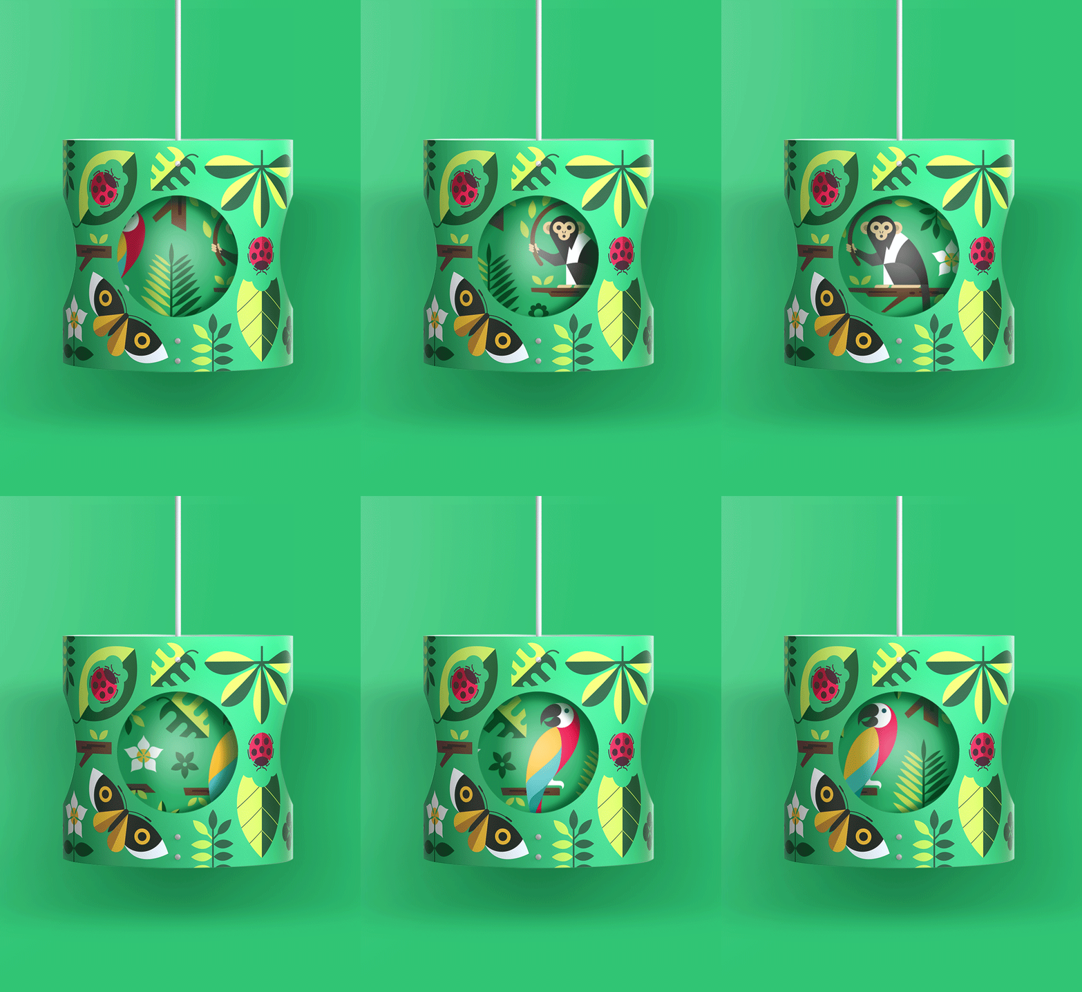
Patterns and illustrations can be so much more than just embellishment. They can reveal what a product is all about. In 2021, expect to see a lot of intricate patterns and tiny illustrations on the packaging. And expect it to be doing one specific job: giving you a hint about what’s inside.
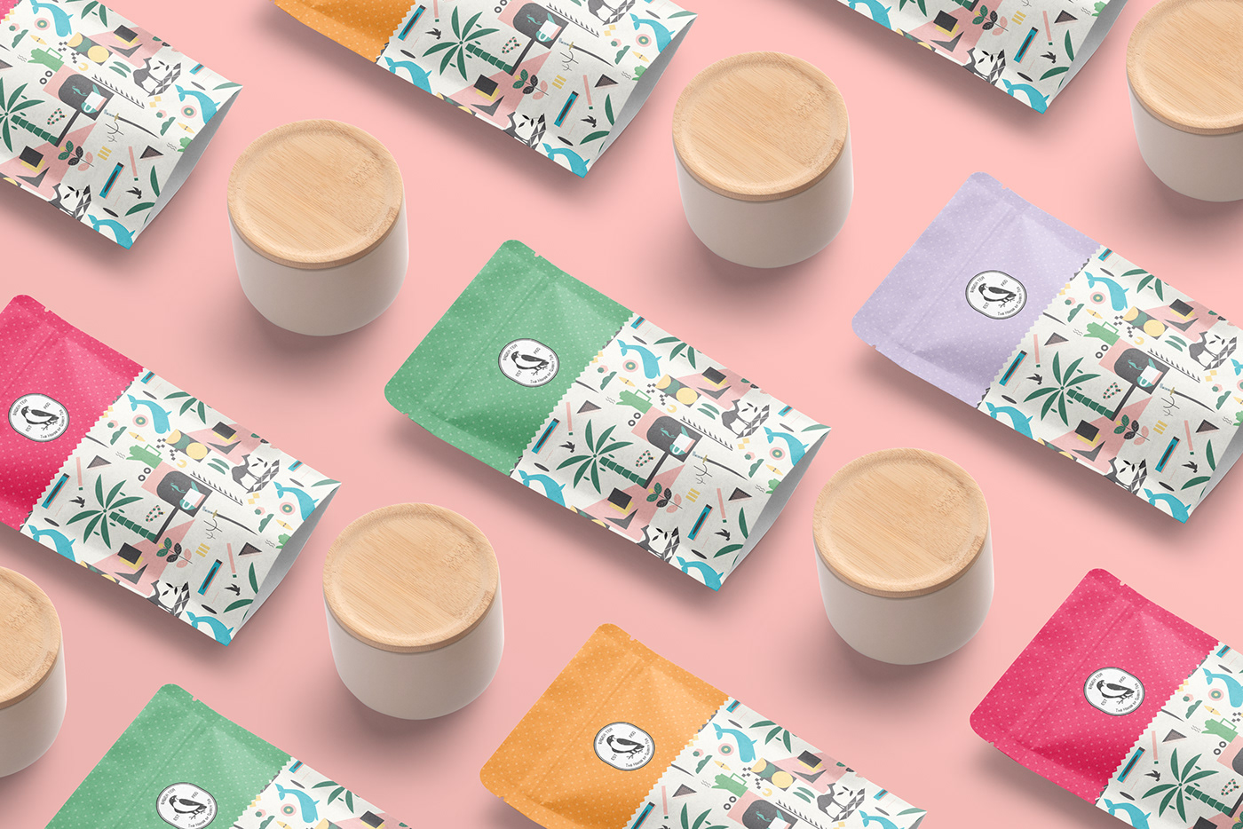
These illustrations are often simplified or abstract. Giving you more of an artistic rendering of what’s inside the package than a literal look at the product itself. For example, instead of a photo of actual tortilla chips, a chip brand might decorate its bags with a triangle pattern that’s reminiscent of tortilla chips.
In 2021, expect to see packaging design that uses small illustrations and patterns in whimsical ways just like that. Intricate patterns like Gstar’s design for Nourish or the cute, minimal popcorn pattern by Cime show. You everything you’re getting without overwhelming you with a complicated, overwhelming image.
-
The authentically vintage unboxing experience
Vintage-inspired packaging has been a trend for a while now, so what’s different about it this year? The fact that the whole unboxing experience looks so authentic, you’ll think you traveled through time.
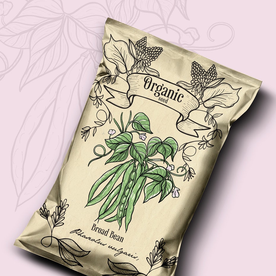
In 2021, you’re not going to see a bunch of generically vintage-inspired packaging. You’re going to see packaging that has an authentically old-school look and feel that is taking things further by creating a completely immersive experience. You’ll come across packaging designs that look almost indistinguishable from something your great-grandmother would have used, transporting you to a different moment in time.
That means going beyond logos and labels and encompassing the whole brand experience, making use of vintage-inspired textures, bottle shapes, materials, outer packaging, and imagery choices. It’s no longer enough to give a package a few fun retro details. Now the package itself feels like it was plucked from a shelf that was frozen in time.
-
Hyper-simplistic geometry
Another one of the packaging trends we’ll be seeing a lot of in 2021 is designs that make use of extremely simplistic, yet bold geometric concepts.
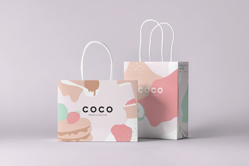
We’ll see bold geometry with neat lines, sharp angles, and expressive colors giving packaging designs an edge (literally). Much like the pattern trend, this trend gives consumers a sneak peek at what a product stands for. But unlike patterns and illustrations, which depict what’s inside the box, these designs are abstract to the extreme. It may seem simple at first, but it’s an incredibly impactful way for brands to make a statement and leave a lasting impression.
-
Packaging dressed in fine art
In 2021, expect to see lots of packaging designs where the packaging itself is a piece of art. This trend is mostly gaining momentum with high-end products, but you could see it on mid-range products too. Designers are drawing inspiration from paintings and paint textures, either playfully integrating them into their designs or making them the focal point. The goal here is to blur the line between packaging design and fine art, demonstrating that anything. Even a bottle of wine that will eventually end up in the recycling, is beautiful and unique.

While some designers like to draw inspiration from the old masters (like the cheese packaging above). This trend largely draws from abstract paintings and fluid painting techniques. The texture is key here, and packaging designers are emulating the kinds of textures and effects you’d see on a long-dried oil painting or a freshly-poured resin painting.
-
Technical and anatomical ink drawings
Seeing the theme yet? Overall, 2021’s upcoming packaging trends feel way more “art gallery” than “commercial graphic design.” Alongside bold geometry and tactile textures. You’re also going to see a lot of your favorite (and soon-to-be favorite) products packed up in designs. That feels like they were pulled right out of an anatomical illustration or engineering blueprint.
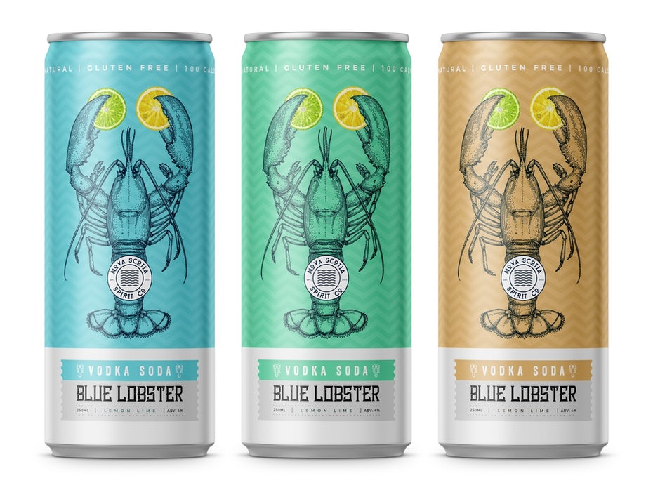
Perhaps it’s because 2020 forced us to slow down and reevaluate what’s really worth doing. Maybe it’s a response to the years that minimalism reigned supreme in packaging designs. In any case, prepare to see more designs with incredible detail that look and feel like they were sketched and inked by hand for an ancient (and sometimes surreal) science publication.
-
Organically shaped color blocking
Color blocking is nothing new. But color blocking in blobs and blips and spirals and dips?
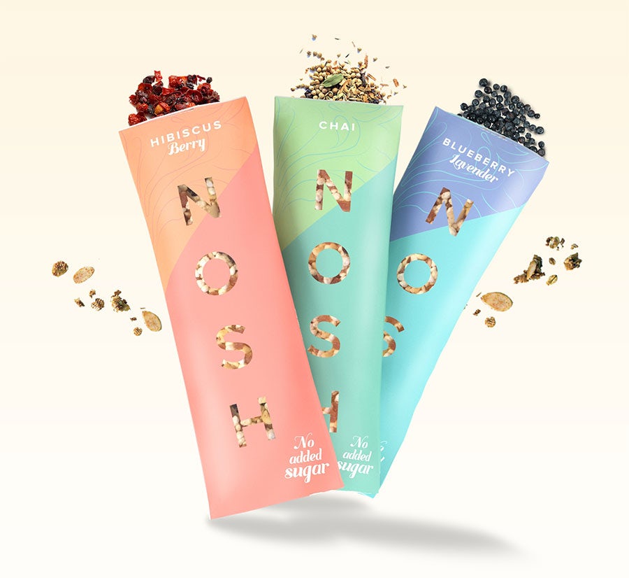
What separates 2021’s organic color blocking from previous color blocking trends are the textures. The unique color combinations, and how much the blocks vary in shape and weight. These aren’t clear, straight-edged boxes of color that make perfect grids and clean lines. They’re uneven, unbalanced, freckled, and dappled collages that feel inspired by an eclectic flower garden or a dalmatian’s coat. They feel real, they feel organic.
-
Product names front and center
Instead of making an illustration or logo the packaging’s focal point. Some designers are instead choosing to make the product’s name the star of their designs. These are designs that get extremely creative with lettering to allow the product’s name to take center stage. Each name on these packaging designs feels like an artwork in itself. Giving the whole design a distinctive personality.
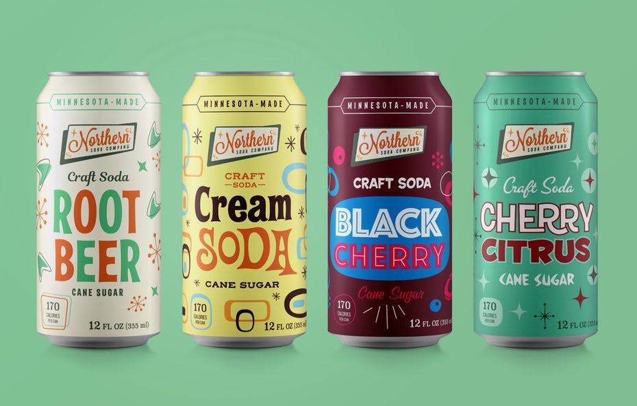
With this kind of packaging, there’s no doubt about what the product’s called or what kind of product it is. Making this the perfect packaging trend for product-focused businesses that aim to increase brand awareness. These designs rely on strong typography that can carry the brand’s whole aesthetic. Any additional design elements are just there to make the name shine.
Conclusion
If you’re planning on unleashing a new product on the market in 2021—or redesigning a current product’s look. Pack it up in one (or more!) of today’s hottest trends. Great packaging design gets buyers pumped about your product before they even open it. So don’t miss the opportunity to wow them from the second they see it.
You can try out draftss for an excellent experience and increase your product marketing. We provide premium quality services on unlimited graphic designs, WordPress, Webflow, HTML, Illustrations, Websites, Landing pages, Dashboards, App UI/UX, and many more. Here we provide our clients with 73+ types of design and code services.
