As an entrepreneur, you must be aware of the impact your web page makes on your potential clients. In this digitized world, it is not surprising to have people who would check your company out on search engines before opting to make any purchase.
Your landing page might be the first thing they see, and that constitutes the make or break point for your customers.
In case you are of the opinion that a decent landing page design is sufficient and you do not require a professional designer then you cannot be further from reality.
Web graphic design services require an in-depth understanding of what can work in a specific environment and what will not. There are variations in different landing page layouts that can either attract more viewers or drive away your potential customers.
So, what are the things that distinguish between a landing page designed by professionals and something designed by amateurs? Let us find out.
Structural layout
One of the first things to catch the attention of viewers would be the layout of your landing page. The page should be easy to navigate and information easy to find. Even a layman who has no understanding of graphic design would prefer an accessible layout better.
Apart from this, your structural layout should speak volumes about the type of product or service you are providing to your customers. In case your website is meant to provide medical services, make sure you keep a minimalist outlook.
The minimalist outlook is applicable for those products and services which require professionalism and to create a sense of urgency and importance. Products such as wheelchairs or oxygen tanks do not need a cluttered website. This enables the viewers to search for their requirements in a smoother and faster manner.
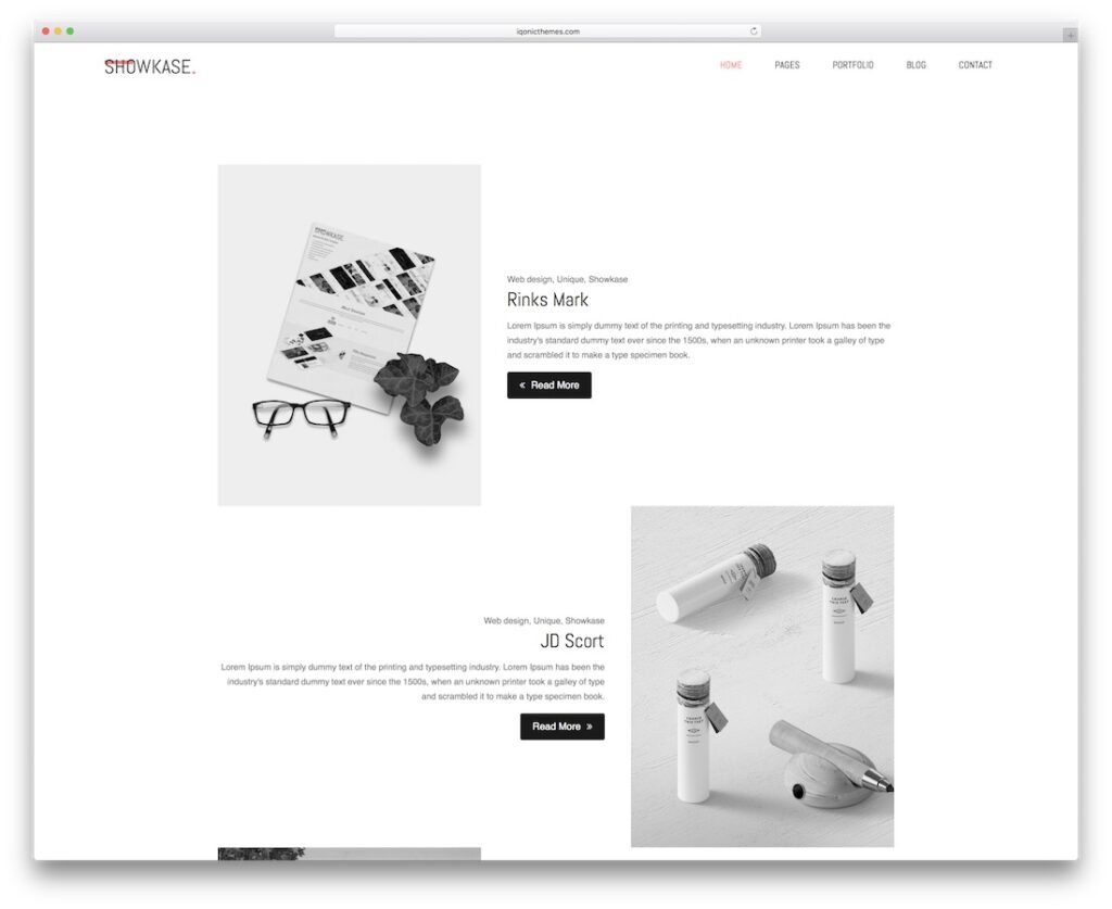
On the other hand, if you are selling products like home decor or paintings, it is advisable to engage in a more aesthetic outlook for your website. After all, these products are targeted towards a special group of the audience so you can afford to make them classier and tasteful.
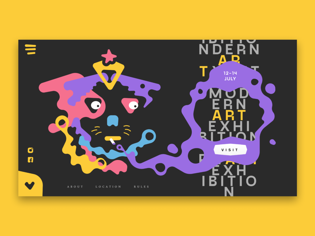
There are certain landing pages that require attention from various age groups and targeted towards a wider set of audience. Vacation spots, for example. Hotel advertisements, tour packages, or car rental services are some services that use creative and bright landing pages.
Color contrast
Do you have a company logo? It is recommendable to use the same colors used in logos to be incorporated into your landing page. This enables branding your business.
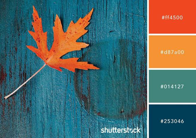
However, in case you have not yet decided on a company logo yet, try to use contrasting colors for your landing page. It is preferable to have a maximum of two to three colors. However, your color combination should look appropriate and modest to the eyes.
Extremely bright colors, especially at the corners of your page can misdirect the viewer’s attention towards that particular area and not make a good impression.
Relative information with necessary links
Your page is most likely to be viewed by those who need your products and services, or those who are looking up information on a similar substance. Make sure your landing page can satisfy both of these purposes.
In case your viewer is a potential customer, you need to have the landing page modified such that payment options or procedures are subtly highlighted or made easier to spot. The items you are selling should be clearly visible and there should be no space for doubt on the product category you are selling.
The landing page should also make use of related content. Provide links to your blogs or articles on the landing page itself with the topic name. It will promote engagement within your website and viewers.
Creating a landing page may sound easy, but it requires an understanding of different designing concepts to have the best web landing page. For some unlimited graphic design services, you can consult Draftss. They are a team of creative designers and artists who can give you the best consultancy and services regarding your web landing page.


