



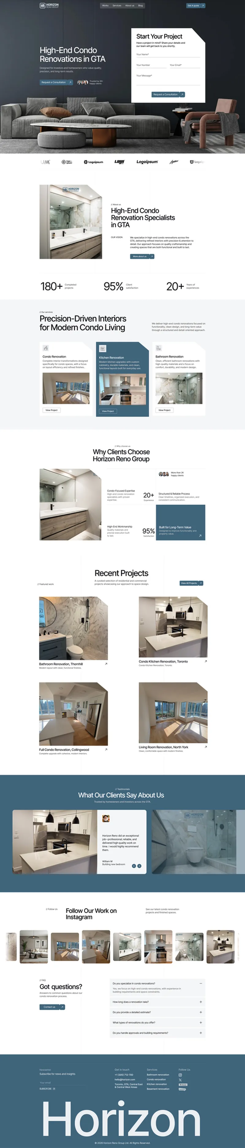
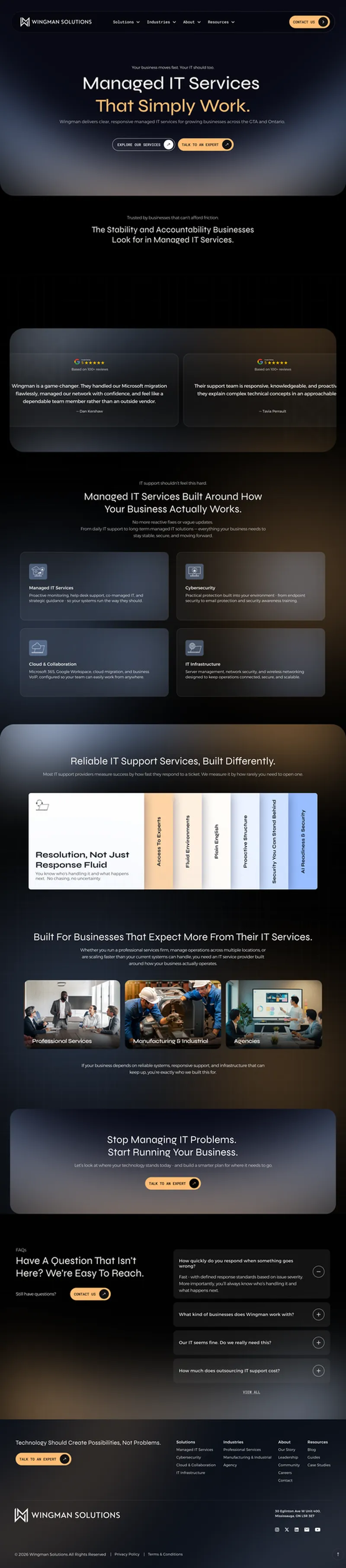
April kept our team busier than usual, and honestly, we’re not complaining. This month’s roundup is packed with projects that pushed us to think differently about how a landing page should feel, not just look. We’ve compiled some of our latest web UI designs, highlighting responsive layouts, engaging visuals, and user-focused experiences crafted by the Draftss team.
Custom Web UI & Landing Page Designs
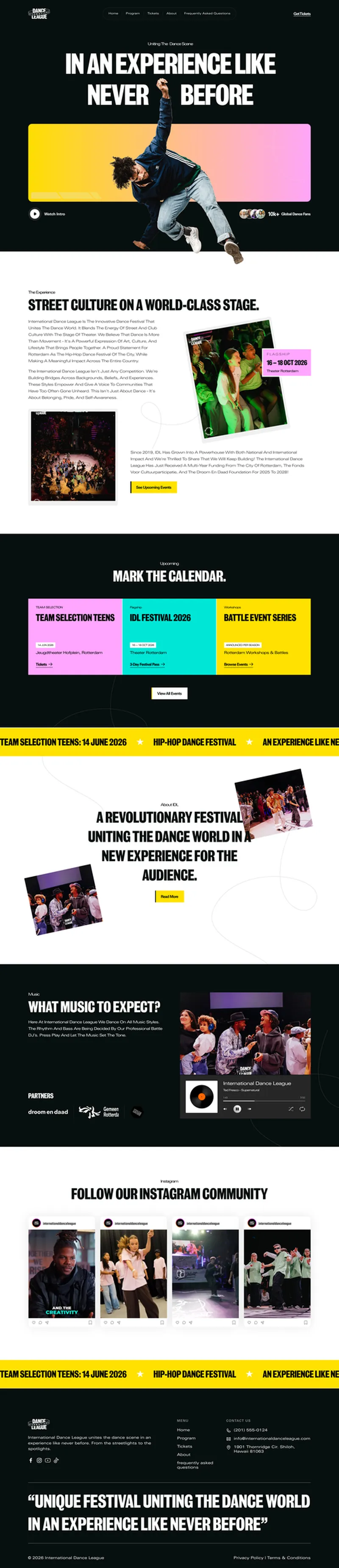
Website work this month leaned heavily into conversion-first layouts, with several projects built for brands actively running acquisition campaigns. Structure was prioritized throughout: clear hero sections, benefit-led copy blocks, testimonial placement, and FAQ sections designed to reduce buyer hesitation before a visitor reaches the contact form.
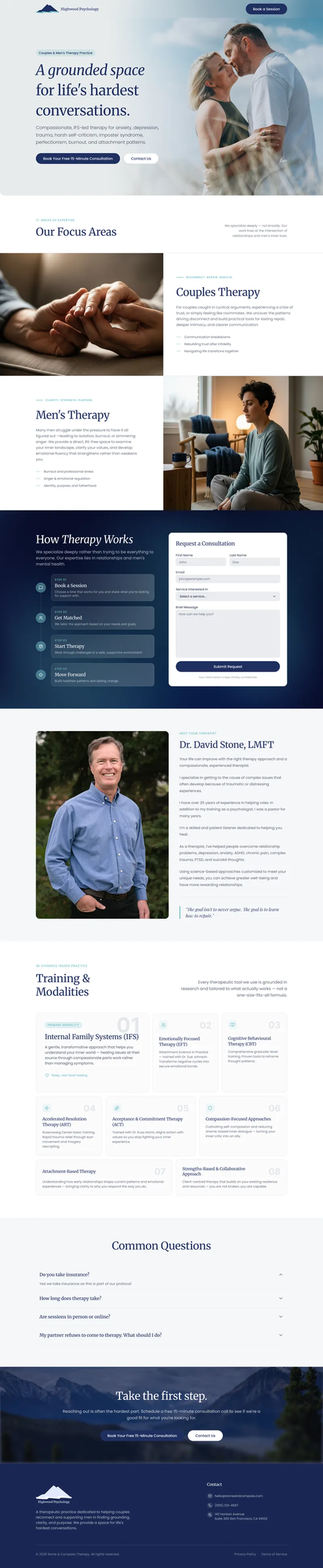
International and niche-market projects also featured this month, including a fully Italian-language landing page for a logistics digitalization consultancy, showing the team’s ability to adapt layout and copy hierarchy for non-English audiences without losing conversion intent. Therapy, coaching, and wellness-adjacent sites took a calmer visual approach, using softer palettes.
Across all projects, the emphasis stayed on structure that supports the client’s actual sales funnel, not just visual polish. Every layout was built to be handed straight to development or plugged directly into a page builder.







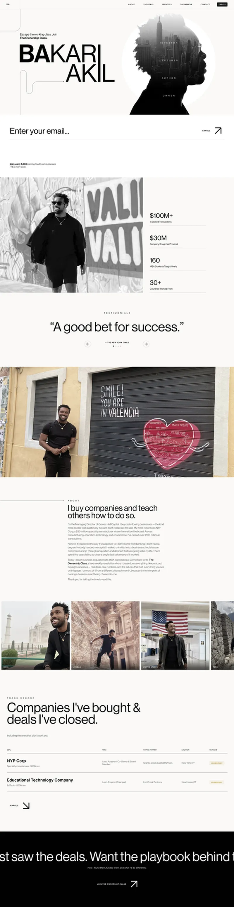
Landing page for The Ownership Class, a newsletter and personal brand site for a business acquisitions expert



Need consistent creative output like this every month?
If you are evaluating how Draftss supports ongoing design needs across websites, apps, branding, and social media, this month’s work reflects the kind of dependable execution delivered quietly in the background. Brands that value speed, consistency, and quality often start by reviewing our portfolio or exploring plans that fit their workflow.
Drop your thoughts in the comments below.
Your email address will not be published. Required fields are marked *