Client: My Caroline Baby
Description: My Carolina Baby is a medical diagnostic center and provides state-of-the-art ultrasound imaging.
Industry: Medical
Project: Web UI Design & Development
Problem
Branding a business is always a job that requires a lot of creativity, effort, and resources. However, rebranding becomes even more of a difficult job. One just doesn’t need to add up to the branding but also needs to remove some. Every bit of creativity has to be replaced diligently. With every step you take to rebrand, you are editing your earlier effort of branding and thus the new efforts have to be to make it only better.
That’s exactly what My Carolina Baby also wanted to do. They wanted a transformation of their outlook and get themselves a rebranding over the online platform. From having a great user-friendly design to one that reflects the perfect outlook of the business they are into, the users should feel the presence of the valuable services with designs and colors.
Draftss has done it for a number of its clients and yet again our designers had to deliver results that could actually make a lasting impression for the website of the client. Thus, we signed up our best web UI/UX design team for the project. The team started to think on the lines of how could the design convey the services.
That’s where we picked it up from!
The Draftss Solution
Understanding the Problem
The brief of the client talked about his preferences on the new design and how they wished the website design and structure to be similar to the existing one. The client wanted to use the theme colors to keep the branding of the business intact. With the values of warmth, caring, and friendliness, the website had to exhibit the qualities of the services by the brand to let the users feel the vibes of the brand.
Draftss follows a very open nature of communication. That is, we have a number of channels for the clients to communicate with us to help maintain the comfort and clarity of the particulars to convey. We kept in touch with the client over our dedicated dashboard to manage the projects and keep everything updated and on track. We also used to regularly share the progress as well as the outlines of the ideation process and take suggestions to keep the progress aligned with the expectations.
Brainstorming Solutions & Crafting Results
Our web UI/UX designers started jotting down the points to ideate upon and laid out a plan. We planned to complete the design in just a few days and thereby conveyed an expected date to the client to keep him updated on when can it expect the delivery. Also, like every project, we offered the client two different concepts on the day of delivery. The two alternate options help the client get a wider perspective on how can he look forward to implementing the design and which one can be more suitable for catering to the needs.
That’s what we do at Draftss – Propose a number of great concepts for a single design to choose from!
The client belongs to the medical domain and thus the design had to be very sober and reflect sophistication. The text had to be perfectly in alignment with the images to exhibit clean designs and the healthy nature of the services.
We shared the very first design of the landing page of the design with the client and he just had to say, “Loved it! Great Work”.
We kept delivering the other designs as well with the wireframes as requested by the client. The tasks thus started finishing off. We went on building the website on oxygen as preferred by the client.
With constant feedback, reviews, and fixes, we started developing the design into a full-fledged working web platform.
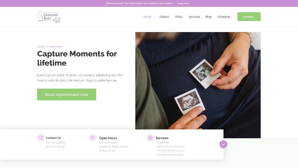
The landing page of the web design for the client was designed upholding the preferences of the colors purple and green. Not keeping the page too bright and a little sober in the outlook, the colors were reduced to fade. The hero section of the design has a corner for the picture in its background to showcase and convey the warmth of holding up a service with the client. The hero section itself holds up an option to book the services or an appointment with the client directly.
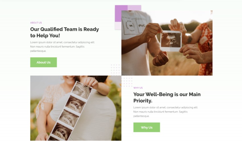
With a blend of white and very light shades of green, the background is quite minimalistic and soothing. The section below appears to be very crisp and displays the about us section. Another option conveys why should a user choose a client for the services. With very finely aligned vectors and shapes, the section gives a clean and yet classic look.
It is im[ortant to convey what the client usually does. How good are the services, the blog section conveys a very elaborative description of the know-how. Blogs also help to convey to the users how well does a business holds the knowledge of the domain it is into and how well can the expertise is.
For the website to be easy to navigate and function, a contact option is provided on the landing page. It helps the users to reach out to the client with ease and also stays handy. The background reflects bold purple and the form is blunt white giving a light and focusing effect.
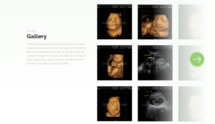
The gallery section on the website comprises a number of images of the ultrasound delivered by My Carolina Baby. It perfectly showcases the quality of the pictures. Also, the short description makes a blend well of pictures and images. The background of the section fades on the right-hand side with a light shade.
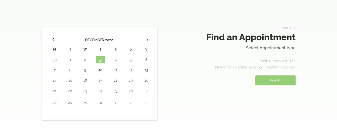
Another section of the website gives users a facility to find and book an appointment for themselves. This further helps the users to find an appointment in a very easy way. It also helps the client to manage everything easily and efficiently without much effort. The section also resembles the color theme. Rather than keeping the background pure white, a shade has been well utilized.
Conclusion
Thus, making the web design for My Carolina Baby, was a very rich experience for the client. The client also rated us with highly positive reviews on Trustpilot. The client was happy to receive the website developed with new designs. Each of our efforts in the process while working with a client is thus focused on making the experience better and easy for the client with minimal effort maximum output. This helps us in delivering not just good designs but great designs.
The web design is live and looks quite sober and exactly how it was meant to be. With easy navigations, user-friendly design, clean and quality combination of colors, text, and pictures, My Carolina Baby is serving its clients well.
This is how it looks:
Thanks for taking the time to go through our project case study. If you too want to get designs done you can ahead and SIGNUP for 7 DAY FREE TRIAL + Our co-founder loves talking and consulting on projects for free, you can schedule a free call with him regarding your project here calendly.com/junaidansari
