Psychological Elements Of Effective Web Design
The Human Element
Users are merely like to be engaging and connecting with the application/web design if the designer empathizes with the user. The human factor is that becoming more and more important in the designing world. Often the designer keeps guessing about the users and hence produces something which doesn’t consider the user’s needs. One trick to ensure that we are designing for humans is to create a user persona. The designer can use fictional identities composed from researching about the users. We are required to create things people want.
The Comfort Of Usage
Here, the ‘feel’ needs to be taken into consideration. For any design to feel right, we have to ensure that it is comfortable to use. The design should be such that it is equally convenient for the user to operate the web page or application across all devices be it a PC, a laptop, or a mobile phone.

Things To Consider
- Typography
- Contrast
- Colors
- Thumb patterns
- Real-life like motions
People are more likely to engage and continue using the product created by the web designer when it is comfortable to use and navigate.
Emotional Connect
The majority of designers get caught up in trying to strike multiple emotional chords with one product. A smarter thing is to do is, to focus on one emotional aspect and develop the design around it exceptionally well.
What Does The Web Design Need To Achieve?
- Should create a relationship between users and the product.
- Should create relationships between the users.
One of the most popular ways of evoking emotions in the user is by using the color theory. Colors have such a massive effect on our moods.
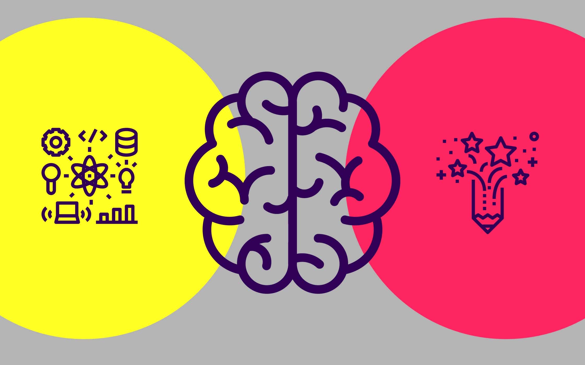
Color psychology and its emotional effects
“Color psychology is the study of hues as a determinant of human behavior.”
- Red: encourages appetite(hence often used in websites related to fast food), high in energy, and creates a sense of urgency, raises blood pressure, and increase heart rate.
- Blue: provides a sense of security and promotes trust in the brand, curbs appetite and stimulates productivity, calms the mind, and provides a sense of tranquility and space, associated with maturity.
- Green: stimulates harmony in the brain and encourages the balance between body and emotions leading to decisiveness.
- Black: It associated with authority, power, stability, and strength, can often overwhelm people if used too frequently.
- White: Associates with feelings of purity, cleanliness, and safety. Can spark the sense of creativity and since it acts as a clean slate.
Color, the one aspect that goes into nurturing an emotional bond. Copywriting and visuals also play an important role. Emotional connections are established in a variety of creative ways. Brand loyalty, one such example that stems from an emotional connection. The type of emotion determined by the tone, message, and design choices that the designer makes.
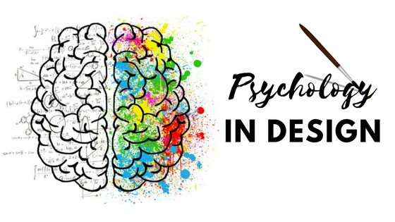
Web Design Have Mental Triggers
Few concepts can be correlated to how design has a strong connection with the user’s psychology. Let’s talk about them briefly
- Do something for other people i.e the users and their communities and they will return the favor.
- People look at the behavior of others to figure out how to act.
- Inclusion of a social stream in our design to make users feel like part of a bigger group or community.
Users desire what they can’t have or what is difficult to get. This scarcity principle, the reason behind limited-time deals works so effectively. Users usually tend to confused when it comes to making choices. Most people usually drawn to the option that falls somewhat in the center. According to Hick’s Law, more choices leads to decision paralysis or what is popularly known as the paradox of choices, so the designer must be careful.
People are drawn to what is relevant to them at the moment. For example- beacons, notifications, or check-in tools are the in trends at the moment. People remember the elements which stand out. The use of contrast creates focus.
Over To You
The website and user experience designs need to feel real. Every aspect, from aesthetics to interactions to motion (both perceived and real) to emotional connection needs to have a human touch to it. The humanistic design creates engaging experiences that the users connect with both physically and emotionally. Bottom line is that the designer must always aim to strike the balance between the simplicity of usability and aesthetics of the product to keep the customers engaged and satisfied.
