With computer screens and electronic tablets becoming the rage of the new era, technology has evolved and advanced at an unfathomable rate. Companies and businesses have started relying on custom illustration design and graphic design services to make their pages stand out. As the saying goes, ‘If you snooze, you lose’; you cannot afford a moment in a frivolous arrangement of your content. A graphic designer is the best person to help you arrange your page clearly, and they follow a visual hierarchy to make your pages eye-catching and beautiful.
Visual Hierarchy…What Is It?
According to Adobe XD, graphic and web page designers use visual hierarchy to rank the page content in the order they want visitors to view them. Using different styles of contrast, scale, and balance, the elements of a page can be arranged in their rightful place. The most important elements tend to stand out and make an impression on the visitors.
Companies and businesses often outsource the design of their page to external graphic design services or subscribe to unlimited graphic design packages to achieve their goal of an eye-catching page.
How Do You Read a Page?
Every web page has to make the most important elements stand out so that the human eye perceives them as important at first glance. Most pages are designed to be read from top to bottom and from left to right. There may however be exceptions, but it is a safe bet that you do not generally start from the bottom.
While considering the visual hierarchy of a page, one of the most important things to consider is how the human eye will perceive the page data. There are two main ways to perceive information – the F Patterns and the Z Patterns.

F Pattern of designing is very common for dense and text-heavy designs. Viewing starts from top-left to top-right. The viewer’s eye scans for short headlines and subheads along the left-hand side of the page.
The Z Pattern of designing is used for pages with less dense pages. Viewers read the page following a ‘Z’ – from the top left to top right, then diagonally across to the bottom left to bottom right. Canva feels these design techniques are most widely used, and implementing them on your page would make it easy for readers.
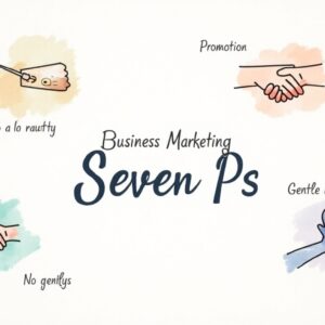
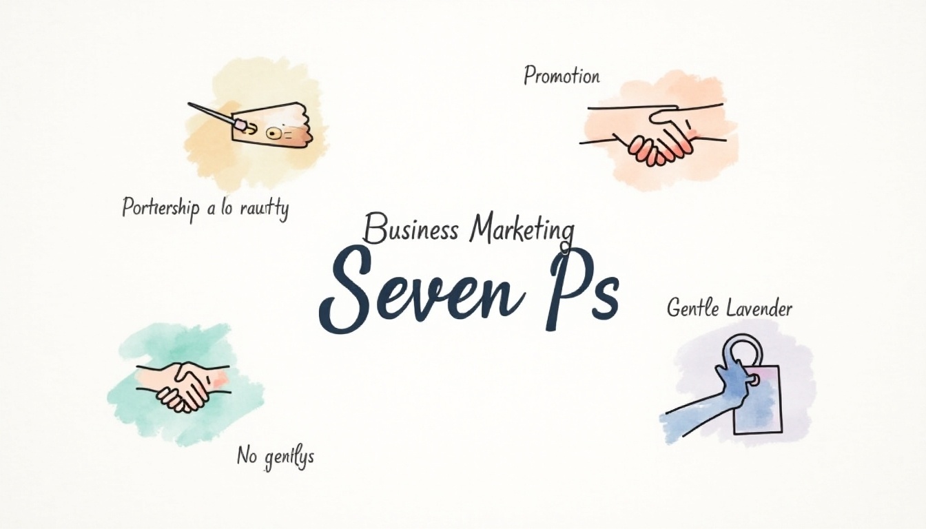
Visual Hierarchy plays a unique role in information architecture to increase the ease of navigation.
Implementing Visual Hierarchy To Your Page
After you hire professional designers or subscribe to graphic design packages, you would surely notice a sudden increase in the number of visitors to your web page. Visual hierarchy and the page design would be a key contributor to the fact that the page became easy to read and appealing to the eye.
Most businesses and companies prefer to pay for unlimited graphic design packages as it gives them the freedom to access unlimited designs and work does not halt because of shortage. Let us look into some of the ideas that you can implement to make your page visually attractive by implementing visual hierarchy.
Sizing and Scaling the fonts
Proper font sizing can turn out to be crucial for your page. Larger font size attracts viewers – headings are made larger than normal text to give it a sense of importance. The page has to be designed in such a way that not too many elements are given a large size, as it would decrease the importance of the other elements on the page.
Coloring and Contrasting Page Elements
Coloring can add or take away weight from the design elements. While brighter colors bring forth important ideas, dull and non-saturated colors tend to fade into the background.

Similarly, colors with high contrast appear heavier and closer to the viewer than colors with lighter contrast. An element with high color contrast is going to be of greater importance for the viewer.
A Play on Perspective
Most web pages and applications have a two-dimensional interface, that may appear comparatively drab and flat. By applying the sense of perspective to your design, you would be able to bring forth the important ideas and make the other factors fade behind them.
Consult your graphic designer to make the most out of the designing ideas that you have. Professionals can always help you out and make the most effective designs with your ideas.

Spacing directs the Viewer’s Eyes
While designing, spacing ideas and elements properly is very important. The space between elements known as ‘Whitespace’ is used to group similar elements or separate dissimilar ones.
Content Alignment
Aligning elements along the same side of the page gives the feel of their association. This makes it easier for readers to scan through similar content and read on. For example, if in a table, you arrange similar content along the same line, there is no need for borders. Our eyes associate the column data because of the data alignment.
Proximity of Elements
Contents based on similar ideas or topics can be placed closer to each other. Readers would get an incentive to read on or engage further if they find that the content is related.
Does Motion Attract or Annoy?
About a decade and a half ago, when the internet was particularly new, most pages had blinking and bouncing popups. Though they were meant to get the attention of the users, it turned out to be more of an annoyance. In recent times, motion and animation have started being used differently, and that is indeed less annoying.
Gone are the days, where popups in motion annoy. Many websites tend to use pleasing and soothing motion to show turning book pages or unwrapping an item while you eventually scroll through it.
Final Words
Maintaining a properly appealing page design is no longer a luxury for business owners and companies. Though back-end pages can be simplistic and work-oriented, customers and viewers should not go through them. That would be a blow to your reputation, goodwill, and standards.
With several illustration designs and proper visual hierarchies on your page, you would surely stand to compete among your rivals. You must compete to win, and not only to stand on an equal footing. It is the era where everyone focuses on design-led content marketing, and you must make sure not to fall behind. Based on the content and the type of services you offer, you should decide how to design your page. Who better than designers and developers to help you in this regard? Graphics and illustrations have taken over the market as they appeal to the masses, and you should not fall behind in making use of them.