A beginner’s guide to white space

“Ohh God, what to do with this white space”
” Wow, the white space is so beautifully used “
These are the two moods that one can experience while seeing a space that is empty around any design. While some people feel it’s useless, others feel the opposite. And what is that space called? Well, it’s called the white space which some people love referring to as “Negative space”.
Now suddenly a question pops up in our minds as to what is negative about it? Well, some people in the business world believe that this empty space around margins or between columns largely goes waste. Since putting up designed advertisements both physically and digitally is a task quite expensive, carefully using space that is available, is crucial. Moreover, it takes a lot of time to design some banners on the web. Thus, it’s imperative to choose wisely as to what use can white space be employed for. There are basically two types of white spaces keeping in mind the area they cover- micro and macro. So if you are in this same dilemma as to how to use your white space creatively, then do read these below ideas! You are sure to grab some good ones!

How to use white space creatively?
- Choosing a good designer

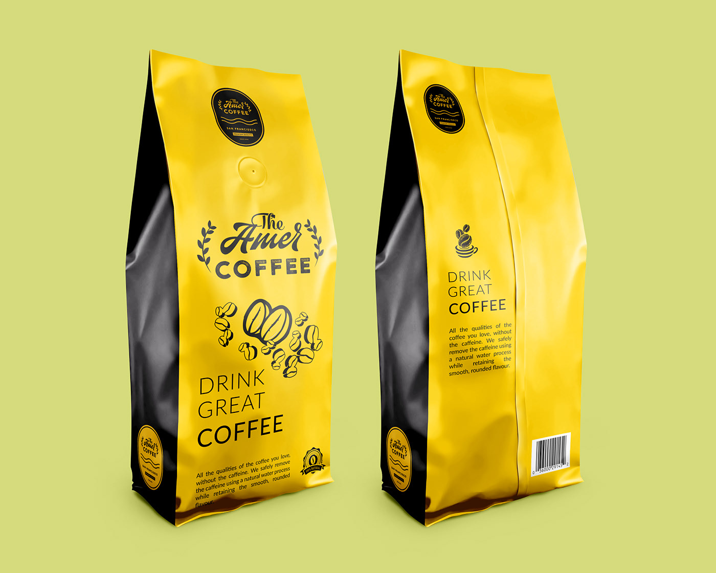
Now starting with this tip becomes very important. More often people who are in premium businesses don’t really do designing themselves. There are graphic designing companies that provide such services. They just hire a designer directly and do the needful. Now choosing a good designer becomes very important. Most often the designer has in his/ her hand the power to make the most appropriate and creative use of white space. For example, Draftss provides really good designing services which can be a boon to you!
The same applies to other designers in the market as well.
- Using a solid colour background

Now there is a common misunderstanding among people that white space has to be “white”. But that’s completely wrong. In fact, white space is a misnomer. You can use any background or colour you wish to use for it. For example, there’s a popular India’s largest student-led newspaper – DU Beat. And the white space used by it includes dark violet and purple colours which look phenomenal! That’s why they have a unique reputation owing to good white space usage in their graphics.
You can surely adopt their formula by using some visible and bright colours that make your text content look raised among the white space.
- Space in Text is important

This tip needs to be reiterated again and again. Now obviously your content is something that’s crucial to any of your design. For say the Astronauts Wanted creates shows, media etc. It has a typical background in white space. And it very beautifully puts its brand name in capitals with enough space. It’s a typical example of how white space can be employed creatively. They don’t crowd it with tightly written material. You also need to make sure that your text in terms of brand name or tagline has appropriate spacing. Furthermore, it makes it easy for the reader to read!
- Lay emphasis on service/ product

Who doesn’t adore Apple’s advertisement? Apple is one of the umpteen brands that know how to do everything best in every field. Be it designing, marketing, promotion or anything, they are the pioneers in setting trends. In their ad, you must have seen how their iPhone lies in the centre with a lot of white space surrounding it. This is a conventional way to highlight your product in centre amidst the white space. So what you can do is: firstly, choose a colour for white space. And then place the centre of attraction ( product/ brand/ service provided) in the middle.
- Keep the layout minimal

Now there are certain companies that provide unlimited graphic designing services. Some of them largely clutter the whole white space with one or the other thing. But that’s a faulty thing to do! By putting literally everything on Earth in your design you tend to make viewers confused. This induces them to not see your design. Yet if you have seen Oreo’s biscuit campaign, you will get shocked! They have used milk in the background as white space. And have put an Oreo biscuit in it. Such a small thing has brought huge success to them. Thus, this technique can do wonders!
Altogether you have realized how white space isn’t really negative altogether. If used properly, space can certainly reap some good benefits. You will then realize the importance of White Space! Sometimes we see an empty visual and realize what’s this for? Well, that’s in itself a good marketing usage of white space. Extraordinary visuals do attract individuals. So you need to creatively mix up things and make an excellent visual.
That’s how your white space will turn out being a magic space!!