After Designing & Managing my team at Draftss for many websites, I found some common mistakes in the website design for small businesses tend to make in designing their websites.
Here, in this article, you will read about some common mistakes your website should avoid. Avoiding these can improve the SEO ranking, makes your website user-friendly & high converting website.
If you don’t want your business to face the wrath of being a bad website then get on board.
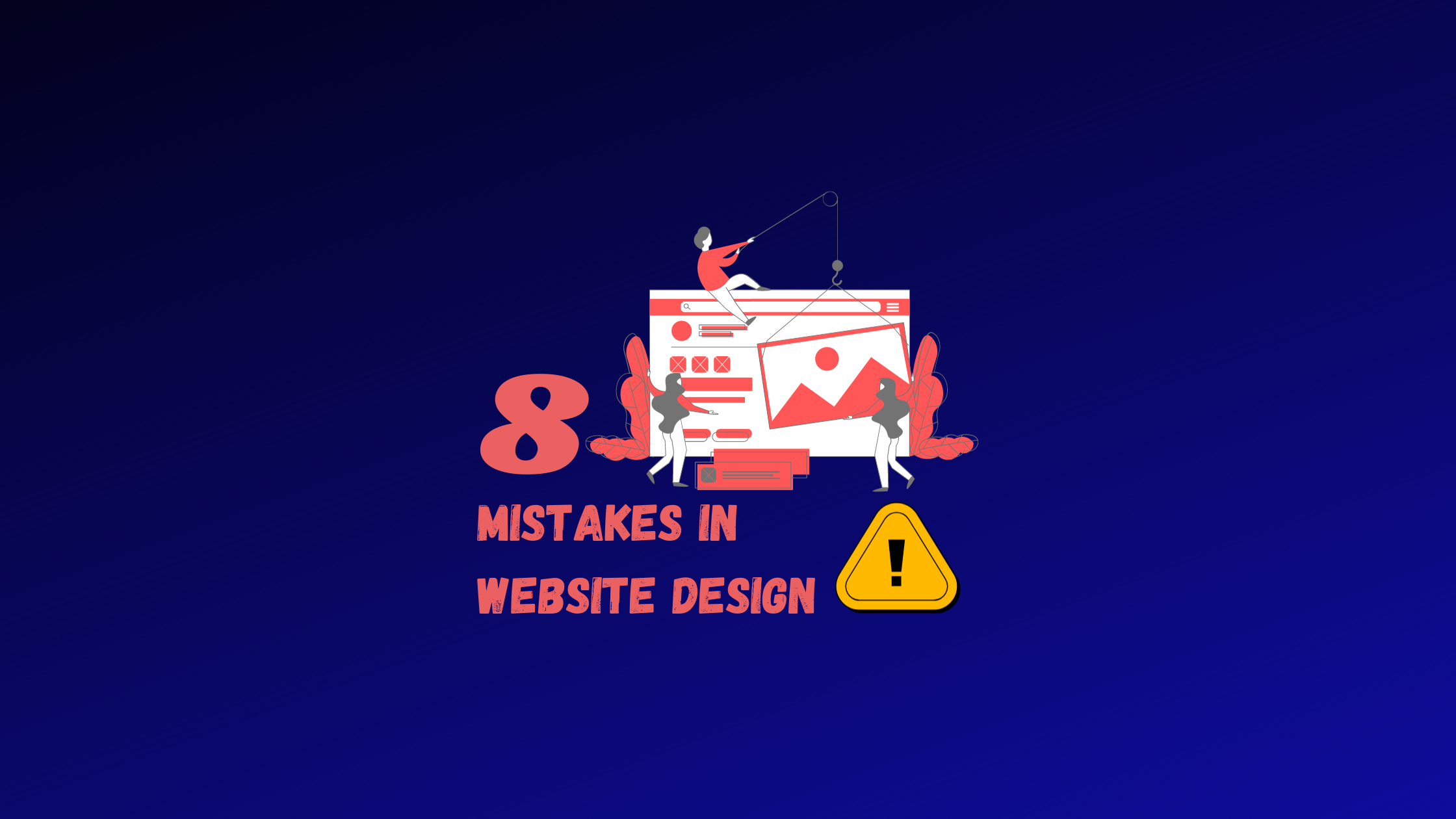
Mistakes in Website Design for Small Businesses
1. Not allowing enough whitespace.
Whitespace is a breathing space provided to users to make your content more readable. Also, help you to highlight key elements in your website & enables the visitor to connect with the content.
The founders of startups & small businesses find whitespace as the waste in the website as they want to make the most of each section displayed on the screen.
But remember, lesser whitespace makes your website less understandable to your audience & causes a high bounce rate.
So remember to have whitespaces on the website as it also conveys the message to the visitor. (like confidence, quality & management)
More on managing the space on the website will come in the following points just stay on your saddle.
2. Not having a contrast between your text and background color.
Choosing the colors for your website is crucial for website design for small businesses. There are times when we get projects & the entrepreneurs are confused about the colors or come up with the wrong color scheme for the website.
You can refer to our color palette themes to get ideas to create a specific brand image through your website.
Apart from that, focus on the contrast between the font & background with a ‘special’ emphasis on the keywords.
3. Using all caps
Fonts are also a point of discussion that small business website crash out on. Starting with the font size, Balancing between going too BIG or small is a task. The most preferred font size is 18 px to be readable by the users. You can use a font size of 20 or 22 px for the copy.
Next would be the amount of text on your website. The visitor’s reading pattern would be different for a website than for a book.
The visitors usually scan through the website first rather than directly reading your content. So don’t cross 30 words limit for describing any part of the website as the visitor may not stress to read more.
Next on the list is Font Style & Case. Most website design articles advise creativity to capture attention, but effective website design for small business focuses on clarity, usability, and conversion rather than flashy visuals alone. But in trying to show, creativity website’s experience gets irritable as they find content challenging to read.
Check out the portfolios of how being creative & simple can be on the same side of the coin.
4. Too many website elements
Continuing whitespaces, website elements consist of information, navigation & action. There has been a detailed discussion on the first part, now get to the other two.
In Navigation, the visitors look at the menu bar for the webpage to get more information related to your business. But hiding navigation can make the users, unlike your website.
Apart from that, in the work of making comprehensive navigation, designers tend to overcomplicate them. Thus, bringing more bounce rates to your website.
CTA is the way your website creates value for visitors. A bad or wrong CTA can all together spoil the whole work of the website. Remember your CTA to be linking to the correct landing page.
Other than that, you must follow the visitor through the marketing sales funnel. How? That would be the question, right?
Suppose a visitor enters by reading your blogs, then next, you navigate them to the homepage as they will be the top of the funnel visitors. But if the visitor is on your portfolio page, you must provide a CTA to the pricing page & not the CTA to the blog page.
5. Choosing generic stock images seen on other websites in your industry, Having blurry images
Images & videos are more visible than the content. Irrelevant, Generic or Blurry elements are a letdown for the visitors. Such practices show the business can also lack quality in the product too. Also, that’s a sign of an untrustworthy or spammy website.
To avoid such mistakes, use .png or .svg images as they have fewer chances to get blurry on the website.
6. Untrustworthy website elements
This issue is what website design for small businesses suffers a lot, as with time there is an increased fear of cybercrime. To create a trustworthy website, avoid the following red flags:
- Missing or incomplete contact information: make sure your site has a comprehensive contact information page that includes a physical address and a phone number
- Excessive graphics and pop-ups: there’s nothing wrong with pop-ups, but use them sparingly. When users are bombarded with tons of pop-ups and graphics as soon as they land on a site, it can come off as spammy and arouse suspicion.
- No SSL certificate: SSL certificates safeguard data and communications, verify site ownership, help prevent cybercrime, and play a critical role in making customers feel safe while interacting with your site
- No About Us page: customers want to know the story behind your brand and get a glimpse of the real people working behind the scenes. If you don’t have an About Us page, users may question your transparency.
- Performance issues: for your site to be trustworthy, it has to be consistent and work well. Problems like slow loading times, glitches and bugs, and broken elements all make your brand seem less credible.
Drop your thoughts in the comments below.
Your email address will not be published. Required fields are marked *