![]()
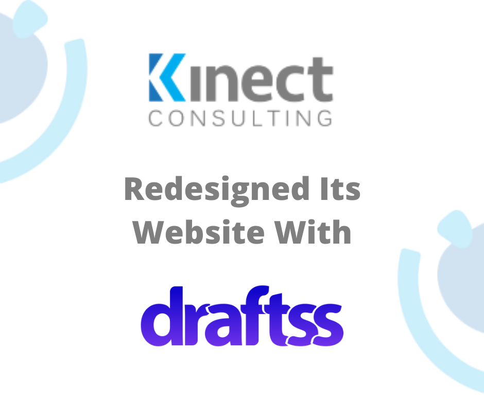
Client: Kinect Consulting
Description: Kinect Consulting is a group of professional experts in technology and integrating the businesses with cloud computing, enhancing reliability, and reducing costs.
Industry: IT Consulting
Project: Web Design & Development
Introduction
Every business in the world today is looking forward to leading their domain and is trying hard to reach out to the customers as well as showcase them in the best way possible. What’s better than a website to do that! This has brought web designing into a very critical role to play for any business.
Kinect consulting wanted to have their website look refreshed and improvised. The trends in web design change quickly and to keep up with this rapidly changing world, it is important for businesses to keep up with the latest trends.
The client also wished to switch from Drupal to WordPress. This also required for the design to be in Elementor – a puck and drop website builder, so that the client could edit the design later by self and keep making frequent changes.
The client has started making a website but due to a lack of resources and skills could not complete the web design. This is where Draftss came in to rescue them. Draftss equipped the client with a full-fledged team of web designers. The designers are highly skilled and professional.
The Draftss Solution
Understanding the Problem
The brief of the client talked about what they were looking for and what was the requirement in a very general format. There were lesser specifications as to what was exactly to be on the screens. The only guideline which was specific was the use of the colors. The aim was to have only the colors from the logo of the firm in the web design throughout.
We got over with the team on Slack. We then tried to understand the complete requirement in a more specified manner. Unless and until we can’t visualize what is required, everything stays very fragmented. Thus, with continuous conversation and brainstorming sessions, we tried bringing clarity on both ends of the teams. The ideation process kept going on and we kept sharing the progress of the design.
Brainstorming Solutions & Crafting Results
With some clarity of the requirement and understanding of the client, our designer started working on the brief. The design had to be bold, fresh, and with the colors only used in the logo of the company. The designers worked out the design in the direction of making it dynamic and interactive.
We had to create a perfect balance of visuals and text. The design template of the website also was to be minimalistic and radiant. We had to compile all these requirements and give them a shape.
Finally, we started coming up with close to finalized designs and shared the landing page with the client. With several feedback and suggestions, new editions, as well as improvised ideas, we started working on each of the feedback and editions that the client gave. All the team members of the client’s end were happy with the changes and revisions. We then moved on to the next step and started with the development of the designs with coding.
With each and every point being worked and reworked again and again, here’s a sight of what we came up with.

The hero section of the website is a slider as per the requirement of the client. The section can have multiple images and motion graphics in the background to compliment the text upon it. The section appears before the visitors first and is completely customizable to stay up to date and fresh. The quadrilateral frame presents a very dynamic view of the complete experience and enhances the visual appeal.

This section of the platform showcases the services and offerings that Kinect Cilsulting has got for its clients. It also has got powerful features to attract and catch the hold of the eyes of the visitors. It has a small mainframe graphic design and an additional copy of the same as a watermark. This complete visual comes with a great appeal and a perfect blend of text and visuals. This avoids the section being completely textual which in turn keeps up with the readers and visitors. This appeal keeps the visitors engaged and the website to be interactive making it a great asset as well as a point to be leveraged by the firm to utilize and benefit from.

The footer of the section is very bold and bright. It is equipped with the theme color of the website and also a dark shade to it. The color combination is thus made out of two bright and beautiful colors. The website gives a strong appeal and a great look. Vectors and illustrations all across the platform make it very easy for the eyes to extract the information out of the page. The watermark text and images also play a great role in pumping out the content and keeping the layout interesting with a plain and minimalistic background.

This section is a very good example of keeping the website very much informative. It is also low on design and high on infographic representation. It talks about what is this product by Kinect Consulting. With a very subtle and plain background, the information comes easy and natural to the eyes.

In a packed up and white background, the blue color of the theme for the business comes to add the necessary gloss and shine to the section. The shadow of the individual sections adds up to the attraction of the section with information clear and crisp.

To highlight the core competencies of Kinect Consulting, the section has a very strong and bright blue background with white and bright icons of the competitive domains of the firm. The idea appears to be quite subtle yet strong enough to convey a message to the visitors of the services and the major aspects of the firm.
Conclusion
The web redesigning of Kinect Consulting was a work of ideation and brainstorming. New and innovative ideas came in throughout the process. The inclusive sessions of both the teams also discussed what to display and what out of the ideation phase to remove. The sessions played a critical role in helping the designers at Draftss reach out to an expression of the design. The final designs felt satisfactory to the client fulfilling all of the requirements into a single web platform.
The continuous feedback and revisions that the designers at Draftss are committed to also plays a major role in achieving and giving out great results. The website is live and running with a very bold and strong look. The colors representing the theme of Kinect Consulting look beautiful. The website is also integrated with elementor successfully. It enables the client with customizing the website and updating the content.
Draftss thus allows a very open nature of communication. This plays a very crucial role for the client to be able enough to give out the specific requirement. It also helps both ends of the process to have a very smooth and seamless functioning.
This is how the website looks:

Thanks for taking the time to go through our project case study. If you too want to get designs done you can ahead and SIGNUP for 7 DAY FREE TRIAL + Our co-founder loves talking and consulting on projects for free, you can schedule a free call with him regarding your project here calendly.com/junaidansari