No matter what kind of platform you have, be it a blog, magazine, portfolio site, or online store, you can rest assured that there are numerous sites out there that have the same purpose.
If you want to succeed at what you do, your website needs to stand out. Good design is good business. To help you out, here 6 essentials to designing a flawless website layout.
Define Your Goal
You should establish what you want to achieve before you get to work. Do you want to generate new leads? Improve your sales? Offer a great reading experience? Whatever your goals are, your website should reflect them.
Contemplate your goals while you are trying to come up with the site’s description. When defining goals, think about your target audience.
Their goals matter as well. What do you want to present to your target audience? What problems do they have? What solution are you offering to them?
Keep It Simple
The Hick-Hyman Law states that the more choices a person has, the longer it takes them to make a decision. You do want your users to spend more time on your site, but you want them to enjoy their time there, not hate it.
By giving them too many options, you will just frustrate them, and that’s not what we are going for. If you want to avoid that, you need to make your website layout intuitive.
Don’t overwhelm them with menu items. Only include items that are essential, such as Blog, Services, Products, FAQ, Contact Us, and About Us.
When naming items, be straightforward. For instance, calling your products “Our Bread and Butter” may sound very creative, but it will make for a horrible element on your site.
Vagueness doesn’t convert well. It’s true that your site needs to stand out for it to be successful, but naming your blog “My Musings” isn’t how you’re gonna get there. To make sure your visitors will understand everything quickly and easily, use plain language.
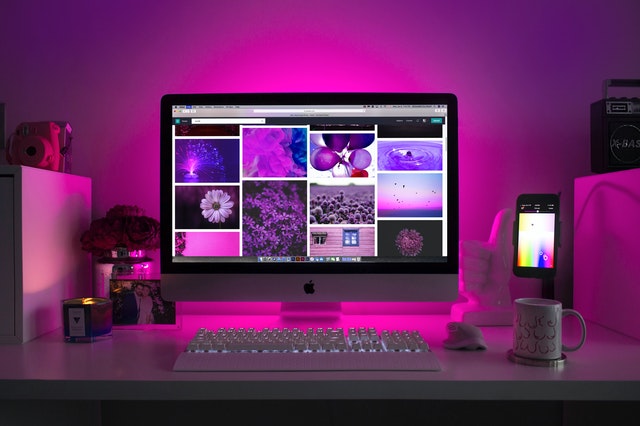
Utilize the Power of Color
People utilize the psychology of color in business, marketing, and design to achieve their goals. Considering that 85% of consumers cite color as the main reason why they purchase a particular product, it is safe to say that color is one of the most powerful tools you have.
You have to carefully consider the colors you will use if you want to ensure a flawless website layout. The colors you choose will transcend your website. If you are setting up a business site or an online shop, this choice can affect every facet of your business.
Consider how fundamental branding is for your business, as color is a major part of that as well. Think about Twitter, YouTube, Google, Facebook, Quora, etc.
The most successful brands use their colors as their foundation. Since a signature color can increase brand recognition by 80%, it’s no wonder so many major brands heavily rely on their colors. Follow their example.
When deciding on which colors to use, start by checking out a color palette and remembering step one—simplicity is key. For instance, you can use colors that are opposite each other on the color palette (complementary colors), or you can use the ones that are next to each other (analogous colors).
Purple is soothing, yellow emanates youthfulness, and orange creates a call to action. Use the science of colors to your advantage. The right colors will give your site depth and make it more interesting, but they will also represent your brand, so take your time with this one.
Don’t Forget About Google
There’s more to web design than meets the eye, quite literally—it’s not all about what you can see.
Your visitors won’t be the only ones looking at your website. Search engines such as Google and Bing will also be interested in your website. And, if they like what they find, your site will rank better on their search pages.
The process of making your site search-engine-friendly is called search engine optimization and it will help you attract more visitors. You should focus on SEO from the get-go. It’s something that you will continuously need to work on, as many businesses do.
But, most of them start SEO after they have a website designed. That’s putting the cart before the horse, so they often have to get back to the drawing board.
Designing a search-engine-friendly website takes some planning. For your site to rank better on Google, you need to publish content that answers Google’s search inquiries, and you need to make it easy for Google’s web crawlers to navigate your site.
Your site must include a blog. It will be the backbone of your SEO efforts. You should use it to target keywords, answer people’s questions, convey the purpose of your site, and provide useful content in general.
To exercise good SEO hygiene, avoid using repetitive wording in your site’s layout. The way you name links and images is also important.
The content management system you choose (CMS) will have a great impact on your site’s relationship with Google. For most businesses and purposes, WordPress should work best.
Take the time to get better acquainted with Google Analytics. It’s a tool that will help you see what you can improve.
Use Negative Space
If you want to make your site simple and pleasant to look at, you will have to make heavy use of negative space (aka white space). It allows you to drive visitors exactly where you want them to be.
For instance, you can use it to lead them to your Call-To-Action (CTA). So, negative space is so much more than space that just fills the void between text and photos.
Google’s home page is a perfect example of how negative space should be used. There are no distractions and there is no clutter; it’s very clear what you need to do when you load the page.
The photos and items are kept to a minimum. Be like Google, use negative space to accentuate the most important elements of your website.
Show Them Your Smile
Your site won’t stand out if you heavily rely on stock photos. They are everywhere, they are repetitive, and, often, they are very cheesy. But the biggest problem is that they are soulless.
Use photos to show your visitors the best you’ve got. If you’re running a business, show them your team and their smiling faces. If it’s your personal blog, use them to share a slice of your life.
Website visitors ignore generic figures, but they will connect with real, genuine people. As seen in a study by Marketing Experiments, real photos convert much better than stock photos. So, if you want a website that inspires trust, put your camera to work.
Takeaway
Web design is an ongoing process. To make sure it will go smoothly in the future, you need to invest a lot of effort when laying the foundations. Then, as you grow and get better acquainted with your target audience, making the necessary tweaks and adjustments will come easily.
Michael has been working in marketing for almost a decade and has worked with a huge range of clients, which has made him knowledgeable on many different subjects. He has recently rediscovered a passion for writing and hopes to make it a daily habit. You can read more of Michael’s work at Qeedle.