A home page for website is like a greeting to the visitor. It must look welcoming, beautiful, engaging & many more things. After all, just looking beautiful isn’t enough.
People say that- don’t judge a book by its cover, which may be true sometimes, but this statement doesn’t apply to a website’s home page. You need a solid home page, as it can make or break users’ experience. When many users don’t stay on your home page, your bounce rate increases, which can severely affect your sales.
To avoid falling into the same pit, many businesses have already fallen into. We’ve shared with you some phenomenal details & things you need to keep in mind when building a home page for website. But first, let’s further understand why designing a good home page for website is so important.
Why Designing a Good Home Page for Website Important?
Typically when a visitor visits your home page, whether they stay on your site or leave depends on their experience. Nielsen Norman Group conducted a study to determine the duration of users’ staying on web pages. In this study, they analyzed a concept called ‘time-to-failure’ & found out that, on average, most users leave web pages between 10-20 seconds. However, users stay longer on web pages with a clear value proposition.
This means that you have approximately 10 secs to show value to users & effectively communicate it. If you fail to do so, you jeopardize users leaving your web page. This makes it much more important for you to have a good home page if you want users to stay on your website.
Now, let’s understand how you can build a breathtaking home page to make people stay longer on your website.
How to Build a Killer Home Page for Website?
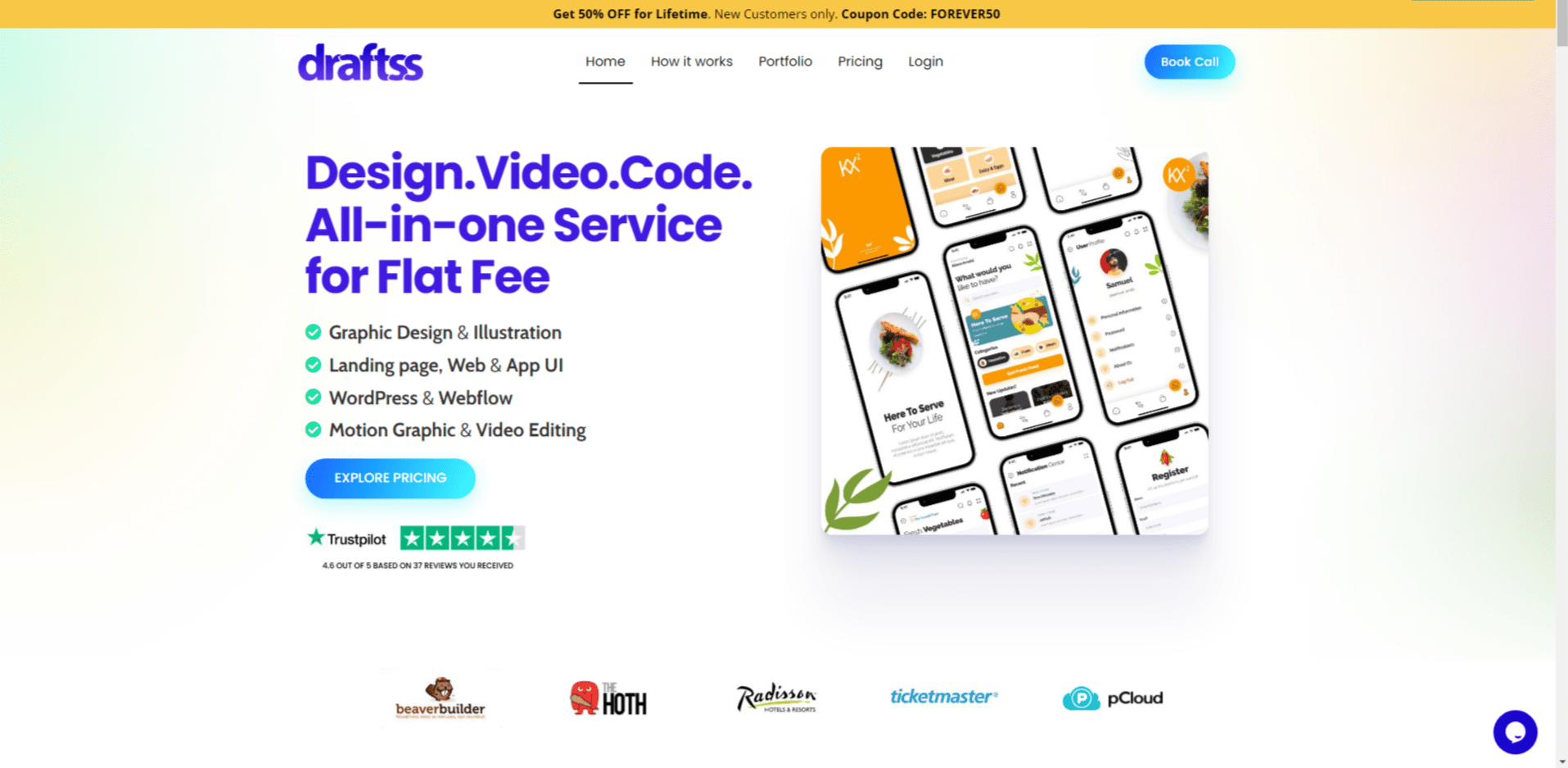
Building the right home page for website is not an easy job. You need to consider many things such as relevant images, headlines, icons body copy, etc. Then you need to place all those things in such a way that is appealing to website visitors.
Here, you can think about micro-interactions. Micro-interactions basically are trigger feedback. For example, the way your menu slides when you click or hover your cursor on it.
Aren’t you wondering where to begin? Let’s find out more about the things you need to keep in mind when building a dazzling home page for website.
Research your Potential Visitors
Knowing what your visitors need is key to every business model. When you know the things that are important for your users, you will surely try to include them on your home page, right? Also, it’s very important for you to understand what your users think & behave when they land on your website.
Start by conducting interviews, contextual inquiry & testing your website’s usability to collect data from your visitors. There are many tracking tools that also might help you in gathering visitors’ data.
Home page Layout
When designing a home page layout, you must consider two things.
1-How easy it is for the users to find what they are looking for.
2-How quickly the users understand how to navigate the website.
Understanding how to better user interface(UI) will ultimately lead to users staying or leaving your home page. There are endless factors that come into play when designing the layout for your home page. But, to simplify things for you, here are the 3 most important things you need to consider when designing your home page layout.
- Typography
- Using the Right Images
- Composition
1. Typography
Without words, there’s no meaning to your website. Designing your words is a crucial aspect of a home page. You need to make sure that users don’t find difficulty in reading the copy of your home page. So how will you ensure that?
Consider how you will place your words, colors, font style, size, etc. You don’t always need to go for fancy font styles. Simply using San Serif, Arial, Roboto & such popular font styles, can take your value proposition to the next level.
2. Using the Right Images
Images can highly influence people’s emotions. People perceive your home page by its first appearance. If you only have text, chances are that people might leave within the first 10-15 seconds.
Think about whether the images you use, evoke emotions that users feel or don’t. Do those images solve the problem your visitors landed on your website for? Are they relevant to your audiences’ demography, occupation, problems, etc.?
3. Composition
Now that you’ve got the perfect body copy & images for your home page, do you think that’s enough? No, it’s not! You need to figure out how to combine everything together & do not jumble it up & overcomplicate things.
Right from the copy & images to the button placements, you need to carefully place everything together. For example, using too many images on your home page can distract users & make it difficult for them to navigate your website.
Responsive Home Page
Most people revisit a website whose they have a great first-time experience. Hence, it’s essential to make a highly responsive home page. Making a home page responsive means that it’s optimal for PCs, tablets & also for mobiles.
60% of all web traffic comes from smartphones these days. Since users are shifting from PCs to smartphones, you must consider both options when creating a home page.
See to it that users from all platforms easily navigate your home page. You must ensure that all your text, buttons & interactions should be very easy for users to see & operate. Have consistency across all platforms to leave a positive impression in users’ minds.
Interactive & Engaging Home Page
People typically remember events that are happening, unlike bland ones. The same concept applies when creating a home page. That’s why creating a Dynamic home page instead of a static one is often better.
A dynamic home page can make the user experience more interesting by having more interactions & engagement. Using illustrations, animations, gifs, mini-games & even audio can make it exciting for users to stay on your home page for longer.
In short, using a dynamic home page makes your website unique, interactive & something for users to remember.
Have Proper CTA
If you’ve successfully made visitors & stay on your home page, you’ve done a great job. However, it’s only a battle half-won. You need to convert those visitors into paying customers, don’t you? To do that, you must have a clear call-to-action(CTA).
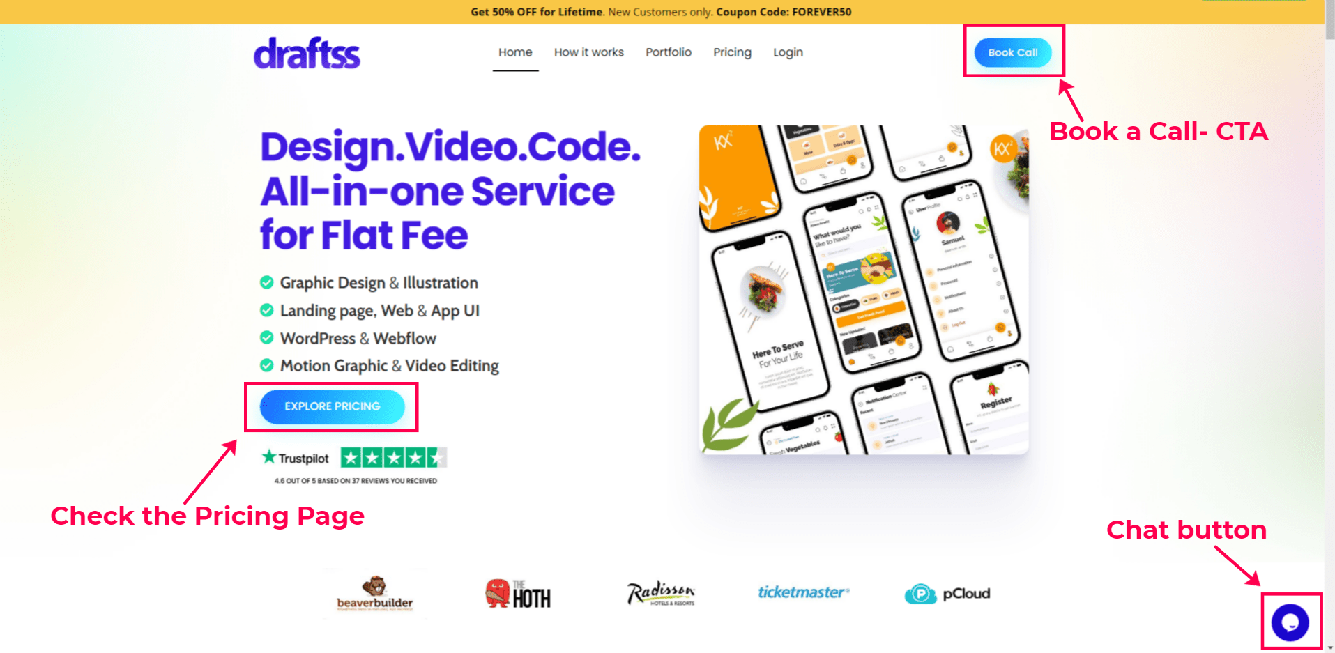
Mane modern websites use multiple CTAs at different parts of their home page & website in general. For example, Sign Up Now, Subscribe to our Newsletter, Explore pricing, Book a call, etc. It encourages users to take action. If you’ve successfully managed users to have seamless navigation & engagement. They are more likely to take action.
Take a look at our Website as an example. You’ll see many CTAs & action buttons that drive users to take action. (Refer to the image below)
Our Ending Thoughts
Your home page is probably the most important page of your website. Thus, it is crucial for you to design it to the best of your abilities. Since there are so many different aspects you need to think about when making a killer home page for your website, we’ve made this article. Just remember not to complicate things & keep it simple.
You can check out our Portfolio if you want to take inspiration from it.
