Introduction:
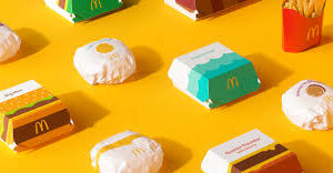
Sometimes we often are fascinated by this three-letter word: I’m lovin’ it! May it be the sad or good day, what cheers us more is the Happy meal. Although if we have a look at How McDonald’s menu has incorporated a few more iconic items with a perfect touch of design orientation showcase more connective and playful manner. The illustrations are curated in such a manner that this design-oriented packaging becomes the hero of the game. Its main aim is to create new vector-styled illustrations. Likewise, for instance, McDonald’s represents the more bifurcated look of the Egg McMuffin, the fries, and the Big Mac. The revamping done here is in such a way that is more playful and the graphic representations establish a more effective connection.
What’s New in Design-oriented Packaging:
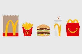
The graphics on the boxes, packaging, wraps, and cups being communicative enough to create a zeal in the minds of the consumer. This depicts the brand identity as well. And this redesign is done in order to modernize the brand value. Illustrations in the case of McDonald’s are significant to the concept of a direct interpretation of food. The most significant ingredients are used as graphics with a pinch of modern colors. Here in the case of McD, the styles of the designs or illustrations are kept simple, at the same time iconic and minimal. Say for example:
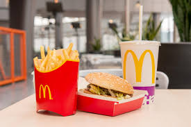
- Cheeseburger: the Mc Cheeseburger now comes with a wrapper and it showcases a single dripping yellow line which represents the cheese
- Egg McMuffin: As being discussed earlier, the Egg McMuffin comes with a wrap-up that consists of a single yellow circle which is the indication of a yolk.
- Fillet-O-Fish: It is covered with turquoise waves.
Needs of McD for Redesigning the Entire Global Packaging System:
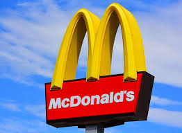
Pearlfisher, an independent brand agency has redesigned the global packaging of the system for the fast-food chain McDonald’s. The designs seem to adhere to the visual framework for the brand and its long product line. Good packaging with some bold graphics makes a brand long-lasting. It creates a sense of joy too among the consumer group. McD has used this approach also to make the operations more clear and simpler. The easy-to-understand graphics also help in driving the recognition of the other brands and customers. It also helps the brand to outstand the competitors.
In the case of McDonald’s, it has taken special ingridients from the menu and has designed in a great manner such that it becomes easier in understanding. While, the iconic expressions make this design-oriented packaging more special, recognizable and help people celebrating the smiles of the mass. Likewise, the redesigning of the packaging of McDonald’s aims at sticking to the brand identity, and the color palette is related to the illustrations. In short, the aesthetically pleasing, minimal designs, simple colors help in improving the functionality and recognition. This also leads to an emotionally joyful impact on the minds of the viewer.
Effects of This Design-Oriented Packaging:
As we already know that whipping and changing the brand packaging over time makes any of the ill-famed brands to heights of success. This in turn helps in solving multiple problems as well. This approach also helps in building a loyal customer base.
And it can be seen in the case of McDonald’s, how the company is looking for streamlining all its products by rolling in designs of bags, cups, boxes, and wrappers with a minimal design. Adding on top of it the brand also is through its product enhance consumer satisfaction by ensuring convenience. Moreover, the use of illustrations and graphics tells stories using a brighter idea. This approach might prove helpful in tricking and catching the attention of the public.