Never underestimate the power of the simple Call-to-action (CTA) button which appears as a pop-up out of nowhere or is constantly present at the corner of your screen. CTA might look like the smallest element of your marketing strategy, but it can be the most crucial. We are programmed to expect when and where the call-to-action button may appear but to make the most of it we should follow some proven techniques among which a good design is the most important part of a call-to-action button. Before understanding the complete benefits let’s understand what is CTA and why should we use it?
What is Call-To-Action?
Your Customers are driving a vehicle and you want your place to be their terminal destination, but they’re unable to find you because of heavy traffic on the road but one road sign in front of their eyes can make all the difference and head them to your place. The vehicle here is the device while the road is the internet, traffic is the competition you’re facing in your niche, and the place is your website. It can also be defined as an image that allure your readers and redirect them to a particular landing page where they can be converted into a possible lead. Alluring is the toughest part of this process but a good design can make it happen.

Why is Call-to-Action important?
A call-to-action button will help you to turn your customers in the right direction.
It could be a Sign-Up page, a Buy now page or even a Landing Page. A great design
along with a great message can convert spectators into customers. One of the
cheapest ways to advertise yourself and increase your sales/reach.

How to make the most of CTA?
Achieving your goal of marketing with call-to-action is an easy task that requires just two things Design and Data. If you have the right data but your design is unlikeable then this method may fail for you. Placing these images in the right place is most crucial to attaining the maximum benefits.
Here are some of the tips to implement and boost your CTA rate:
1: Design
Design your CTA to be click-able :
Your Call-To-Action button should be different from your other content so that it catches the eye. If the first impression is not good, this might be the user’s last visit to your website.
Be Clear in your design. You may use a 3D layout or effect and make your CTA button more appealing but the goal is to get the viewer’s attention and not annoy him.
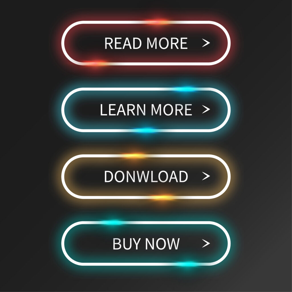
Colour Is The Key :
Colors are the most important part of a CTA button. A very slight change in your chosen color can make your design dull and lame from attractive and appealing. Green, Orange, and Red are some colors that are tried and tested. Depending on your site’s design always go for a contrasting color so that it stands out from all the other content on your website. Getting the right color can be difficult, and the only solution is to try until you get the desired output.
” A Graphic Design Can Help Convey A Message Better ”
When a CTA pops up the first thing that comes in front of the visitor is the Design and Layout of the CTA Button. If the Design is dull then chances are the visitor may not even read your Message and close your Button.
Get Creative with Button Graphics. Sometimes an arrow or graphics can enhance the effectiveness of the CTA Button. Your Graphic/Icon should make sure the viewer gets the message/offer rather than confuse them with unnecessary graphics. Hiring a Graphic Designing firm can help you achieve all your goals of the CTA button as they are experienced and understand the nature of your requirement.
If possible add testimony to your CTA button as people tend to believe in a certified and trusted brand. This Technique is old but still effective in today’s time and date as People still buy with emotion.
Declutter everything around your CTA. Unrelated ads, Social Media Links, Site content and everything that can distract the viewer should be kept as far as possible from the CTA. Other Buttons on the page that are not related to the CTA Button should grab less attention than your CTA Button. Design the CTA button as per the requirement and size.
A round-shaped button is the preferred choice of many7 people but you may experiment with it according to your needs.
2: Message
The Message is the heart of the CTA Button. Choose very few and gripping words to direct the visitor about what to do and anticipate. A message should include highly compelling words such as (Free, Now, Click, Reserve, Limited, Expires). Benefits and Data Points (e.g. Users mark a 60% increase in traffic in 1 month) can also be added as per the requirement of the brand.
Create a Sense of Urgency for your viewer in your call-to-action button. Viewers should feel that if we don’t opt for this we’re being left out of the opportunity.
Example of text on your CAT button:
Sign Up and Get 60% Off Today!
Hurry! Only a few seats left!
Phone Prices Going Up This Week! Book Now!
CTA can help you build a relationship with the visitor and without a good message that’s not possible. Think hundred times and then conclude the Message.
3: Placement:
People tend to read from top to bottom and from left to right, keeping this natural flow in mind your button should be placed. The Most preferable positions for the button to get placed are at the bottom and the right side of your content. Never make a visitor turn back to find your CTA button. Keeping the CTA button at the end of your page or content is also preferred as the visitor is now made aware of your brand; an example of this can be using a “Join Us” Button at the bottom of your landing page or post.
Chances are that a visitor may not complete your post or not reach the CTA at the end of your landing page, to avert this issue a text-only CTA can be used in the middle of your page/post. This method of CTA button is called Anchor Text CTA.
4: Testing
You won’t know what’s best for you until you try enough options and analyze the output. A CTA button can have moving impacts on your brand. Color, placement, font, size, message and everything you can think of that can be changed should be tested. If you’re not familiar with the Designing part then you should hire a firm for your designing needs and is highly recommended.
Testing is not a simple process, the CTA should be continuously optimized as and when the change is needed.
Need Help?
Draftss provide a variety of services including designing a Call To Action button. Our team of experts are well aware of the latest trends in the market. Enjoy a dedicated designer for your project at a very low cost. Get in Touch to know more.