
Studies in human psychology show that different Graphic Design Colors can evoke different moods in the human mind. Have you wondered why specific designs are more eye-catching to you? Whereas others appear a misfit even if the color is the same?
Color and mood often go hand in hand. If you are trying to create a comforting and welcoming appearance for a restaurant or hotel blog, you will likely use warm and friendly hues such as yellow or orange.
On the other hand, if your blog is supposed to be formal and for extremely official information such as doctor appointments or hospital info, it is preferable to keep the designs to a minimum.
To ensure that you have the readers’ interest alive in your web page or blog, you need to understand the proper use of colors inherently. If you can pair the right type of contrasts or shades, your digital illustrations will stand out from your competitors!
Graphic Design Color Combination
If you provide graphic design services, you are likely to come upon logo designing requests. It is advisable to use minimalism in graphic designs while creating a logo.
Since it becomes essential to make a logo stand out yet keep a touch of simplicity, you also ought to keep in mind the firm’s goals or agenda for whom you are designing.
There are specific colors that have managed to create a dynamic and powerful presence through their aesthetics. These combinations have been incorporated into logos to make them eye-catching yet subtle.
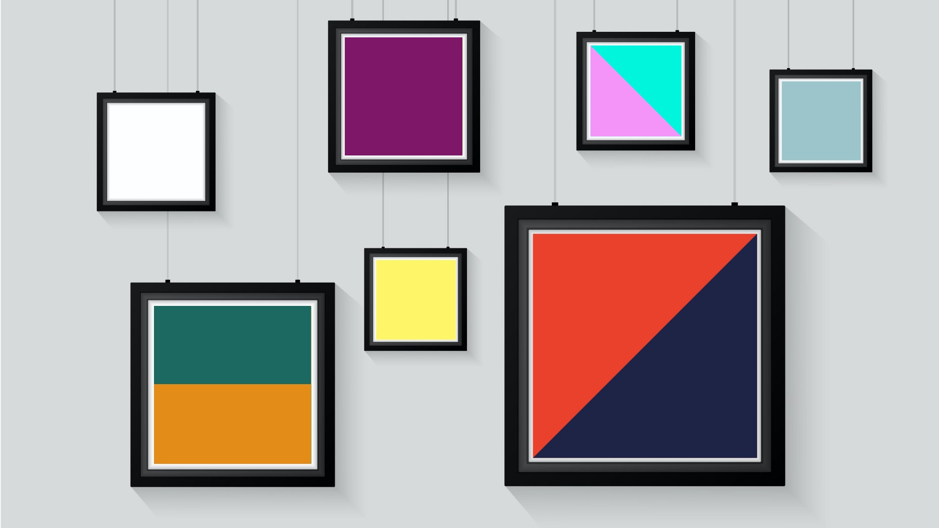
• Two-color combinations include contrasting shades. For example, combinations such as yellow and navy blue, orange and black, navy blue, and teal blue. These shades are from opposite ends of the light and dark spectrum and provide good contrast.
• Three color combinations tend to work better with one complimentary and two contrasting color designs. For example, you can contrast warm tones of brown with light beige color or different green shades. It is also recommendable to use different fiery shades with one cool color such as blue to get trendy and breathtaking designs!
While selecting color combinations for your logo, it is essential to keep in mind the kind of service they provide and a suitable mood for them. After all, you cannot have loud and bright colors for hospital logos!

Color Combination in Landing Pages
Your web landing page is the first thing any new viewer or potential customer is likely to encounter while exploring your services. Therefore, if your page is not aesthetically pleasing to your target customers, then it is expected that they will leave the page and visit your competitor’s page.
To avoid this situation, let us look around some rules that are likely to work best for web page color combinations!
• Use the dominating color in your logo as your foremost color. In case you already have a logo design ready, you can typically use the most dominant color of that logo for the landing page with other colors.
• It is better to use a maximum of 3 colors for your landing page. Using more colors might make it look cluttered and disoriented.
It is essential that you use primary colors, secondary colors then, and gray zone colors at last. It will help you in finding the perfect color balance.

Primary Graphic Design Colors and the Moods They Evoke
Even though color connotations vary across cultures and individuals, there is an encoding of certain emotions with different shades that have been a part of the human psyche since primordial times.
• Red invokes a feeling of passion or love or power. This color is dominating in nature and should be used in graphic illustrations very carefully. This color seeks attention, and if excessively used, it can tire your viewers.
• Yellow: This color denotes sunny and enthusiastic feelings. It is advisable to use this wisely to alleviate the mood of your viewers.
• Green: This color denotes wealth and prosperity. This color can be extensively used for environmental awareness pages or for displaying content based on outdoor activities.
• Blue: Invokes a feeling of safety or creative vibes from the careful application. It is recommendable that you use various shades of it wisely.

If you can use Graphic Design Colors wisely, you can transform your viewers into potential clients. It is recommendable to understand the relation between color and moods before using them!
Draftss is a company that provides unlimited graphic design services. It is advisable to visit their website for more information regarding the proper use of graphic colors in your digital illustrations!


