
Company: Employeelink
Description: Providing solutions and easy interfaces to the clients and boost the productivity of their team.
Industry: Executive Search
Location: Surat, Gujrat
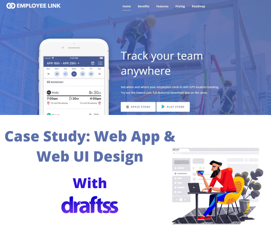
Project: Web UI/UX & Application UI/UX Designing
Problem
Employeelink wanted to create a platform for its clients to manage their teams. The team wanted to develop a one-stop solution for its clients to bring all their employees on-board onto a single platform. The platform would serve to be an easy option to manage and function for the clients’ workforce. The app could serve the purpose for the management of all the workforce of an organization and take care of all of their needs, which makes for an important part of the business – smooth functioning! The design of the interface for the app and a website had to be cool, fresh, and minimalistic.
With several samples, features, and options to consider in mind, we wanted to create that one perfect blend of every element. The final result was expected to suffice all of the requirements. It should also comfort the eyes even if a person has to work for hours and hours.
With all the parameters in place and timely delivery of the project in mind, our professional designers folded up their sleeves. Eyes on the screens, they began to scribble up something that could suffice everything in a single interface!
The Draftss Solution
Understanding The Problem
We understand that a team that understands the key points of the concept and can think in a direction that a client wants the team to, is a team that is great to be backed up with!
Starts with a sample website, the brief of the design from the team Employeelink comes with a lot of information. We were required to keep a number of points in mind and work them out. With some of the features, and outlook of the dashboard, the very first brief came with a number of tasks. From fonts, sizes, and colors, to the design, template, and feel, we had to design everything genuinely qualitative and fresh!
For the first design, we presented the design to the client and he said, “Landing page is looking good. Still needs work. Here’s my feedback”. Definitely, he had a number of more points of feedback to share which the team was looking forward to working upon enthusiastically.
Brainstorming Solutions and Crafting Results
We went back, tried to put it all up on our screens, worked out all of it, and shared a draft. What did we come up with?
Here’s a snapshot!
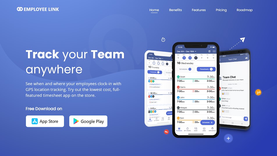
After the approval of the landing page, we had our spirits on! We quickly went through the design brief for the dashboard that the client had shared during the on-boarding process.
The brief talked about what the client does and what is the motive he wants to achieve through the app in-making. He wanted the app interface to be fun, simple, and professional at the same time. With some very specific features and color combinations that the client wanted to have, we started designing to put forward a very easy and minimalistic dashboard for the app.
Working with full spirits, we took up the brief for the dashboard and went back to our screens! Worked out a few concepts and options, as usual!
The first comment that the client made after having a look at the dashboard was, “Wow! These look great”. We had created a dashboard for the web, mobile, and iPad.

The side panel for the tool is minimalistic and is also very easy and crisp. The color reflects the theme color of the brand and presents a number of important features for the users.

We designed this panel to be very informative and segregative. To identify the information easily, it reflects clarity. We also used icons and different colors to make it even easier for the eyes to get hold of the information.

This panel of the dashboard reflects the timesheets of the employees. It becomes easy for the project manager to record the individual working hours of the employees. With different colors for all employees, hours in words as well as the meter, and easy differentiation, it makes it easy to manage.

For the user to not miss important notifications and updates, this panel reflects the calendar as well as the notification panel just below the calendar to keep up with the time and schedule.
Here’s a snapshot of the dashboard!

Conclusion
The dashboard of the tool for Employeelink was thus designed to be effective and efficient for the users. It’s designed to bring everything in place with a crisp and easy interface. With a very collaborative and complementary interface, the management on the dashboard is hence very easy. Also, the game of colors makes it even more smooth to access information for the eyes and process the dashboard quickly. The addition of the calendar and the notification panel further eases the management and time schedules. This in turn even reduces navigation and minimizes clicks on the dashboard.
The final output took some fixing and changes based on the recommendation and ideas from the Employeelink team and our senior design team at Draftss.

Thanks for taking the time to go through our project case study. If you too want to get designs done you can ahead and SIGNUP for 7 DAY FREE TRIAL + Our co-founder loves talking and consulting on projects for free, you can schedule a free call with him regarding your project here calendly.com/junaidansari.


