This article is all about the conversions high with some critical tips. Website conversion rates average around 2 percent. For every 100 visitors, you can expect to only get 2 customers. And honestly, that’s a pretty good conversion rate. Many sites only have a 0.1 to 0.2% conversion rate. That takes 1000 visitors to get 1 customer.
Draftss has also helped its clients to develop substantial e-commerce platforms with unlimited graphics designs, illustrations, WordPress, HTML, and more for building your website, brand, etc. you can check on our website at draftss.
How do we improve our conversions so we can get more customers with the traffic we already have?
We have come up with 13 best ways to improve conversion rates:
- Add a pop-up to your site
- Remove unnecessary form fields
- Add testimonials, reviews, and logos
- Remove distractions
- Make the initial step really easy
- Add a third-party signup service
- Strengthen your CTA copy
- Add live chat to your site
- Try another offer
- Offer a money-back guarantee
- Add a countdown timer
- Add a point of purchase upsell
- A/B test your headlines
1. Add a pop-up to your site
According to a study by Sumo, the average conversion rate for all pop-ups is 3.09 percent. However, if you do it the right way, you can reach the top 10 percent of pop-ups which average a 9.28 percent conversion rate. This one change will catapult your conversion rate. And it works on almost every site.
Here are some quick tips for getting the highest conversion rate from them:
- Try several offers (PDFs, premium content, different products, other free stuff) until you find a winner that you can feel right away.
- But a 30-second delay timer on the pop-up keeps them from being annoying.
- Make it easy to close the pop-up.
- Set a cookie so the pop-up only appears once per user. Most pop-up tools allow you to do this.
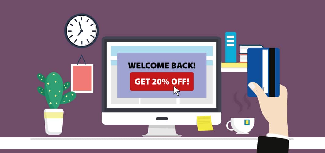
This combination will give you a huge boost in conversions and keep the complaints to zero. You won’t annoy anyone and you get all the benefits. The impact on your conversions will be so large that you could skip the rest of this list.
2. Remove unnecessary form fields
Have you ever had the intention of filling out an online form, just to be scared away by too many required fields?
It’s one of the best ways to kill your conversion rate. Remove all unnecessary form fields, leaving only those that are essential to accomplishing your goal. We have also done a bunch of A/B testing on form fields within our signup form. For each form field that we removed, signups grew by about 10%. Obviously, you can take this too far.
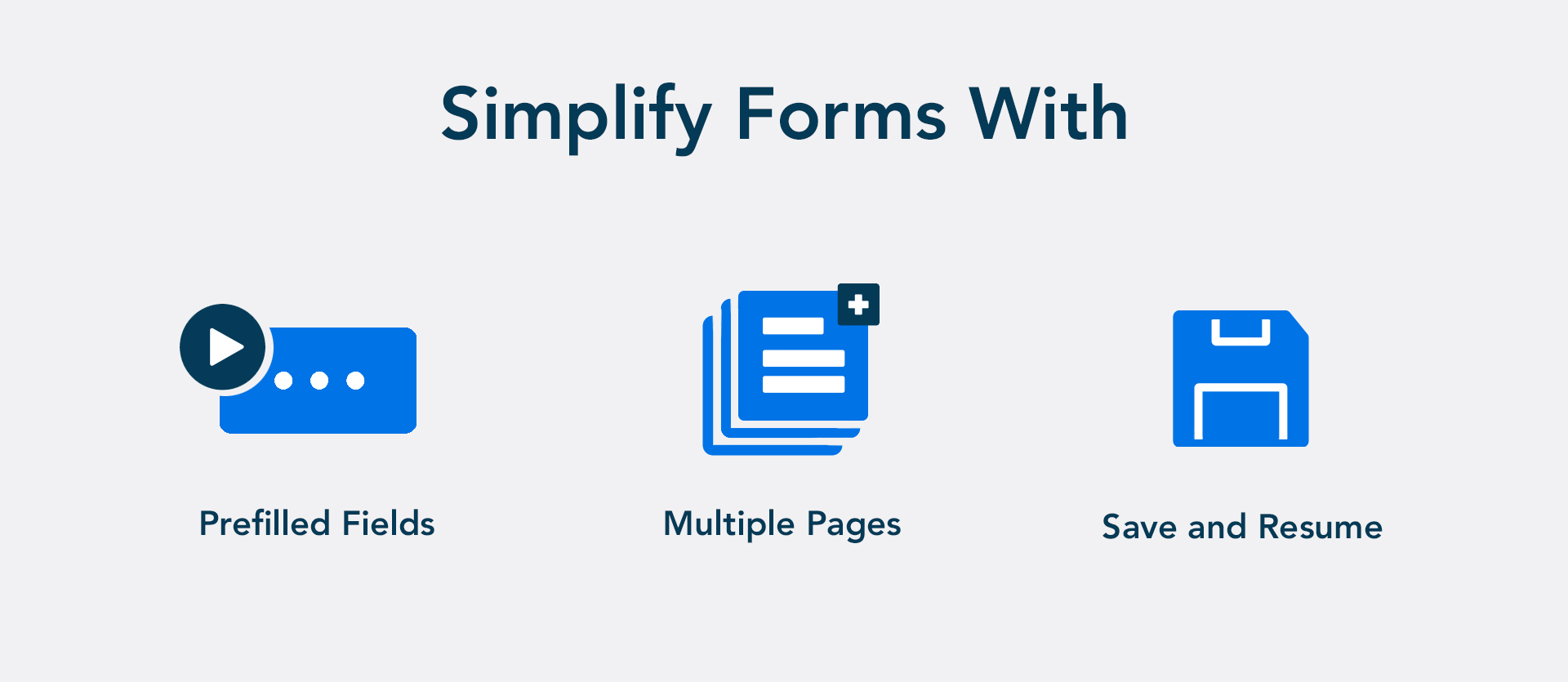
If your sales team doesn’t get all the lead info that they need to follow up, your signups could be super high but your close rate will be trash. To find the right balance between getting the critical lead info while keeping fields to a minimum. Just make sure every field plays a critical role. If not, remove it.
3. Add testimonials, reviews, banners, and logos
No one wants to be the first person to use a product or service. So, you can put their mind at ease by providing testimonials and/or reviews from past customers.
For homepages, you can also add a series of logos that instantly build trust with new visitors:

Social proof, including testimonials, puts consumers at ease. In an interview with ConversionXL, growth marketing expert Angie Schottmuller said, “If quality social proof buffers notable uncertainty, get ready for some remarkable conversion impact — in some cases up to 400% improvement.” Every critical page adds on your testimonials, reviews, banners, or logos.
4. Remove distractions
There’s nothing worse than visiting a website that pulls you in too many directions. Your landing page should be clear, concise, and easy to navigate. If it’s not essential, don’t include it. Stick with what your visitors need to know and nothing else.
When possible, implement the following (and not much else):
- Headline and subheadings
- Benefits and features
- Testimonial and/or reviews
- Visual combined with context, which shows what you’re offering
There are other things to consider – such as a live chat box, social proof, and video (more on these below) – but the point remains the same: eliminate all distractions. You want your visitors to focus on your offer and nothing else.
But how do you tell if something is distracting? You can use heatmaps. It is helpful for people who are lost and aren’t clicking on it. Visitors can get a click map for a better understanding.
This is one of the easiest ways to find conversion increases on the critical pages of your site.
5. Make the initial step really easy for conversions high as critical tips
There’s a psychological principle that humans prefer to finish things that they start. So, when it comes to your offer, the first step should be extremely simple to complete. Instead of asking for an entire form to be filled out. simply request an email address to start. From there, you can provide the rest of the form in hopes of securing additional information. But even if you don’t, you still have the person’s email.
The easier you make the initial step, the greater chance there is of your visitors taking action and following through to the end.
6. Add a third-party signup service
Alternative logins have become quite popular. Instead of creating a new profile from scratch, a user logs in using their Google, Facebook, or another account. This eliminates the signup form.
You’ll see an immediate impact on your conversion rate.
7. Strengthen your CTA copy
Generic CTAs like “Sign up” and “Start trial” won’t give you the best conversion rates. A few minutes spent improving the copy will give you an easy conversion rate win. Start with a CTA that starts with the word “Yes.” It’s highly effective psychologically because it paints the offer in a positive light. Like this:

Try this formula: Yes, I want [your offer]!
It works a lot better than a generic CTA copy. You can try different CTA buttons from different sites and copy to see which ones get the best clicks Heatmaps and recordings tell you when users avoid your CTAs. Then you know you have a problem and need to spend time improving the CTA copy.
8. Include live chat to your site for conversions high as critical tips
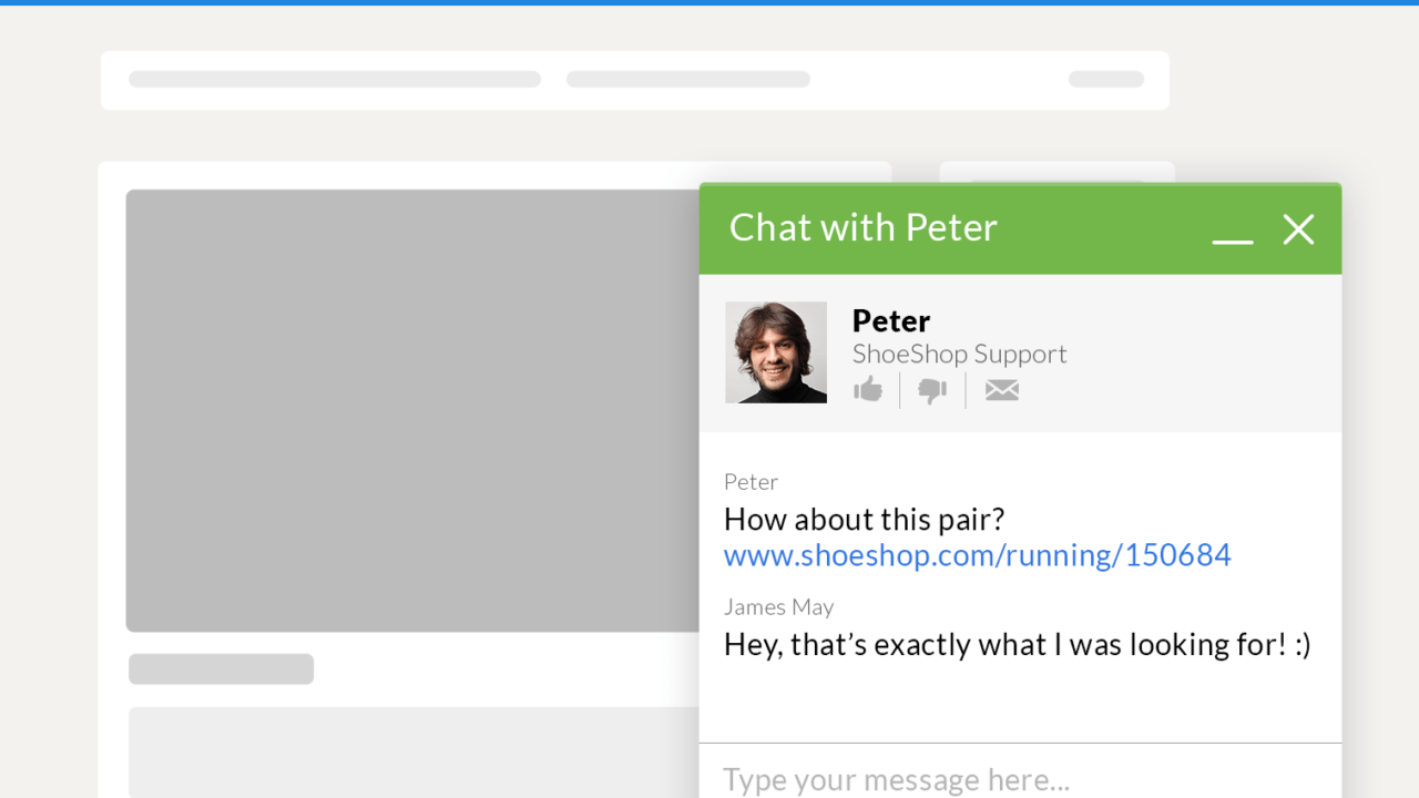
Many visitors want to buy your service but are on the fence. They have a lingering doubt or question that keeps them from taking that last step. Live chat tools are perfect for helping these folks. Just like a pop-up, live chat tools are easy to add to any site and have an immediate boost to your versions.
9. Try another offer as a tip for conversions high as critical tips
Don’t pay so much attention to your landing page design, copy, and related factors that you overlook the importance of choosing the right offer. This has one of the biggest impacts on conversion rate, as your offer must be appealing to your market. If your conversion rate is on the low side, cycle through different offers until you find something that clicks with your audience. It may not be the first, second, or even third offer that resonates with your market. But if you continue to experiment and track your results, you’ll eventually find a winner.
10. Offer a money-back guarantee for high conversions
As marketers and business owners, we know consumers avoid risk. They don’t want to put their money at stake unless they’re reasonably sure they’ll get what they paid for. A money-back guarantee helps assuage fears and move past objections. If you’re worried about losing all your sales because of returns, don’t be. In this video, I explain three of my best insider tips for offering money-back guarantees.
As I mention in the video, money-back guarantees aren’t just a quick way to increase your conversion rate. They also build trust and help the consumer feel more secure.
11. Add a countdown timer
It’s natural to become anxious when time is running out. So, adding a countdown timer to your landing page may be just what you need to capitalize on this feeling. According to Neuroscience Marketing, the addition of a countdown timer can increase a sense of urgency, which leads to a higher conversion rate. Another study by CXL explains how one brand increased sales by 332 percent by using a limited-offer sign with a countdown timer. The addition of a countdown timer, which should only take a few minutes, can immediately boost your conversion rate.
12. Add a point of purchase upsell
While it doesn’t technically change conversion rates, it does increase revenue without any impact on your current funnel. Immediately before a consumer completes their purchase, offer a similar product or service that can be added to the order with a single click. This one trick will lead to your average order value increasing by roughly 10 to 20 percent. You’ll want to experiment with different points of purchase upsells. One offer may fall flat, while another quickly boosts your average order value to 20 percent.
13. A/B test your headlines for conversions high as critical tips
A good headline can make or break a landing page. In fact, if you take the wrong approach, some people won’t read any further. They’ll simply hit the “back” button and vanish for good. According to Copyblogger, on average, 8 out of 10 people will read headline copy, but only 2 out of 10 will read the rest. Imagine that. Eight out of every 10 people on your landing page may neglect to read past your headline.
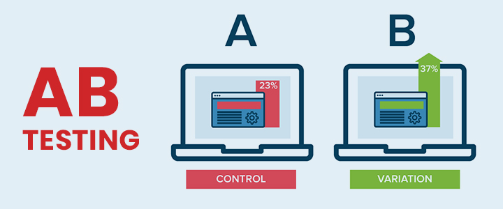
When A/B testing your headline, experiment with variables such as:
- Length
- Tone
- Use of statistics
- Use of numbers
Start Working on Your Conversions High With these Critical Tips
We have given you some tips to help you increase your conversion rate, but now it’s time to test your own site and figure out what you need to do. Start with heat maps at Draftss. They’re crazy easy to use and provide tons of valuable data. Heat maps tell you where visitors interact with your page via mouse clicks. You can figure out where you’re attracting attention on the page. Scroll maps are equally valuable. They tell you when people stop scrolling on the page. I also recommend doing recordings. It’s like looking over your visitor’s shoulder as he or she navigates your page. Apply what you’ve learned through A/B testing. Your conversion rate will go up as you test and tweak.
You can try out draftss for an excellent experience and increase your product marketing. We provide premium quality services on unlimited graphic designs, WordPress, Webflow, HTML, Illustrations, Websites, Landing pages, Dashboards, App UI/UX, and many more. Here we provide our clients with 73+ types of design and code services.
Drop your thoughts in the comments below.
Your email address will not be published. Required fields are marked *

