Fonts and Colors – Identity of Social Media
Whenever someone says ‘Social Media,’ some may not think about the fonts and colors but they think about Facebook, some of Instagram, some of Twitter yet others. But why is that make a visitor remember the Media as his/her first option? What is it that makes a user think of a particular media infraction of a sec? The answer to this question is quite simple, and as yo
You may have guessed it correctly, it is the color and font of any and every kind of media that makes a place in a person’s memory.
Every social website wants to look different from the customers. Be it Google, Facebook, Twitter, Instagram, or others like WhatsApp. Why is that all of these websites focus so much on color and font? Why do they spend so much on mere features such as the color? We will be answering these questions ahead but first, let’s see how these are different and do they mean!
Fonts and colors

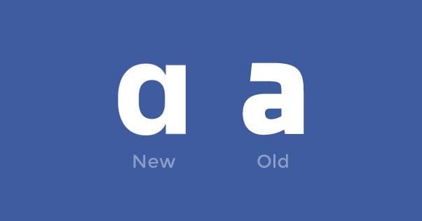
Let’s begin with the Search engine itself like Google, which uses its own font Sans and colors, namely Red, Green, Blue, and yellow. Facebook and Twitter, on the other hand, are seen in blue. Instagram (Insta) is seen in a purple, pink, blue, orange, red, yellow logo. The font of all of these 3 is Roboto, with the exception of Facebook, which uses the font Helvetica Neue for IOS.
Color Battles
In spite of using a spectrum of colors, Instagram is quickly associated with a mix of purple and red. As soon as we see these colors it’s an easy guess that they stand of Instagram. Only a few of those who are keen observers can notice the orange, yellow, pink in the logo.
When it comes to Google it is just the four colors of life. The G color as seen by many is the representative of the four colors known to any and everyone. These are colors seen everywhere products, board game pieces even children books etc. and therefore just too quick to be associated with.
Facebook and Twitter both having the same blue have made a point differentiate themselves well. Let’s see. What would u say for a bluebird and the blue letter? You are right! The blue letter immediately talks about Facebook and the bluebird as well all know takes us to Twitter.
Colors Within

Let us see the app colors. For Instagram, it is basically white. However, with recent updates the company has given an option of customizing the app color. It can be turned into a dark background. With varying feature of story colors the Media has done well in coming up with attractive colors.
While Facebook is very happy with its blue and white palette twitter has gone ahead and given few options. There is always the primary blue and white. But the secondary color palette is the grey-scale from Black to White which you can choose from.
Google follows its white background with a grey scale for search formats and its basic Quadra-color logo at the top. The company has chosen black for the incognito tabs to differentiate it.
Fonts
Except google who developed its own font all the other use the Roboto font. However, the Social Media Apps have gone a step ahead to provide a variety of Fonts for stories, posts, and have included emoji’s as an integral part of Language. Few have also developed their own stickers and fonts and have grabbed the market.
Another amazing feature the social media has taken forward is the concept of font generation. Now new fonts can be developed using a third part app/website and these can be used in your social media app.
The Need of Fonts And Colors
Now coming back to our question as to what makes the user remember? I know it is pretty obvious by now. The Fonts and colors are the backbone of Social Media Marketing. These colors and fonts act as major cues in attracting and appealing to the consumers. It is these that the consumer remembers and carries which play a role of immediate micro cues when similar color or font is seen.
colors and fonts are therefore essential tool of the marketer. A company be is Facebook, Instagram, Google, Twitter or a smaller company all have invested fortunes on the deciding and continuously improving these cues. These features being visual and repeated available get stuck to the users mind. Thus, similar colors or fonts lead to spreading of word-of-mouth which is today the most essential and most needed form of advertising for any company.
Overcoming the Competitor With Fonts And Colors
colors are chosen carefully because it represents the Media Company itself. As the color is the identity of the Media itself no company like and individual likes its identity to be mixed with another. Thus when Google chose the primary colors with the rebel green, Facebook came up with only blue. As Twitter dived in with a lighter shade Instagram brought in the whole spectrum in a very subtle purple and red.
While google chose to create a font of its own the others chose to provide variety of Fonts for personalized stories and post and whatever they wanted to share. They chose to bring in third parties for the fonts that they could not provide thus pulling customers very well.
Conclusion
I believe that each of the players have done well when it comes to Fonts and colors of the websites as well as the app. No matter what the economics status of merger, rise, and fall be the companies have done well when it comes to creativity and have earned loyalty of vast segments from varied walks of life.
As it would be the case in any field ongoing R&D of Social Media is further making the companies capable of not only providing but also creating better cues to attract anther segments of the market.