


In today’s world and the age of social media content generation, it is highly unlikely for a person to be reading textual information. People today prefer to look at videos, photos and creative content rather that reading previously popular written information to understand anything. Therefore, it becomes essential to learn different ways of disseminating information into much more creative and eye-catching ways to stay ahead in the game. One of the ways of creative dissemination of information is the use of Infographics. Infographics are a trending feature of the online world.
But First let’s understand what are Infographics:
The word ‘Infographics’ literally means ‘Information into graphics’. When a huge chunk of information is collaborated and made interactive by the use of graphics, it becomes an infographic. The use of inforgraphics is not limited to the graphics industry, but can be used in every industry.
All information can be designed into Infographics..
Infographics can be used to communicate a range of information- like showing the official sales figures of the company from different locations to defining a particular product’s uses and designs. Even by conservative means, it can be safely said that all information can be designed into Infographics. However, what makes an effective infographic is quite a trick to be learned.
There are a few tools and components of graphics that need to understood and incorporated into the design of the infographic to make the information being presented as comprehensible as possible.
Important Aspects Of Infographics:
There are numerous tools that are used in the designing of infographics which hugely affect the way in which any information is presented. Some of these tools are symbols and icons, arrow-heads, pie charts, graphs, clip-art and colour scheme.
Symbols & Icons:
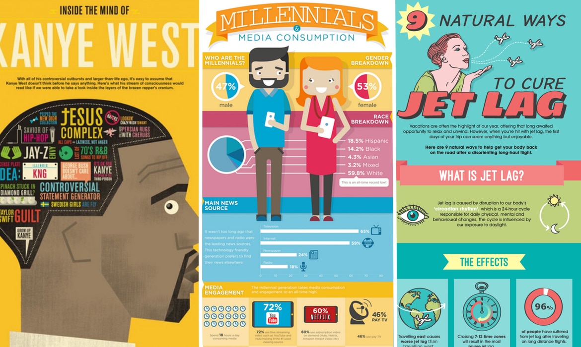
![]()
One of the best tools for showing any information in the most concise form of graphics is the use of symbols and icons that have come to define everyday things. While designing an infographic, the size and theme of the symbols and icons should be taken care of. They should be of similar size and theme. Their colours-scheme should also follow the same tone and gradient so that they do not become a distraction for the reader. Clip art also acts in similar ways to icons and symbols which is easily available on the internet. But some of the best icons are designed by graphic artists who provide personalized design services.
Pie charts:
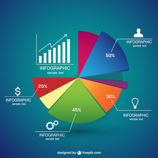
Use of Colourful and graphically enhanced pie-charts can communicate a huge chunk of information in the most short and concise form. When a single pie chart can communicate a lot of information then it should be the norm and not an exception in the design sphere.
While designing pie-charts for infographics, it should be considered that their colour scheme matches or corroborates the overall colour scheme of the infographic.
Arrow-heads:

Arrow-heads in a design gives any particular thought- a direction, so that a person reading it can follow the information presented in it to the conclusion. They can be used in creative ways by the designer who understands the dynamics of the information to make the infographic highly comprehensible.
Cartoons:

Cartoons and clip-art figures adds to the infographic an amazing piece of design. This captures the attention of the reader and gives the information a story-format to be presented. A cartoon character in an infographic can also act as a narrator describing a piece of information.
Colour Schemes:
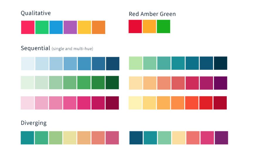
Colour schemes play a hugely important role in an infographic too. A lot of times an infographic can become distracting if the right colour scheme is not used. The use of colours in an infographic should follow a theme. A limited range of 2-4 colours should be used if more information is being provided. The less the better should be the policy here. The guidance for the combination of colours can be taken from the internet. Good colour combination makes great infographics.
Infographics Camparison: What to do? & What NOT to do?
Case study. 1: What NOT to do..
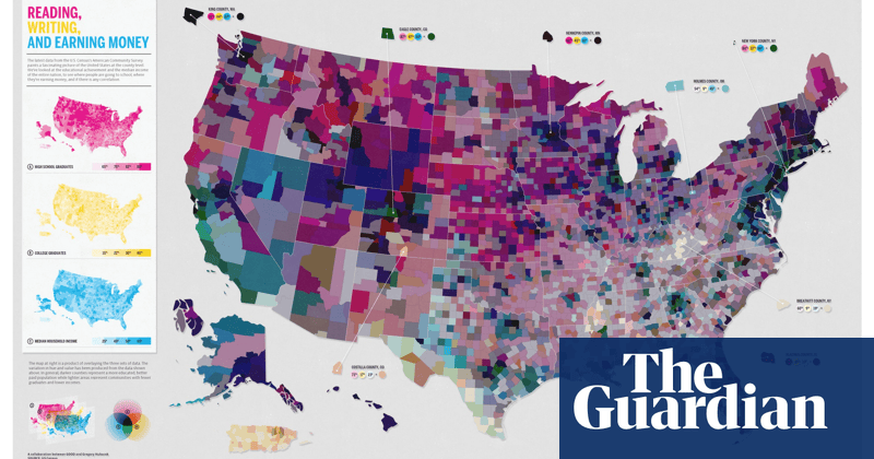
In the above infographic by the Guardian, there is one huge blunder done by the designer- the overuse of colours to present the information. There is no supplementary textual information along with the graphics to make it more comprehensible. Although, the designer has restricted himself/herself to 2-3 colours only but they have been used to tell ALL of the story rather than make if ONE part of the infographic design. This inforgraphic at the first look, giver the reader a much haphazard presentation of facts.
Case study.2: What to do..

The image above is a great example of a well-designed infographic that captures a lot of information using the different tools at the disposal of a graphic designer. The use of just 3-4 colors that follow a particular theme and the matching tone gradient is excellent. The use of universally understandable symbols and icons of design makes it highly comprehensible. The use of a single type of font makes reading the infographic less distracting for the reader. The text has been increased in size, in just the right places for attracting the attention of the reader. This type of effective infographic poster design is just one example of what is offered by companies offering graphic designing services on the internet.
You can get custom infographics developed by Draftss or you can get free infographic templates by Visme.
Drop your thoughts in the comments below.
Your email address will not be published. Required fields are marked *