
Anticipate change. Create winning experiences. Learn more about the UserIQ customer success platform.
The UserIQ pricing section is effective for several reasons:
-
Clear Hierarchy and Visual Appeal:
- Headline Focus: “USERIQ PRICING” clearly identifies the topic. The subheading “17 Days to a Customer Success Win” immediately highlights a key benefit and value proposition.
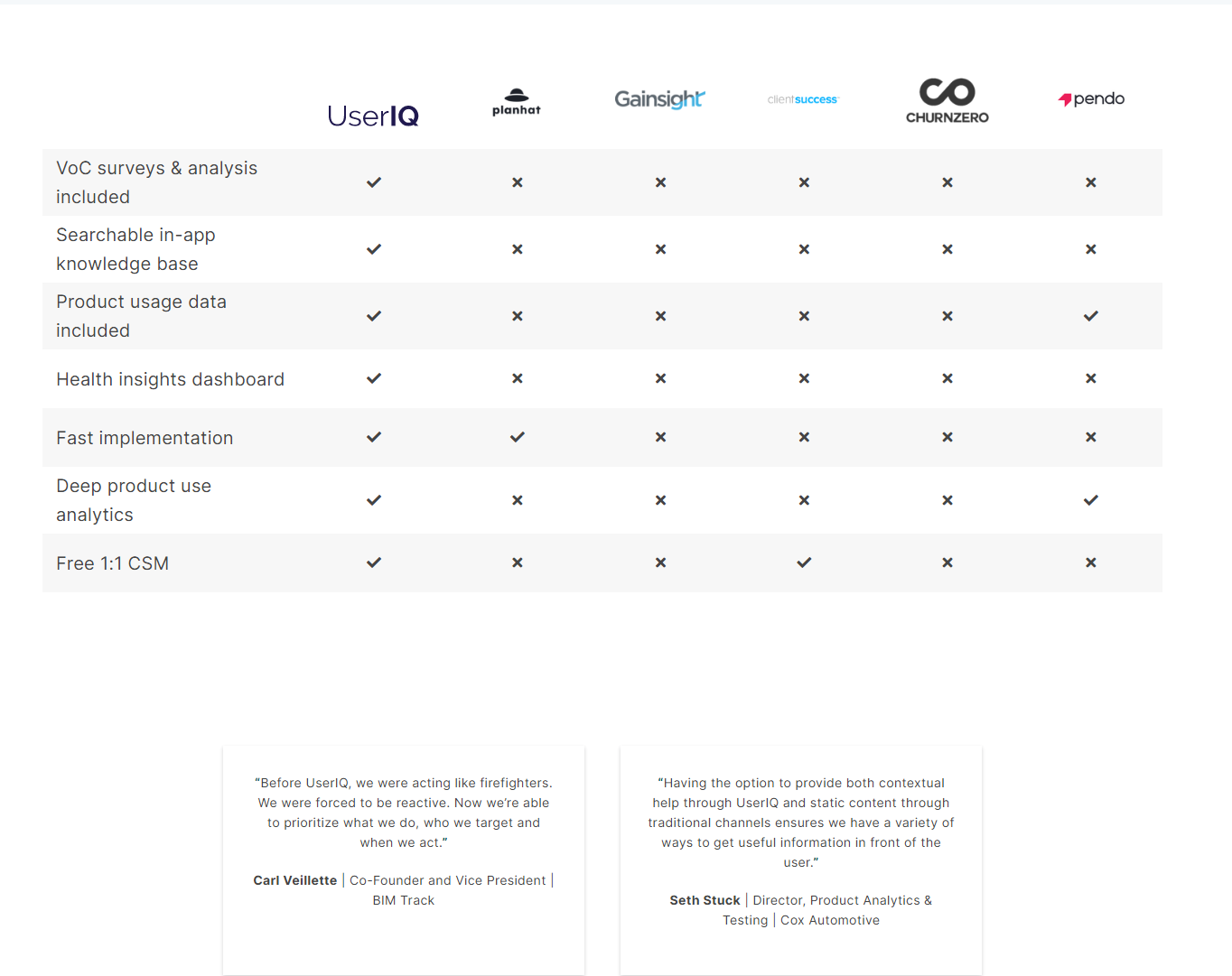
- Visual Cues: A simple, clean design with a prominent “Get Your Demo” button draws attention. A comparison table uses checkmarks to visually differentiate features.
- Layout: The layout is straightforward, presenting key information concisely.
-
Value-Based Differentiation:
- Key Benefit Focus: The emphasis on time-to-value (17 days) is a strong differentiator.
- Feature Comparison: The table clearly compares UserIQ’s features against competitors, highlighting its advantages.
-
Transparent Pricing:
- Pricing Information: While specific pricing is not displayed, the focus on rapid time-to-value and ease of implementation positions UserIQ as a worthwhile investment. The “Get Your Demo” CTA suggests a personalized sales approach.
-
Addressing Different User Needs:
- Target Audience: The language and focus on customer success suggest a target audience of customer success managers and product leaders.
- Feature Comparison: The comparison table highlights features relevant to this audience, such as VoC surveys, in-app knowledge base, and health insights dashboards.
-
Strategic Use of Information:
- Customer Stories: Testimonials provide social proof and build trust.
- Comparison Table: The comparison table effectively showcases UserIQ’s strengths against competitors.
- Clear Call to Action: The “Get Your Demo” button is a clear and direct CTA.