

Infogram
Infogram is an easy to use infographic and chart maker.
Infogram Pricing Page Design
$50 - $149 5+ Plans
Launch Website
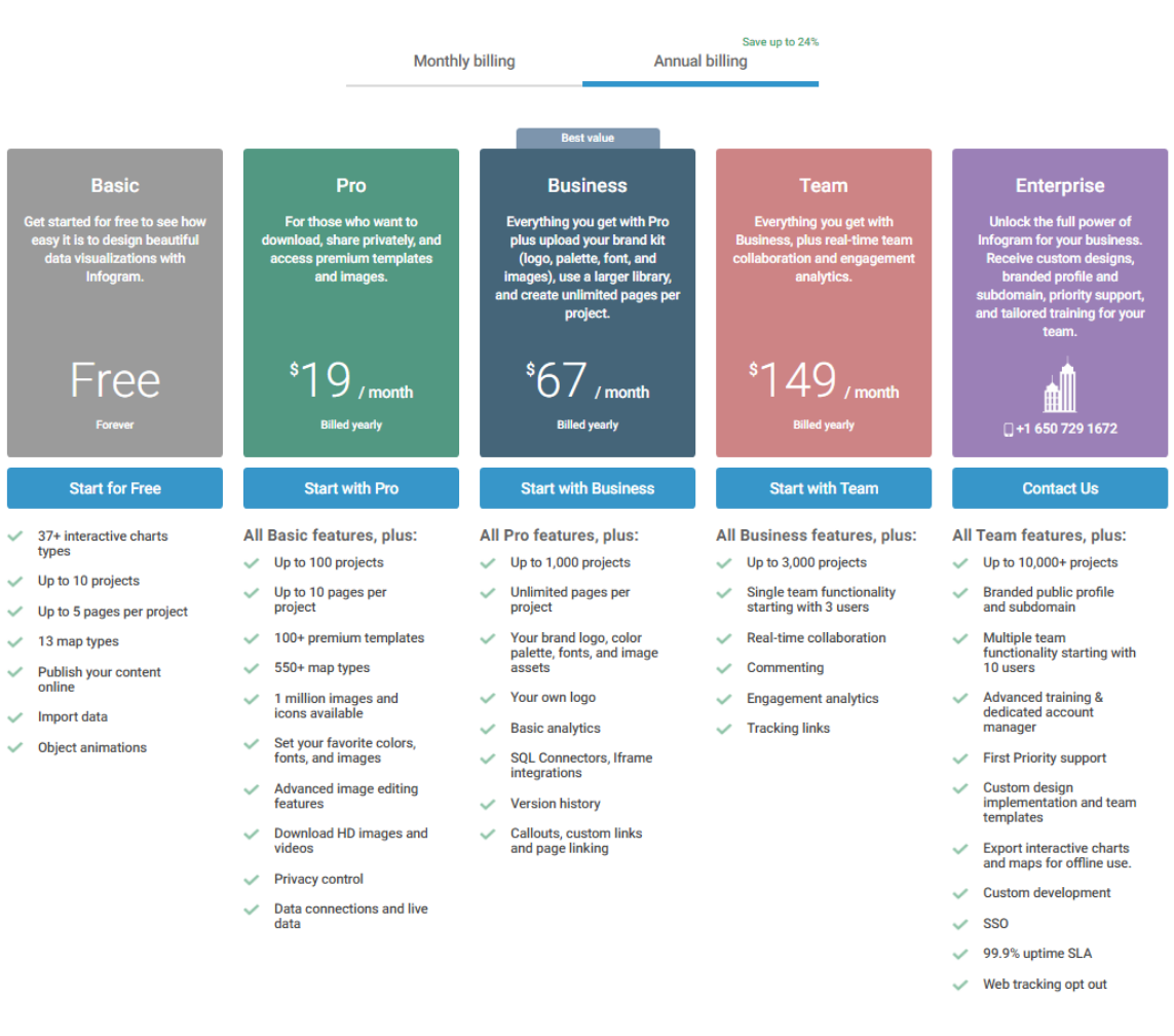
Create and share beautiful infographics, online reports, and interactive maps. Make your own here.
The Infogram pricing section is effective for several reasons:
- Clear Tiered Structure and Targeting:
- Distinct Tiers: The “Free,” “Basic,” “Pro,” “Business,” “Team,” and “Enterprise” tiers are clearly defined and visually separated, making it easy to compare options.
- Target Audience Descriptions: Each tier is accompanied by a concise description of its ideal user, helping potential customers quickly identify the most suitable plan.
- Transparent Pricing and Value Communication:
- Clear Price Points: The prices are prominently displayed for each paid tier, with the “Free” tier clearly marked.
- Annual Billing Savings: The “Save up to 24%” banner and the “Billed yearly” labels highlight the potential savings with annual billing.
- “Best Value” Highlight: The “Best Value” banner clearly indicates the recommended plan, guiding users towards a popular choice.
- Emphasis on Feature Differentiation:
- Feature Lists: Detailed feature lists for each tier allow users to easily compare functionalities and understand the added value of higher-tier plans.
- Feature Progression: The lists show a clear progression of features, with higher tiers offering more advanced capabilities like team collaboration, branded profiles, and advanced support.
- Strategic Use of Calls to Action:
- “Start for Free,” “Start with [Tier],” and “Contact Us” Buttons: Clear and prominent buttons encourage users to take action.
- Visual Clarity and Organization:
- Clean Layout: The layout is clean and organized, making it easy to read and understand the information.
- Consistent Formatting: Consistent formatting across tiers enhances readability and makes comparisons easier.
- Checkmarks: Checkmarks are used effectively to highlight included features.
- Focus on Core Value:
- Data Visualization: The emphasis on interactive charts, maps, and data import highlights the core value proposition of the platform.
- Branding and Collaboration: The focus on branding features and team collaboration tools demonstrates the platform’s suitability for businesses and teams.
- Flexible Billing Options:
- Monthly/Annual Toggle: The toggle switch allows users to easily compare the pricing difference between monthly and annual billing.