
Evernote
Our note-taking app helps you capture and prioritize ideas, projects and to-do lists, so nothing falls through the cracks.
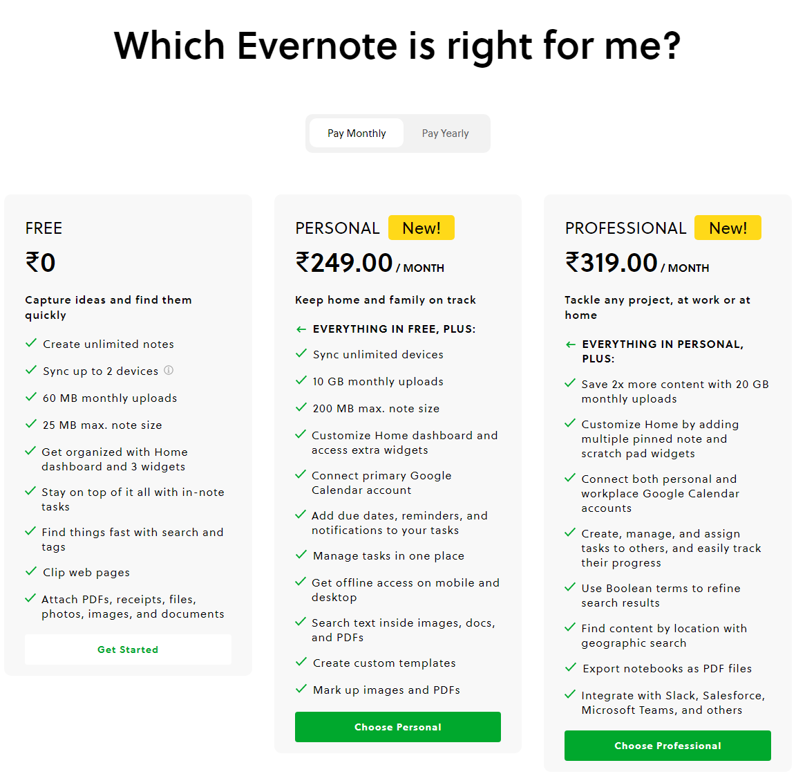
Evernote Pricing Page Design
$150 - $499 3 Plans
Launch Website
Start your free trial today!
The Evernote pricing section is effective for several reasons:
1. Clear Hierarchy and Visual Appeal:
- Headline Focus: “Which Evernote is right for me?” directly addresses the user’s decision-making process.
- Tiered Structure: “FREE,” “PERSONAL,” and “PROFESSIONAL” tiers are clearly labeled and visually separated.
- Visual Cues: Checkmarks effectively indicate feature availability. The “New!” tags highlight recent additions. The “Get Started” and “Choose Personal/Professional” buttons are visually distinct and encourage action.
- Layout: The layout is clean and organized, with consistent formatting and clear spacing.
2. Value-Based Differentiation:
- Target Audience: Each tier is targeted to different user groups (basic users, individuals/families, professionals).
- Feature List: The feature lists clearly outline the core differences between the plans, emphasizing the added value of the paid tiers.
3. Transparent Pricing:
- Pricing Information: The “FREE” tier is clearly marked as ₹0, and the paid tiers’ prices are prominently displayed. The “Pay Monthly/Pay Yearly” toggle offers clear pricing options.
4. Addressing Different User Needs:
- Tier Names: The tier names suggest different levels of usage and support.
- Feature Availability: The feature availability caters to different needs, from basic note-taking to advanced productivity features.
5. Strategic Use of Information:
- Call to Action: “Get Started” and “Choose Personal/Professional” buttons are clearly visible, encouraging user engagement.
- Other Information: The descriptions provide clear explanations of each plan’s benefits and target audience. The inclusion of monthly upload limits and note size limits provides transparency.