This Snapengage pricing section is effective for several reasons:
1. Clear Hierarchy and Visual Appeal:
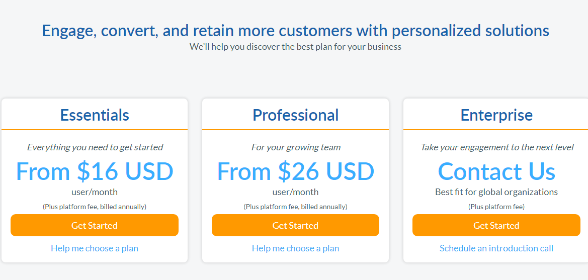
- Headline Focus: “Engage, convert, and retain more customers with personalized solutions” immediately highlights the core value proposition.
- Tiered Structure: “Essentials,” “Professional,” and “Enterprise” tiers are clearly labeled and visually separated.
- Visual Cues:
- The pricing is prominently displayed with a clear “From $[Price] USD user/month” format.
- The “Get Started” buttons are visually distinct and consistent.
- The “Contact Us” button for the “Enterprise” tier stands out, indicating a different approach.
- The “Help me choose a plan” and “Schedule an introduction call” links provide additional guidance.
- Layout: The layout is clean, organized, and easy to follow, with consistent formatting.
2. Value-Based Differentiation:
- Target Audience: Each tier is tailored to different user groups (getting started, growing teams, global organizations).
- Benefit-Oriented Descriptions: The descriptions focus on the benefits each tier provides (e.g., “Everything you need to get started,” “Take your engagement to the next level”).
3. Transparent Pricing (Partial):
- Clear Starting Prices: The “Essentials” and “Professional” tiers have clear starting prices.
- Quote-Based Approach for Enterprise: The “Enterprise” tier uses “Contact Us,” indicating a more customized pricing approach.
- Additional Cost Note: The “(Plus platform fee, billed annually)” clarifies that the displayed price is not the total cost.
4. Addressing Different User Needs:
- Tier Names: The tier names are intuitive and suggest a progression in features and capabilities.
- User Guidance: The “Help me choose a plan” links provide assistance for users unsure of which tier to select.
- Enterprise Focus: The “Best fit for global organizations” description for the “Enterprise” tier clearly targets a specific audience.
5. Strategic Use of Information:
- Benefit-Driven Headline: The headline directly addresses customer needs and highlights value.
- Clear Call to Action: The “Get Started” and “Contact Us” buttons provide clear paths for action.
- Additional Guidance: The “Help me choose a plan” and “Schedule an introduction call” links offer additional support.
- Global Reach: The use of “USD” indicates a global target audience.
- Concise Descriptions: The descriptions are brief and to the point, making it easy for users to quickly understand the differences between tiers.