The Walkme pricing section is effective for several reasons:
Clear Differentiation Between Tiers:
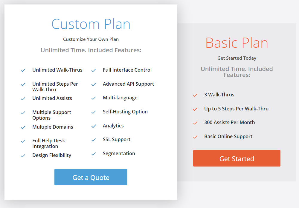
“Custom Plan” vs. “Basic Plan”: The clear naming and visual separation immediately highlight the difference between a fully customizable option and a basic, pre-defined plan.
Feature Lists: The detailed feature lists for each tier allow for easy comparison and help users understand the value proposition of each option.
Emphasis on Customization:
“Customize Your Own Plan”: The tagline for the “Custom Plan” emphasizes the flexibility and control offered to users with specific needs.
Extensive Feature List: The comprehensive list of features in the “Custom Plan” highlights the range of options available for customization.
Transparent Pricing for Basic Plan:
“Get Started Today”: The clear call to action and the lack of a price indicate a free or very low-cost entry point for the “Basic Plan.”
Strategic Use of “Get a Quote”:
Custom Pricing: The “Get a Quote” button for the “Custom Plan” is appropriate for complex or enterprise-level solutions where pricing depends on specific requirements.
Visual Clarity and Simplicity:
Clean Layout: The layout is clean, organized, and easy to scan, making it simple for users to compare features and understand the offerings.
Checkmarks: The use of checkmarks effectively highlights included features and enhances visual appeal.
Contrasting Colors: The use of blue for the “Get a Quote” button and orange for the “Get Started” button helps to differentiate the calls to action.
Focus on Core Features:
Unlimited Time: The “Unlimited Time” designation for both plans suggests a focus on providing long-term value to users.