-
Clear and Compelling Headline:
“Build dashboards and track performance from everywhere” is a strong, concise, and benefit-driven headline. It immediately communicates the core value proposition and speaks directly to the needs of the target audience (likely marketers, analysts, and business owners). The phrase “from everywhere” emphasizes accessibility and flexibility.
-
Value Proposition:
The subheadline expands on the headline by explaining how Databox enables this: “Connect your data from any tool and track it from any device. No more logging into dozens of different tools to understand performance – now you and your team can easily connect your data, build and share reports, monitor trends, and discover insights.”
This highlights key aspects:
- Universal data connectivity (any tool).
- Cross-device accessibility.
- Elimination of manual data consolidation.
- Team collaboration features.
- Reporting, trend monitoring, and insights.
-
Strong Call-to-Action (CTA):
“Start now →” is a clear, prominent, and action-oriented CTA. The email input field combined with the CTA makes the signup process streamlined. The “FREE SIGNUP” button in the navigation bar also serves as a secondary CTA.
-
Visual Reinforcement:
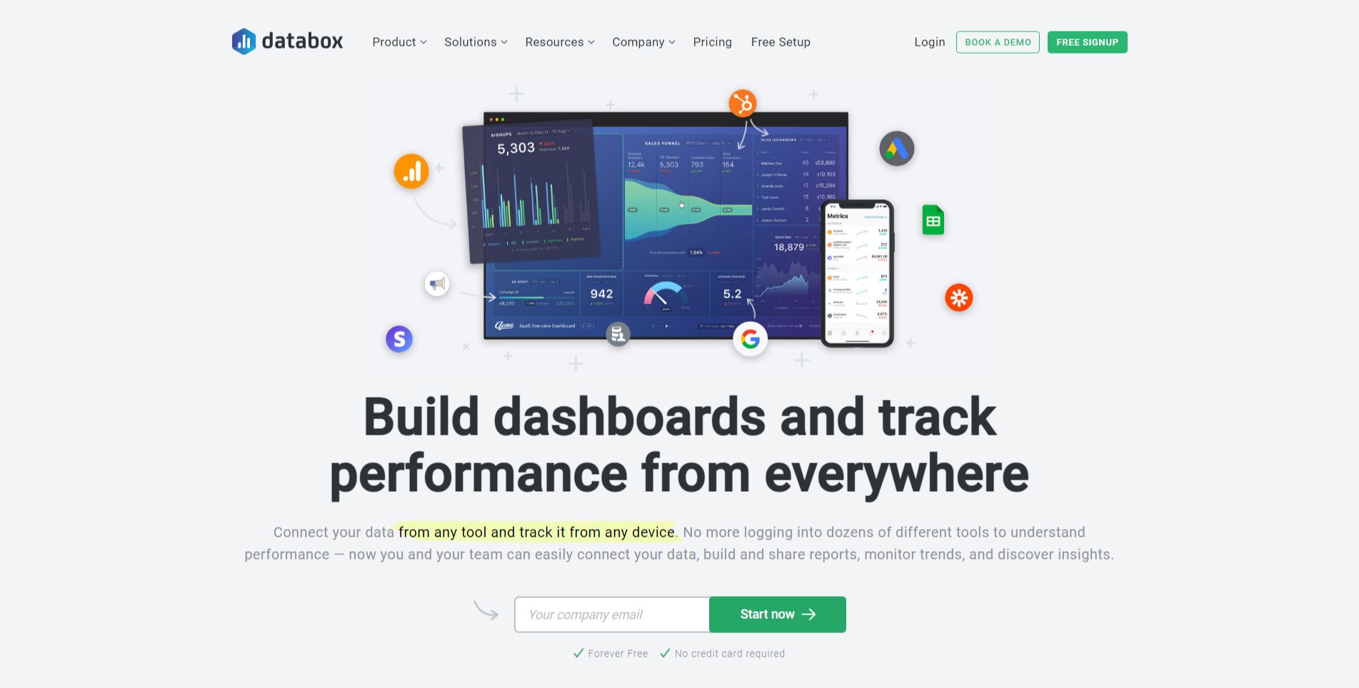
- Dashboard Mockup: The central visual element is a mockup of a Databox dashboard displayed on various devices (desktop, tablet, phone). This provides a concrete example of the product in action and visually reinforces the “build dashboards” aspect of the headline. The data points and visuals within the dashboard suggest data analysis and performance tracking.
-
Strategic Design:
- Color Palette: The use of a clean white background with blue accents creates a professional and trustworthy feel. The bright green CTA button stands out effectively.
- Typography: The use of clear and readable fonts ensures the information is easily digestible.
- Visual Hierarchy: The headline is the most prominent element, followed by the dashboard mockup, the subheadline, and the CTA, creating a clear visual hierarchy.
-
Focus on the Target Audience:
The language and messaging are clearly targeted at data-driven professionals who need to monitor performance across various platforms and devices.
-
Unique Aspects:
- The combination of “connect your data from any tool” and “track it from any device” is a powerful and compelling value proposition.
- The streamlined signup process with the email input field directly in the hero section makes it easy for users to take the next step.
- The dashboard mockup provides a concrete visualization of the product and its capabilities.
- The “Forever free. No credit card required” reassurance removes potential hesitation and encourages sign-ups.