-
Clear and Compelling Headline:
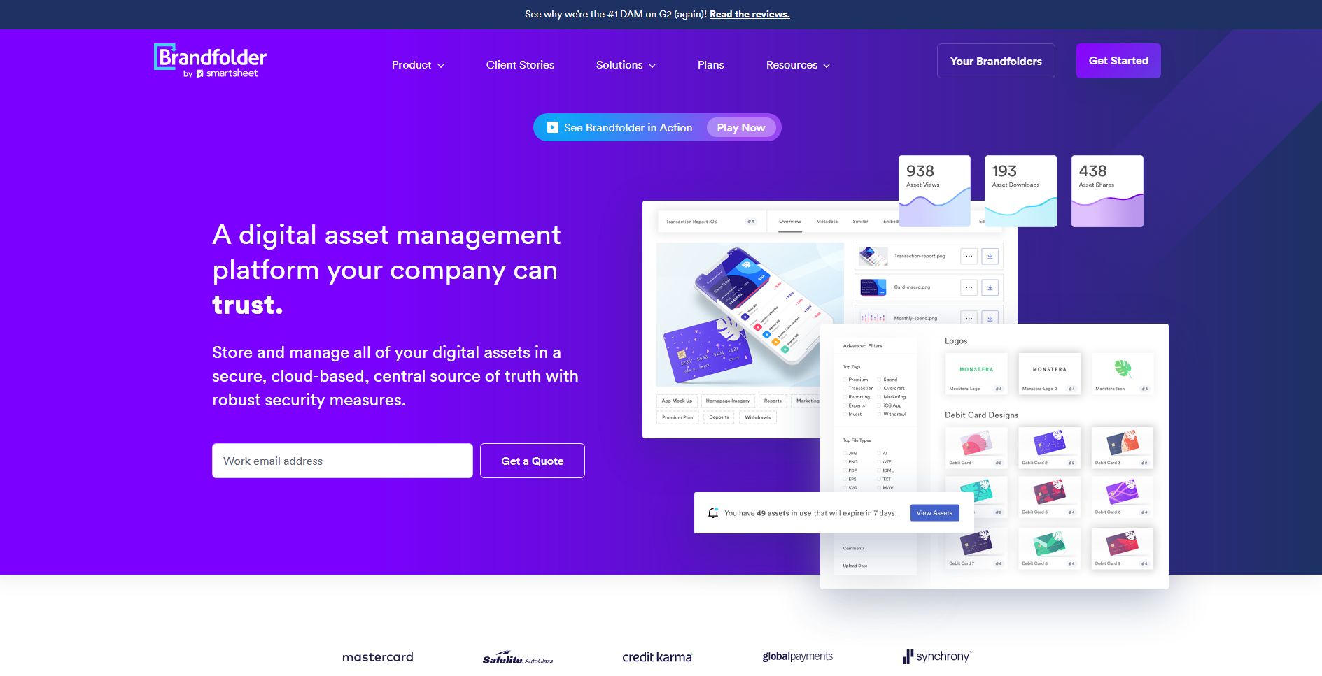
“A digital asset management platform your company can trust.” This is a strong, clear, and direct headline. It immediately communicates the core offering and speaks to a key need for businesses: trust in their DAM solution.
-
Value Proposition:
The text below the headline expands on the value proposition: “Store and manage all of your digital assets in a secure, cloud-based, central source of truth with robust security measures.”
This highlights key benefits:
- Centralized storage and management.
- Cloud-based accessibility.
- Robust security measures.
-
Strong Call-to-Action (CTA):
“Get a Quote” is a clear, prominent, and action-oriented CTA. It encourages immediate engagement and focuses on lead generation. The “See Brandfolder in Action” and “Play Now” buttons offer alternative engagement options, with the latter likely leading to a video demonstration.
-
Visual Reinforcement:
- Screenshot of the Platform: The prominent screenshot of the Brandfolder platform provides a concrete example of the product in action and visually reinforces the “digital asset management” aspect of the offering. The interface shown suggests various features, including asset organization, search, and collaboration tools.
- Purple Background: The use of a bold purple background is visually striking and gives the product a modern, sophisticated feel. It also helps the white text and platform screenshot stand out.
-
Strategic Design:
- Color Palette: The purple and white color scheme is modern, clean, and professional. The use of Brandfolder’s brand colors adds consistency.
- Typography: The use of clear and readable fonts ensures the information is easily digestible.
- Visual Hierarchy: The headline is the most prominent element, followed by the screenshot, the value proposition text, and the CTAs, creating a clear visual hierarchy.
-
Focus on the Target Audience:
The language and messaging are clearly targeted at marketing teams, creative professionals, and businesses looking to streamline their digital asset management.
-
Unique Aspects:
- The “See why we’re the #1 DAM on G2 (again!) Read the reviews” banner at the top provides strong social proof and builds credibility.
- The “938 / 193 / 438” statistics (likely related to customer satisfaction, reviews, or usage) further reinforce the message of trust and widespread adoption.
- The prominent display of recognizable company logos (Mastercard, Safelite, Credit Karma, etc.) at the bottom provides additional social proof and builds trust, especially in the B2B space.