The MURAL hero section is effective for its:
1. Clear and Compelling Headline:
“Let’s transform teamwork” is concise, impactful, and immediately establishes the core value proposition.
It goes beyond simply stating what MURAL is (a digital whiteboard) and focuses on the desired outcome: transforming how teams work together.
This resonates with businesses and individuals seeking to improve collaboration and productivity.
2. Value Proposition:
The subheadline, “MURAL connects teams with digital whiteboards and collaboration features designed to inspire innovation,” elaborates on the platform’s value proposition.
It highlights the key features and how they enable teams to work more effectively and creatively.
3. Strong Call-to-Action (CTA):
“START A WHITEBOARD” is a clear and direct CTA, encouraging users to take the next step and experience the platform firsthand.
The placement of this button is prominent and visually appealing.
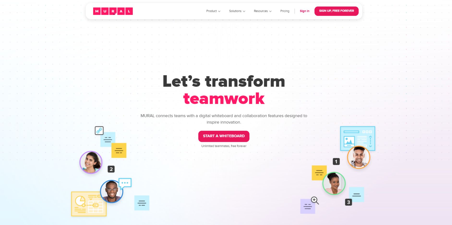
4. Visual Reinforcement:
The image effectively reinforces the core value proposition.
The visual representation of a team collaborating on a digital whiteboard, with sticky notes and avatars, clearly illustrates the platform’s collaborative nature and how it can be used for brainstorming, ideation, and project planning.
The use of bright, vibrant colors creates an energetic and engaging atmosphere.
5. Strategic Design:
Color Palette: The use of a predominantly white background with contrasting pink and blue accents creates a clean, modern, and energetic aesthetic. The color scheme is visually appealing and aligns with the brand identity.
Typography: The use of a large, bold font for the headline and subheadline emphasizes the key message. The font choice is modern and easy to read, enhancing the overall visual appeal.
White Space: The effective use of white space creates a sense of openness and allows the key elements of the hero section to stand out. It also improves readability and makes the overall design less cluttered.
Visual Flow: The arrangement of the elements, with the headline and subheadline at the top, followed by the visual representation of teamwork and the CTA, creates a clear visual flow that guides the user’s attention.
6. Focus on the Target Audience:
The language and messaging clearly target teams and organizations looking to improve collaboration and innovation.
The emphasis on digital whiteboards, teamwork, and inspiration resonates with the needs and priorities of this audience.
7. Unique Aspects:
The use of the phrase “Let’s transform teamwork” is particularly effective as it positions MURAL as a catalyst for positive change within teams.
The visual representation of the team collaborating on the whiteboard provides a concrete example of how the platform can be used in practice.