-
Clear and Compelling Headline:
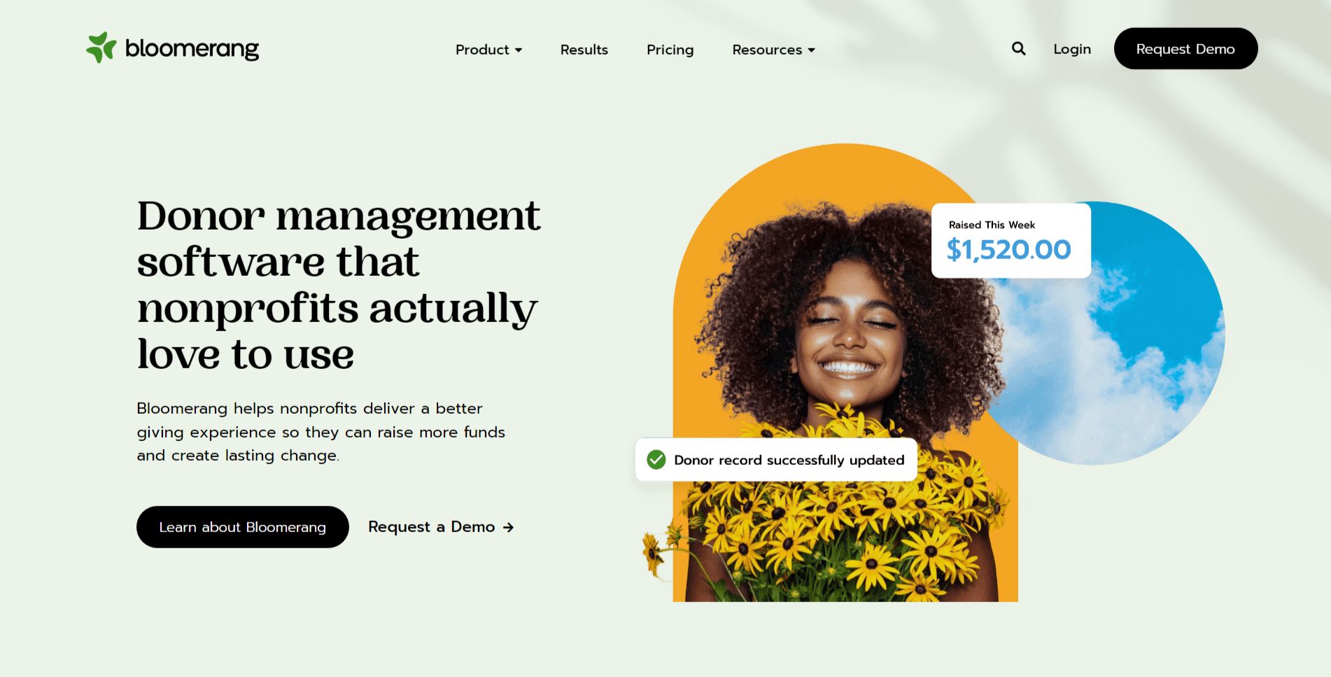
“Donor management software that nonprofits actually love to use” is a strong, concise, and benefit-driven headline. It immediately addresses a key pain point for nonprofits (software that’s difficult to use) and offers a solution (software that’s loved). The emphasis on “actually love” adds a touch of personality and relatability.
-
Value Proposition:
The text below the headline expands on the value proposition: “Bloomerang helps nonprofits deliver a better giving experience so they can raise more funds and create lasting change.”
This highlights key benefits:
- Improved giving experience for donors.
- Increased fundraising capabilities.
- Ability to create lasting change.
-
Strong Call-to-Action (CTA):
“Learn about Bloomerang” and “Request a Demo →” are both clear, prominent, and action-oriented CTAs. They offer different engagement paths: learning more about the product and requesting a personalized demonstration. This caters to different user preferences and stages of the buying journey.
-
Strategic Design:
- Typography: The presence of menu items, a logo, CTAs, and a dollar amount suggests a structured layout.
- Visual Hierarchy: “Donor management software that nonprofits actually love to use” is likely the most prominent text.
-
Focus on the Target Audience:
The language and messaging are clearly targeted at nonprofit organizations and professionals. The emphasis on donor experience, fundraising, and lasting change resonates with their mission and priorities.
-
Unique Aspects:
- The headline’s focus on software that nonprofits “love to use” is a strong differentiator and addresses a common concern in the nonprofit sector.
- Offering two distinct CTAs caters to different user needs and stages of the buying journey.
- The “Raised This Week $1,520.00” element (if dynamically updated) provides real-time social proof and demonstrates the platform’s fundraising capabilities.
- The “Donor record successfully updated” notification (if part of the visual design) suggests ease of use and efficient donor management.