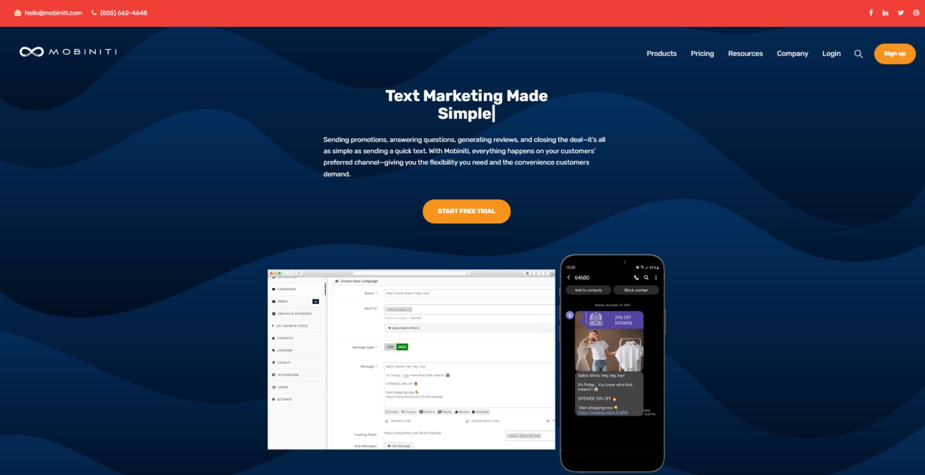
The Mobiniti hero section is effective for its:
1. Clear and Compelling Headline:
“Text Marketing Made Simple” is concise, impactful, and immediately establishes the core value proposition.
It directly addresses a common pain point for businesses – the perceived complexity of text marketing campaigns.
By emphasizing simplicity, it positions Mobiniti as a user-friendly and accessible solution.
2. Value Proposition:
The subheadline, “Sending promotions, answering questions, generating reviews, and closing the deal – it’s all as simple as sending a quick text.
With Mobiniti, everything happens on your customers’ preferred channel – giving you the flexibility you need and the convenience customers demand,” elaborates on the platform’s benefits.
It highlights the breadth of applications for text marketing and emphasizes the focus on customer convenience and flexibility.
3. Strong Call-to-Action (CTA):
“START FREE TRIAL” is a clear and prominent CTA, encouraging users to take the next step and experience the platform firsthand.
The use of a contrasting color (green) makes the button stand out and draws immediate attention.
4. Visual Reinforcement:
Dynamic Background: The abstract, wave-like background adds a touch of dynamism and energy to the hero section, creating a visually engaging experience.
Device Mockups: The inclusion of device mockups showcasing the platform’s interface and a sample text message provides a concrete visual representation of how Mobiniti works and its user-friendliness.
Emphasis on Simplicity: The overall visual style is clean and uncluttered, reinforcing the message of simplicity and ease of use.
5. Strategic Design:
Color Palette: The use of a bold red color for the headline and CTA creates a sense of urgency and excitement, drawing the user’s attention. The contrasting white background ensures high readability.
Typography: The use of a clean and modern font for the headline and subheadline enhances readability and reinforces the brand’s professionalism.
Visual Hierarchy: The headline and subheadline are prominently displayed, followed by the visual elements and the CTA, creating a clear visual hierarchy that guides the user’s attention.
6. Focus on the Target Audience:
The language and messaging clearly target businesses and marketers looking to leverage text marketing for customer engagement and business growth.
The emphasis on simplicity, flexibility, and customer convenience resonates with the needs and priorities of this audience.
7. Unique Aspects:
The use of the phrase “Text Marketing Made Simple” is particularly effective as it directly addresses a common perception that text marketing can be complex and time-consuming.
The visual representation of a text message conversation within the device mockup adds a touch of realism and helps users visualize how the platform can be used in real-world scenarios.