Email design is a critical aspect of the Emails that a business sends out. It can be about the progress that a business has made in a certain area, or informing the clients and customers about something new in the company, or simply an advertisement of a new product or service that is being launched.
Most businesses have email subscribers. With the beginning of a new year and a new decade, it would be interesting to understand what are the kinds of emails that people would like to read after a largely tiring and boring year. It is also important to be aware of the latest email designs doing the rounds in the market.
What are the email design trends for 2021?
1. Visual content–
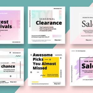
The use of graphics in emails was a hit in 2020. We have entered the new year with an increased need to shop online. So, it would be useful for businesses to incorporate visually appealing content in their emails. This would make their product more appealing. If the mail is about the launch of a product, graphic content can be used to arouse curiosity in the minds of potential customers.
2. Illustrations–
Emails are no longer bodies of text. Increased usage of illustrations and cartoons has made emails efficient tools of marketing. Images go a long way in conveying the necessary information effectively. They can be used instead of long mundane paragraphs of texts. Cartoons help in keeping the audience engaged. One can also insert small and relevant comic strips in the emails and convey the important message.
On a minimalist background, bright colors do a good job in instilling the product in the minds of the email readers. Little uniformity in the email would be good and make it presentable.
3. Personalization:
Make every customer feel important and prioritized. In such a case, it is important for mails to look customized. For this, use the customer’s name in the body of the email. Give the customer some exclusive offers on your products. This should be done based on his/her previous purchases. If you have an idea about the customer’s favorite colors or patterns, design your emails accordingly.
Customization takes time. But, if properly personalized mail is sent at the right time, it is sure to do a good job. Your brand’s goodwill is going to increase in the customer’s opinion.
4. Cards:
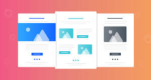
Cards can be used to send out organized and personalized content. A card has a relevant picture on the top, the main message in the middle, and then another image at the bottom. On websites, cards can be dynamic and animated. But, in emails, they are mostly static. The neatness associated with cards is unmatchable. It is also possible to insert symmetrical designs that are relevant to the purpose of the email. Use suitable colors for the background and for text. Don’t make the text too flashy. Remember that cards usually have warm messages in beautiful fonts.
5. Big typography:
There is nothing huge and bright that will escape anyone’s eyes. 2020 celebrated bold typography techniques. 2021 seems to carry the same trend throughout. Insert huge bold pieces of text in the mail conveying one main point. What follows will be information regarding that.
Make sure that the huge bold text has the words chosen rightly. For example, if your business is planning a reduction sale, you might just want to write “SALE” instead of complex long phrases. The message would be conveyed and interested people would look ahead. It is also important to bear in mind in such cases that the bold message should direct the customers to read further. Try to make the huge message coveted, yet not lengthy.
Also, one can try inserting links behind these bold texts such that the customer is directed to a relevant page. This webpage should be impressive and ensure that the client is satisfied. For this, proper web designing must be done. Businesses should explore the different unlimited web designing packages offered by graphic designing companies so that their long and short term needs are taken care of well.
6. Authentic pictures:
While adding images in your promotional emails, avoid using images that are used by others already. Use pictures that are yours. There are many common pictures that are available online for several messages. Use modern graphic designing tools to customize your own pictures. These images should match with the ones you use on your social media pages as well. That way, the customer can identify the brand by looking at the image itself. This is important for building the brand image.
Businesses can leverage the benefits offered in unlimited graphic designing packages. These packages help the business in the long run in developing a strong market presence and brand value.
7. A layer of animations:
In emails, one cannot insert heavy graphics. So, over static images, animations can be used to make the mail more appealing and visually attractive to the readers. It is suggested that these animations be mobile-friendly as well since most emails can be read on the phone now. Also, make sure that these animations don’t occupy the entire mail. They should form just a part of it.
These email design trends for the year 2021 are general. Apart from these, there could be several event-specific, business-specific, and situation-specific designs that are trending now. Businesses have to make themselves aware and ensure to conform to these ways at the earliest.
The most important aspect of changing ways of sending out emails is the design. Companies should hire efficient graphic designers who can make customized email designs that are in coherence with your web and social media designs.
