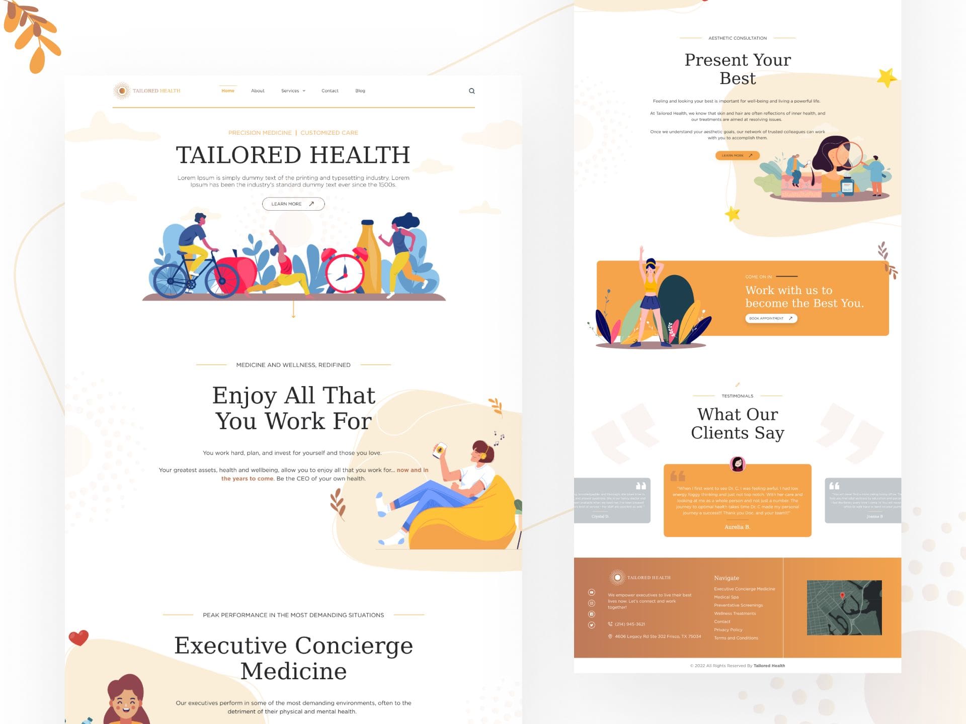
The most crucial goal of UI designers is to create a smooth experience for website visitors. Failing to do so will only lose your company much-needed customers. Good designers know how to make a user-friendly interface to attract people & convert them into customers.
There are some website UI design principles that all good website designers follow. We’ll be talking about 7 such website UI design principles for you to have the maximum ROI.
7 Website UI Design Principles You Must Know
Let’s quickly go through the 7 website UI design principles to enhance your website’s user experience.

1. Design a User-Centric Website
The first website UI design principle is to focus on your users. Understanding who your users are & what they want will be the base for your website-building strategy.
Remember, users should feel they are in control. Don’t force users into taking any action. Rather, navigate them toward your CTAs & other informational body copy.
2. Have a Simple UI Design
A website’s user interface should be clear & simple. Often UI designers need to remember who they design their website for & what objectives they want to accomplish through their website. Keep in mind that a good UI design is practical & not overly designed.
When you do too much of anything, it becomes a distraction for users & they end up increasing your bounce rate. So, keep your website’s UI simple & sober.
3. Flexibility
Designing a flexible user interface is a key aspect of website design. Your website must be correctly displayed across all platforms. Be it on android, ios, mobile phones, desktops, tablets, etc., your website needs to be responsive on all devices & operating systems.
This way, you don’t lose out on users who have different gadgets & get the business that you want.
4. Use Signposts
Users should be able to navigate your website easily. To do that, you need to have a good website layout. One of the key ways to do that is by using clear & visible signposts. After all, they are your CTAs that are going to drive action.
Make sure that you make it easy for users to navigate to your CTAs by having a simple & consistent interface.
5. Provide Feedback to Users
Typically, users respond well to the information that is provided about their progress. It gives them an acknowledgment that their actions were successful or not.
For example: When users hover their mouse over a clickable button/function, make it change color or pop to indicate that it’s clickable.
Keep in mind that it’s important that you draw the line between providing feedback & forcing users to look at the feedback.
6. Have a Clear Hierarchy
Every element on every web page is crucial to the user experience. A structured website layout is extremely necessary for users to not get deviated & wander around your website doing nothing.
Users find it easy to navigate toward your CTAs when visual elements are arranged in the correct order to take the expected action. Consider your website’s color scheme, fonts, white spaces, imagery, etc., when designing to streamline the user experience. They matter a lot in emphasizing things & focusing user attention on the places you want the most.
7. Forgive Mistakes
Users often change their minds amidst navigation. Refrain from holding it against users & make backtracking easy for them whenever needed. Incorporating a undo/redo function in your website(if it goes with your design) will certainly benefit users & avoid frustration. This also allows users to explore your website without worrying about negative consequences.
When people find your website attractive & not complicated, they navigate more of your website & might even end up converting into customers.
Ending Thoughts
We’ve listed down 7 Golden Website UI Design Principles that we think are essential in designing your website. Of course, it’s impossible to appeal to every person, but following these principles will attract most people. Apply these design principles to your next project & see the results for yourself.
Feel free to check our Blog page for more such informative articles.


