You must be going to develop a website or want to give your developer an idea of how your website should appear. You have landed on the correct article that will talk in detail about website design tips that will impress your visitors.
In this article, you will find such website design tips that will help you to engage your visitors & then convert them into your customers.
Buckle up, read & decide which tips you can apply to your website.
Top 8 Website Design Tips for Your Website
1. Leverage a Visual Hierarchy
Visual Hierarchy refers to arranging the elements in the order of their importance. For a more detailed understanding of visual hierarchy, you can refer to the 6 Design Principles that Your Website Must Follow.
Users react quickly as they visit a website, developing thoughts about either staying or leaving the website.
For the tips now,
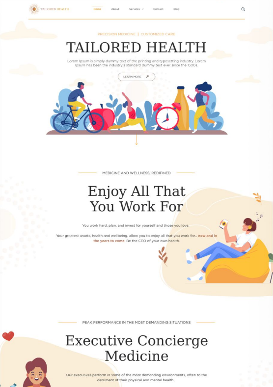
- Fonts – Large font sizes get attention, so try to describe your work to customers with just a 2-6 word limit.
- Whitespace – The key to crisp, clean minimalist designs; use it to calm users’ eyes and direct them to essential foreground elements. More about it is discussed in the later part of this article.
- Colors – Different colors signify messages to the visitors for better understanding check out the color palettes that will suit your business.
- Gestalt principles – These cater to the human eye. Use them to help users group visual elements, notice what’s important on each page & build trust with your brand.
- Consistency – Familiar icons, menu hierarchy, etc. are vital aids for users.
2. Usable CTA
The visitors must be clear about the actions they can take on your website. As a result, have an easy at the same time creative CTA that attracts your visitors.
Another thing to keep in mind would be of using similar buttons as the users can find it confusing for users. To save your visitors, an easy way to clear up their confusion is to use icon-dominant buttons.
Take a look at the Adidas website to how simple their CTAs are that can generate fast & more actions of visitors & less bounce rate.
3. Tall page & answer the questions
More your website is able to describe the product & services to the users better is the chances of them buying from you. So, to get this kind of response your website should have tall pages that can describe your work.
Also, note it’s better to use images, mind trees, or flow charts to describe this rather than just words.
Using GIFs & small embedded videos also can be very useful. Just remember the simple formula more the visitors will know about your products more confident they will feel. Based on your answering the questions for the visitors you can convert them into your customers.
4. Simplicity
Your website’s homepage should communicate your core message instantaneously. After all, we rarely read every word on a website. Instead, we quickly scan the page, picking out keywords, sentences, and images.
With these known behaviors in mind, it’s better to appeal to emotions rather than word count. The fewer site visitors have to read, click on, or remember, the better they’ll be able to process and evaluate your content. By designing for decreasing attention spans & going for a modern website design, it’s more likely that users will do what you intend them to do.
5. Avoid false bottoms
When you give a single section a dark background, viewers will assume that it is a footer. Web designers call this a false bottom—and it is not good web design. If folks assume it’s a footer, they will stop exploring your page (or, worse, leave entirely!).
If you must have full-screen sections in the middle of scrolled areas on your page, avoid making them too much darker than the main content and make sure they engage the user.
Drop your thoughts in the comments below.
Your email address will not be published. Required fields are marked *

