

When it comes to designing a landing page that truly converts, finding the right landing page inspiration can make all the difference. Every now and then, it is good to take inspiration from other websites, as it helps in improving our website design and staying updated with new trends. With detailed planning and creative testing, you can transform your landing page into a conversion machine. While the average landing page conversion rate stands at 2.35%, there are proven strategies to optimize it. The key is to use benefit-driven headlines, value propositions, relevant media, and compelling calls-to-action (CTAs). Whether it’s a webinar, course, B2B service, membership, or newsletter, each type of landing page has unique requirements.
In this article, we will be sharing eight of the best landing page inspirations for startups. These examples will not only spark your creativity but also provide actionable insights to help you refine your own landing pages, ensuring they are optimized for maximum conversions. Whether you’re aiming for a sleek design, powerful CTAs, or a user-friendly layout, the inspiration you find here will help you elevate your landing page game.
Here are the 8 Best Landing Pages for your Inspiration
1) Draftss Landing Page
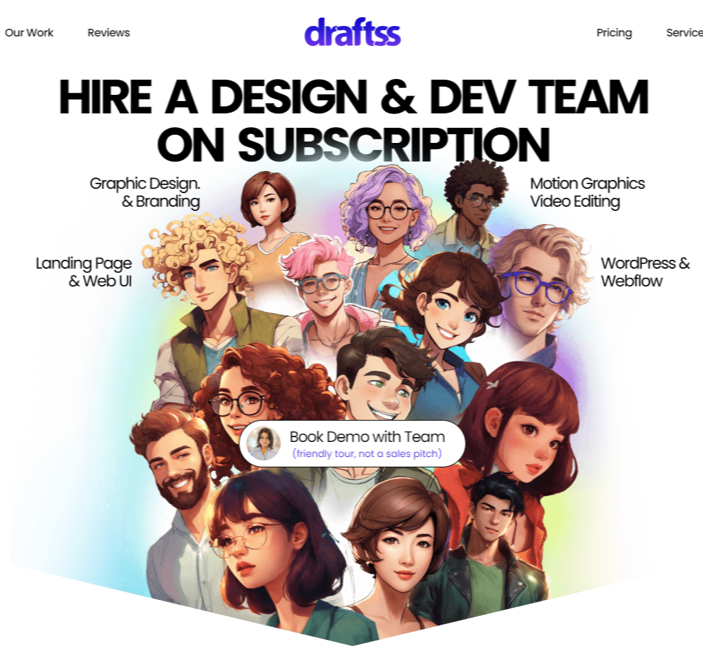
For startups seeking a blend of creativity and functionality in their landing pages, Draftss offers an excellent source of inspiration. The landing page is simple and efficient, showcasing their services with clarity and a focus on user experience.
From the moment you land on Draftss’ homepage, you’re greeted with a straightforward yet powerful message: “Hire a Design & Dev Team on Subscription.” This immediately communicates the value proposition without overwhelming the visitor. With a clear CTA in the center, Draftss invites visitors to book a demo or start their subscription with ease. The user-friendly interface lets visitors navigate with ease, increasing the chances of conversion.
The design is clean and modern, with ample white space that allows each section to breathe, making the content easily digestible. This is also visible in the choice of image, as it sends a message that with each subscription you get a team of designers and developers.
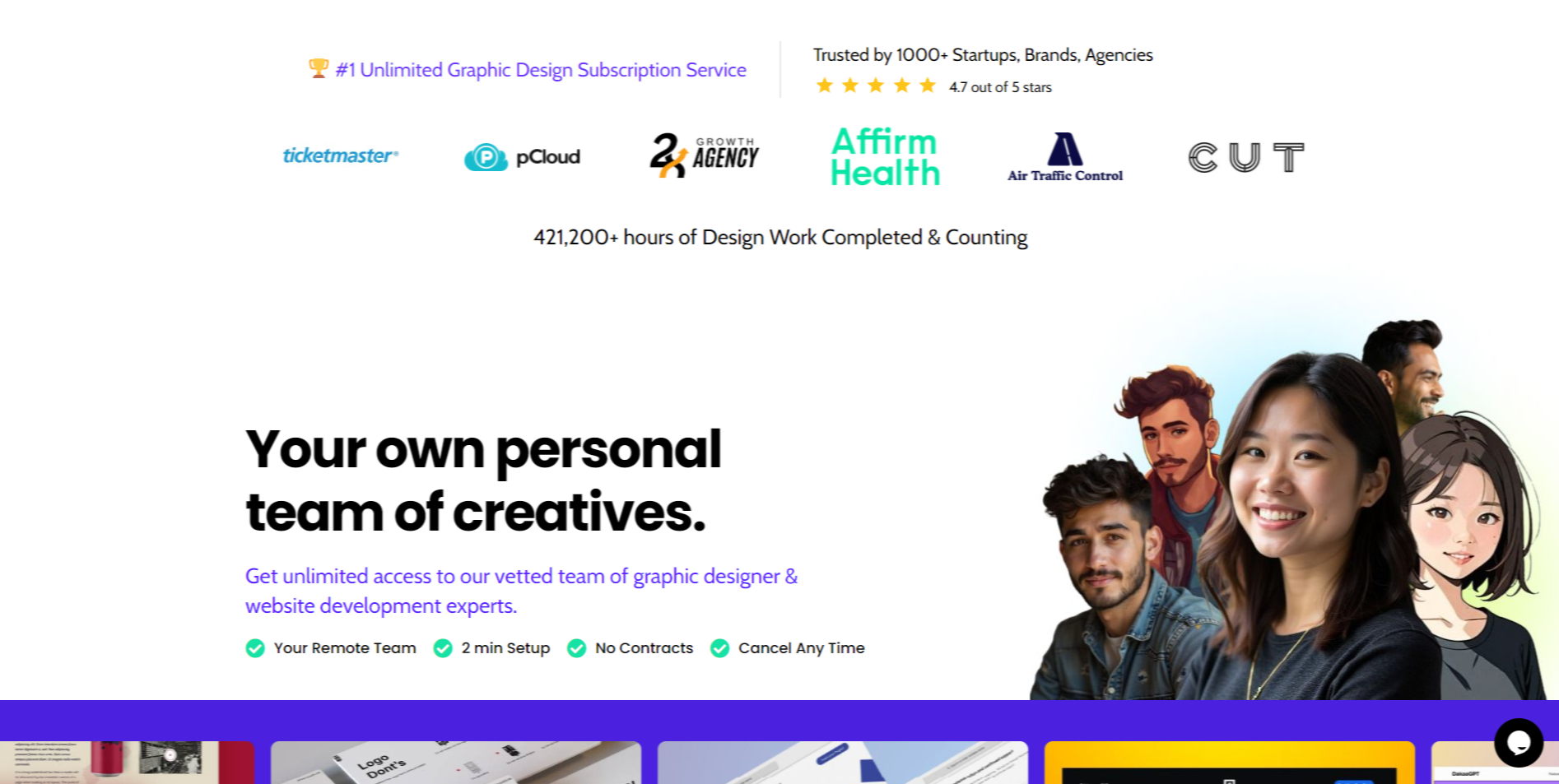
The page effectively uses social proof by highlighting trust from over 1,000 startups and agencies, along with an impressive portfolio of completed work. Visuals are strategically placed to guide the visitor’s attention, using icons and subtle animations to keep the user engaged without distracting them from the core message.
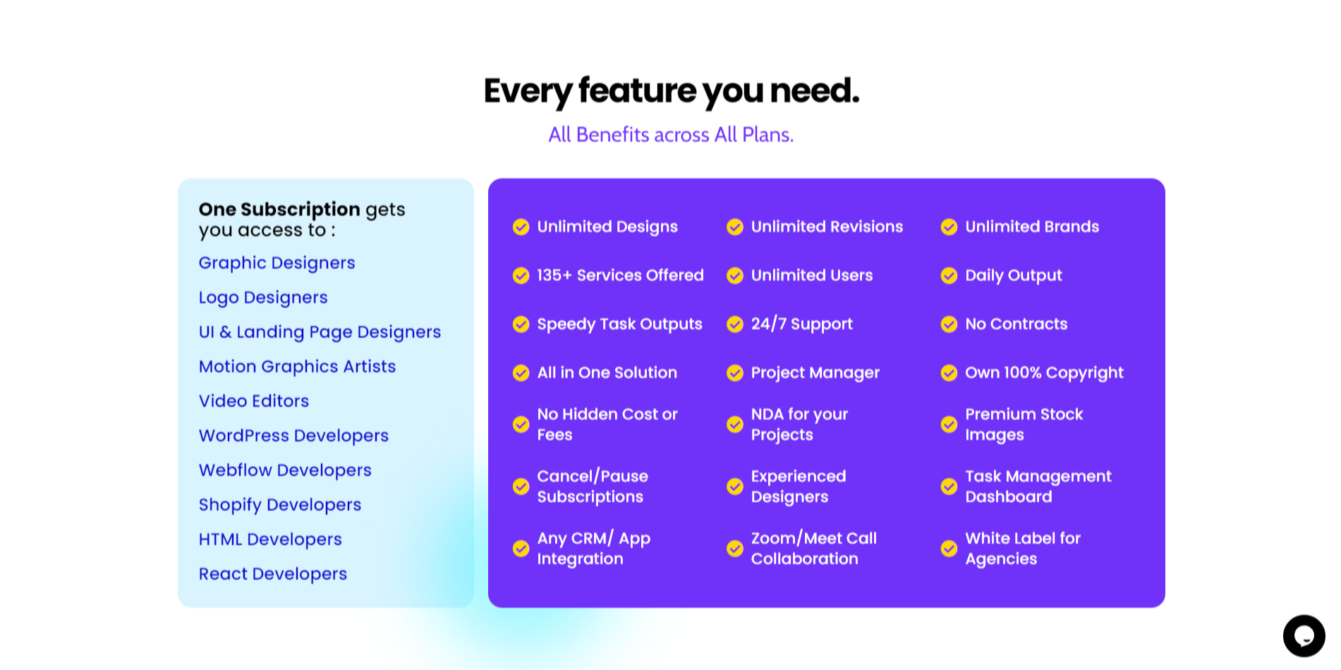
One standout feature is the clear presentation of pricing and services. Draftss breaks down its offerings into easily understandable packages, complete with a detailed list of services and turnaround times. This transparency builds trust, which is crucial for startups looking to invest in design services.
2) Wix Landing Page
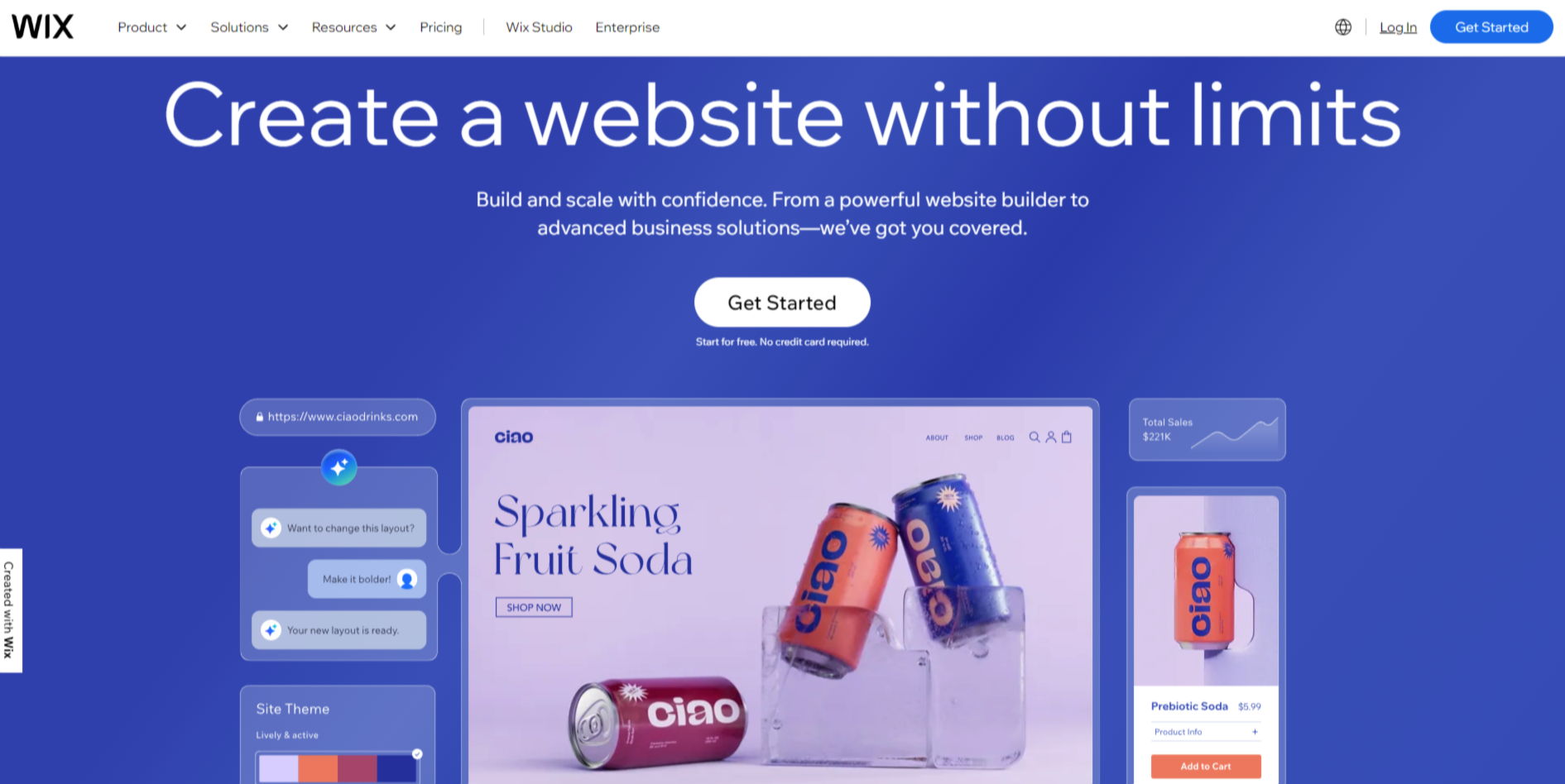
The Wix landing page is known for its eye-catching interactive design. With intuitive animations and modern visuals, it grabs users’ attention instantly. The interactive elements help users engage with the content, making the website experience both enjoyable and informative.
Wix simplifies the signup process by offering clear calls-to-action and a minimalistic form. Users can sign up quickly without feeling overwhelmed by too many fields. This streamlined approach increases the likelihood of conversions by reducing barriers to entry.
Wix prominently highlights user benefits on their landing page. Features like easy-to-use website-building tools, custom templates, and robust customer support are showcased. By clearly communicating these benefits, Wix effectively demonstrates the value it offers to potential users. This helps to build trust and encourages users to take the next step.
3) ExpressVPN Landing Page
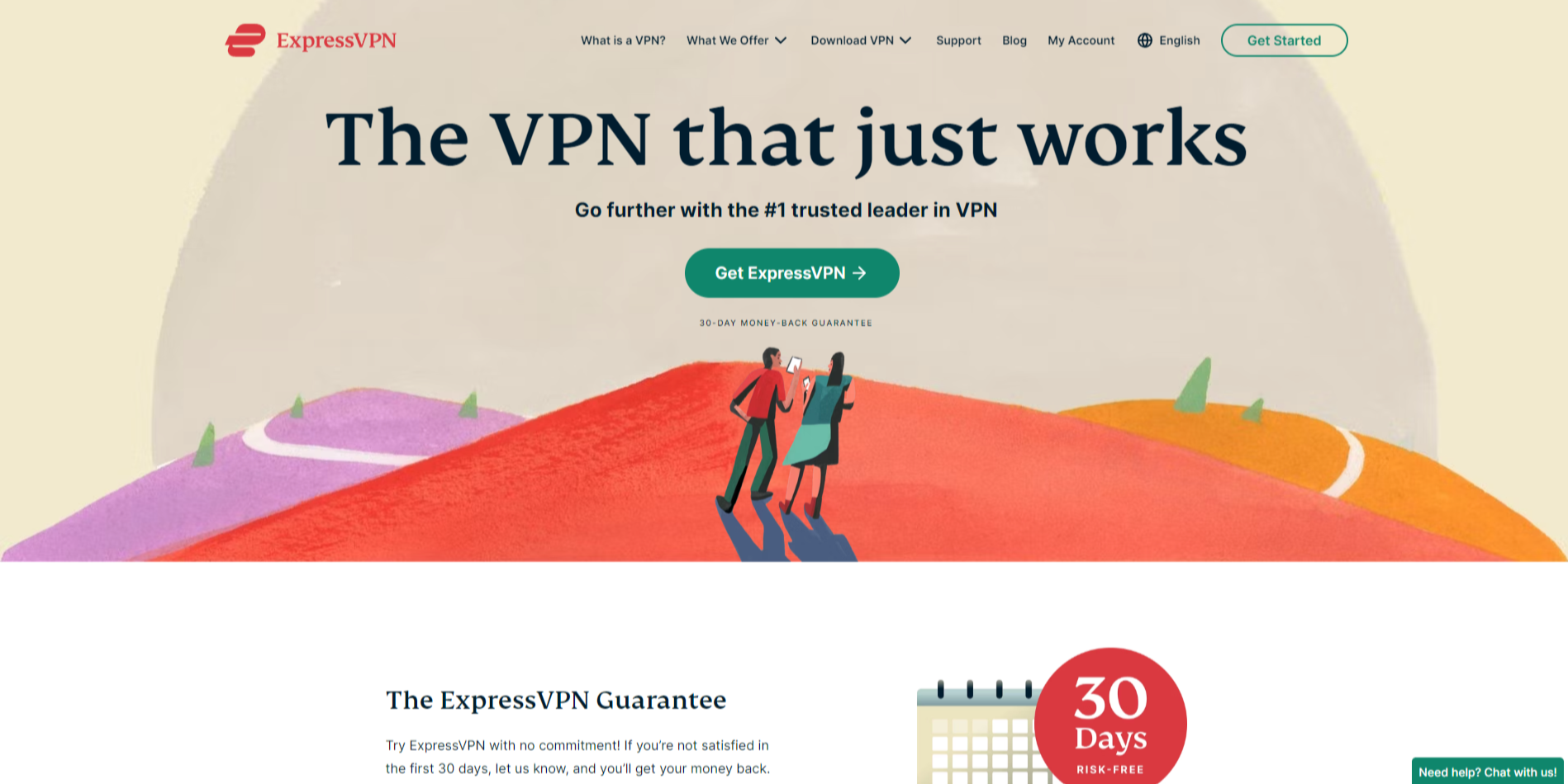
ExpressVPN impressively conveys its strong security value proposition right from the start. The landing page emphasizes the use of top-notch encryption technologies to protect user data, building trust and confidence with potential customers. It features clear messaging about their commitment to privacy, which is crucial for a VPN service.
To add a sense of urgency, ExpressVPN smartly employs a limited-time offer. This tactic encourages visitors to take immediate action, reducing the likelihood of them leaving the page without signing up. Such offers can be pivotal in converting visitors into subscribers.
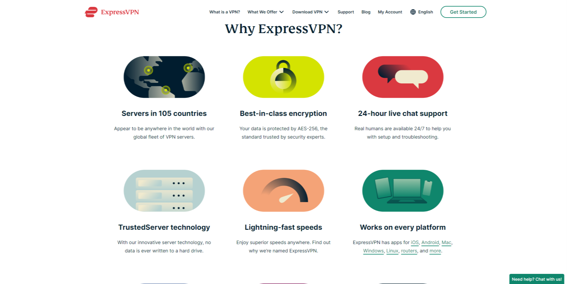
The transparent pricing details on the landing page are also noteworthy. Instead of hiding pricing information or making it difficult to find, ExpressVPN lays out the cost of its plans plainly. This openness helps in establishing credibility and allows users to make informed decisions quickly.
- Security Proposition: Highlighting advanced encryption and privacy features.
- Urgency: Limited-time offers to nudge quick decisions.
- Transparent Pricing: Clearly displayed subscription plans to build trust.
4) Uber for Business Landing Page
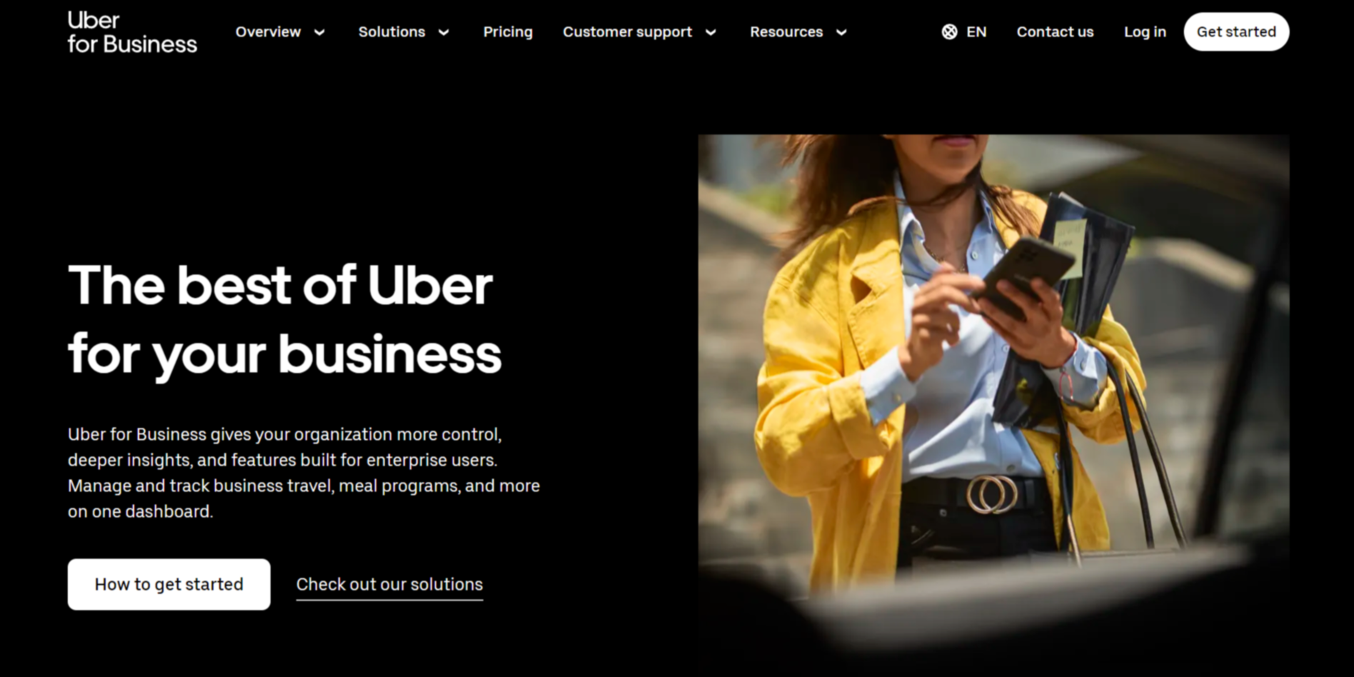
Uber for Business offers detailed enterprise solutions that cater to the unique needs of companies looking to manage their transportation services efficiently. The landing page clearly outlines these solutions, ensuring potential clients understand how Uber can help streamline their operations and reduce costs. It’s not just about rides; it’s about comprehensive transportation management, easy expense reporting, and customer support tailored to businesses of all sizes.
The page engages visitors through compelling visuals. High-quality images and informative graphics help illustrate Uber’s value propositions and key features. These visuals make it easier for users to grasp complex information quickly and can increase engagement rates. For instance, an infographic may show how Uber for Business integrates with various expense management tools, providing a visual representation of its benefits.
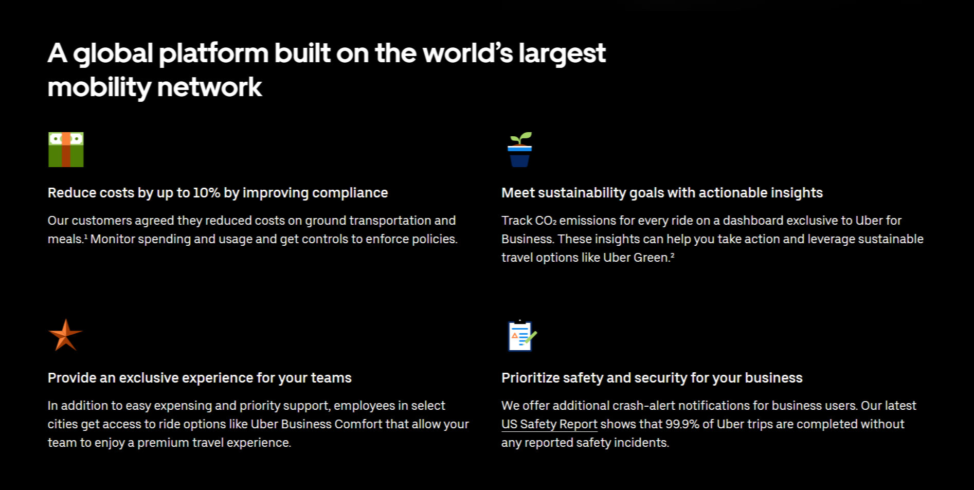
Simple and clear CTAs (Call to Actions) drive visitor engagement and conversions on the Uber for Business landing page. Buttons like ‘Get Started’, ‘Learn More’, and ‘Contact Us’ are prominently placed and stand out due to their distinctive colors and strategic positioning. These CTAs guide users through the journey smoothly, ensuring they know the next steps without any confusion.
5) Squarespace Landing Page
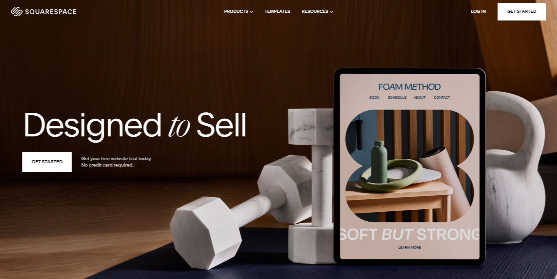
Squarespace is known for its elegant and responsive design that captivates visitors from the moment they land on the page. The layout is clean and modern, ensuring that each element on the page is purposeful and contributes to a seamless user experience across devices.
Strong visual storytelling is another hallmark of Squarespace landing pages. High-quality images and videos are strategically placed to convey the brand’s message and values succinctly. This visual focus draws users in and keeps them engaged as they explore more about the products or services offered.
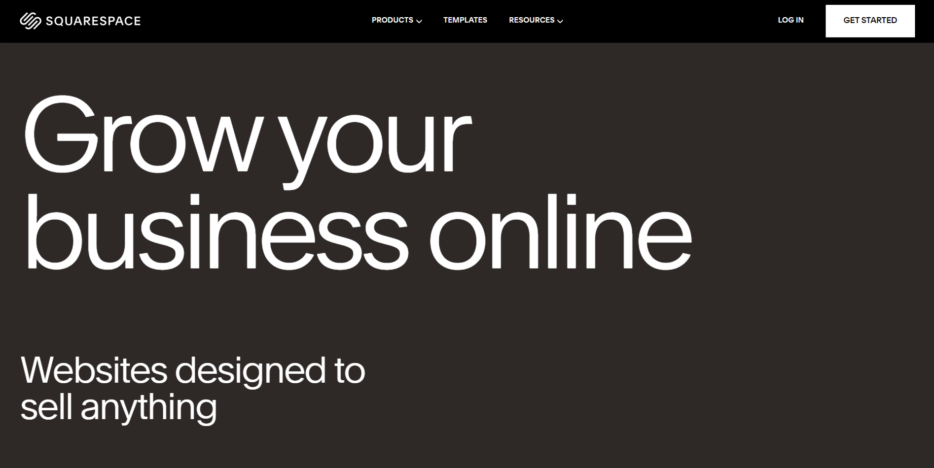
The easy-to-follow Call to Action (CTA) on Squarespace’s landing pages is designed with the user in mind. Clear and concise, the CTA buttons stand out without overwhelming the visitor. This approach not only guides users towards the desired action but also enhances the overall conversion rate.
6) Trello Landing Page
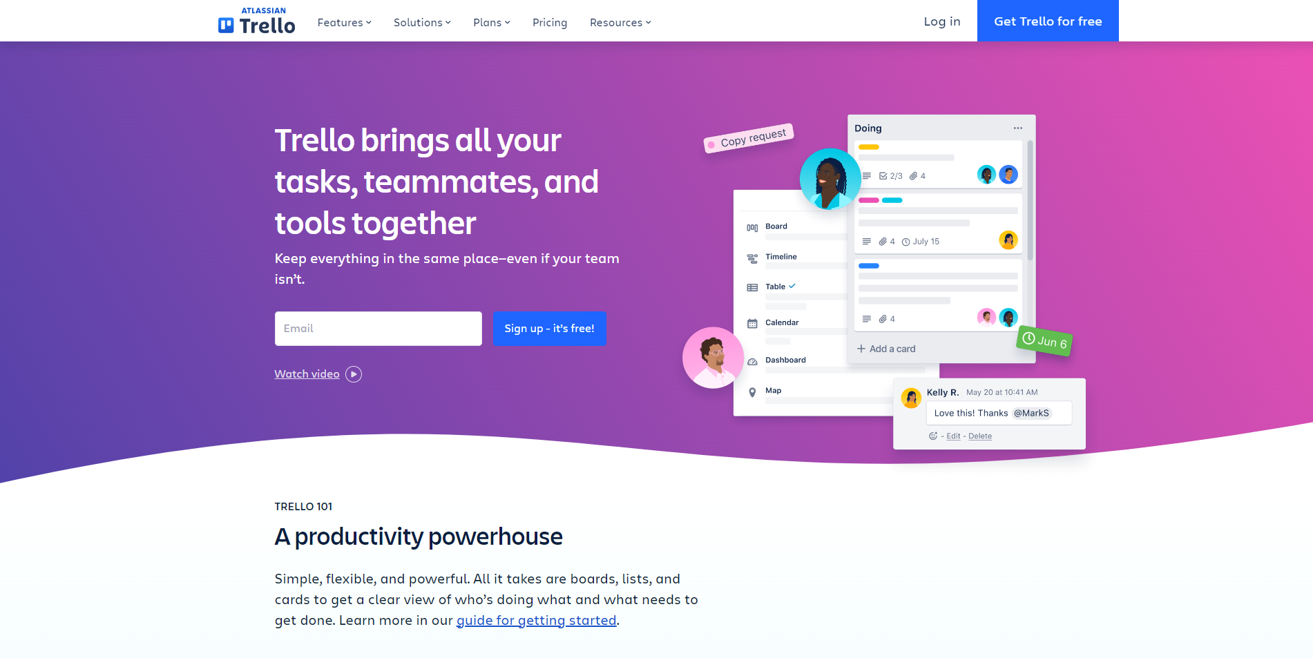
Trello’s landing page stands out with its simplistic and eco-friendly design. The clean layout, combined with a soothing color palette, ensures that visitors aren’t overwhelmed. It provides a clear and concise message about Trello’s value, making it accessible and engaging for all users.
One of the remarkable features of Trello’s landing page is its step-by-step onboarding. New users can easily grasp the basics through a guided process that introduces them to the core functionalities of the platform. This efficient onboarding reduces the learning curve, allowing users to start benefiting from Trello almost immediately.
The landing page also shines in highlighting interactive features. Through concise animations and interactive elements, visitors can get a hands-on experience of what Trello offers. These feature highlights help users understand the benefits that Trello has to offer.
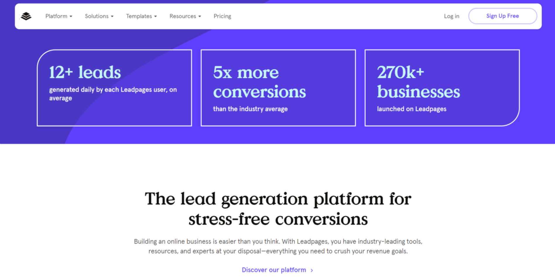
7) Leadpages Landing Page
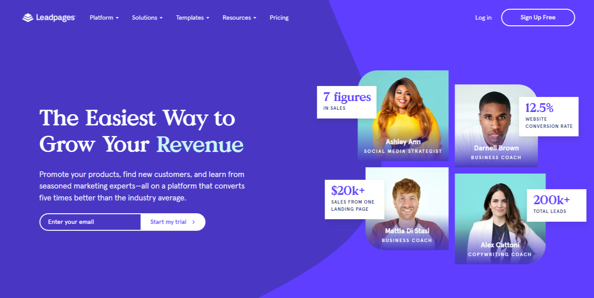
Leadpages Landing Page differentiates itself with its visually appealing digital elements. The designers have utilized modern graphics and seamless visuals that capture and hold visitors’ attention. The modest yet sophisticated design ensures that the presentation remains professional, while vibrant colours and well-chosen images add a fresh appeal.
There is a strong focus on features, which ensures that prospective users see the value in Leadpages’ offerings right away. Features are displayed prominently, accompanied by concise descriptions and relevant icons. This feature-centric approach helps users easily understand what Leadpages can do for them without needing to dive into lengthy explanations.
The call-to-action is clear and direct, a critical aspect of any successful landing page. Leadpages uses straightforward language like ‘Start Your Free Trial’ or ‘Get Started Now’, guiding visitors exactly towards the intended action. The strategically placed buttons stand out against the page’s background, making it easy for potential customers to take the next step.
8) Basecamps Landing Page
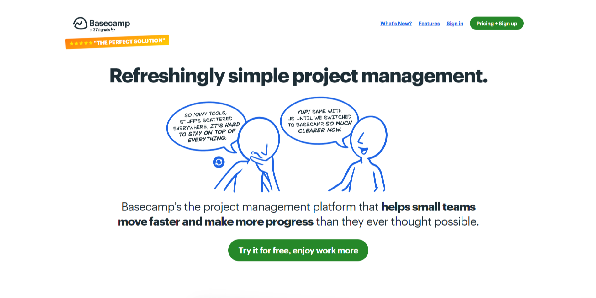
Basecamp’s landing page is super straightforward, but in a way that’s really effective. When you visit their page, you immediately get a sense of clarity and simplicity. They don’t overload you with information, just a clean, no-nonsense design that tells you exactly what Basecamp does.
What’s really cool about Basecamp’s landing page is how it breaks things down. The headline is direct: “Refreshingly simple project management.” It’s clear and to the point, so you instantly know what the product is all about. They then use a few short paragraphs to explain how Basecamp makes managing projects easier without getting bogged down by a bunch of unnecessary tools.
Their use of visuals is on point too. The layout is organized, making it easy to follow along and understand what Basecamp offers. Plus, they include testimonials and features in a way that doesn’t overwhelm you. It’s all about giving you the essentials in a clean and engaging way.
Notable mentions
Abun Landing Page
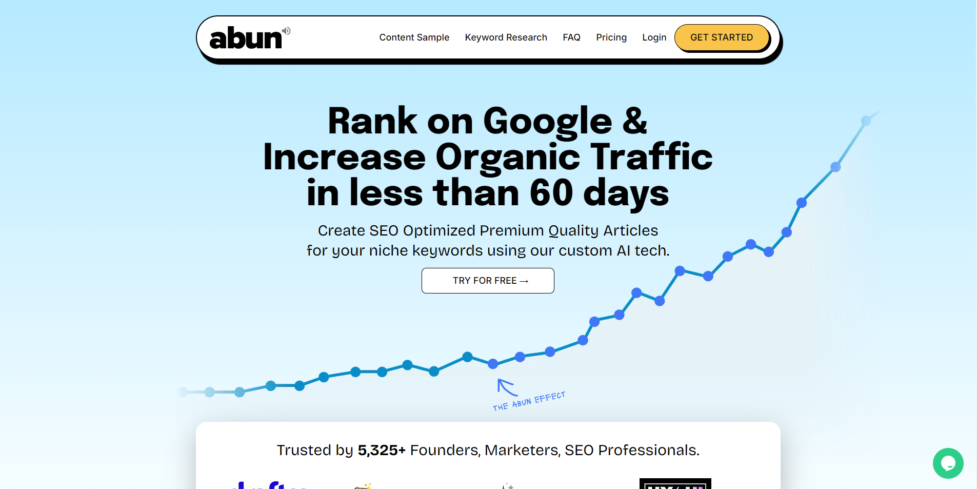
Abun’s landing page makes a strong impression with its clean design and focused messaging. It clearly highlights the benefits of using their AI tool to generate SEO-optimized content quickly. The headline, “Rank on Google & Increase Organic Traffic in less than 60 days,” grabs attention and sets a clear expectation for what users can achieve. With a strong call-to-action button inviting visitors to get started for free, the page encourages immediate engagement.
The layout is user-friendly, featuring sections that outline the features and benefits of the service in a straightforward way. The use of simple language and engaging visuals helps visitors easily understand how Abun can simplify their content creation process. This makes it easy for potential customers to see the value in the tool and take the next step towards improving their SEO strategy.
Instapage Landing Page
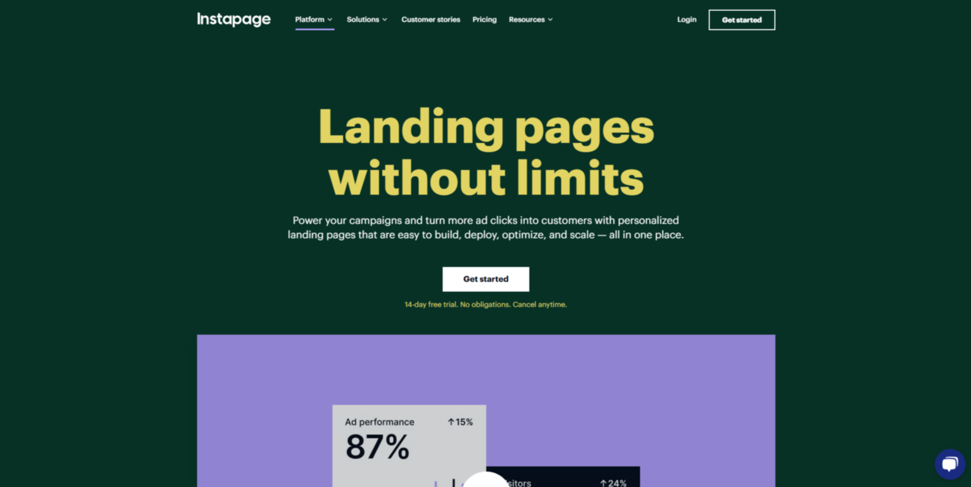
Instapage landing page is a fantastic source of inspiration for designers. Its sleek, minimalist design prioritizes clarity and functionality, making it easy for visitors to understand the value proposition immediately. The intuitive drag-and-drop builder is a standout feature, demonstrating how a clean layout and user-friendly tools can make complex tasks seem simple.
Designers can draw from Instapage emphasis on personalization and testing. The page’s use of AI to generate content and its focus on A/B testing provide a great example of integrating smart features to enhance user engagement. By incorporating these elements, designers can create landing pages that not only look great but also adapt to user needs and optimize for better results. This approach can lead to more effective and visually appealing designs that drive higher conversions.
Designing a landing page that truly resonates with your audience requires creativity, clarity, and a deep understanding of your product’s value. By drawing inspiration from these eight landing pages, you can design a page that not only looks great but also drives conversions. Whether you’re a startup or an established business, these examples provide valuable insights into what works and why. Take the time to analyze what elements resonate most with your target audience and apply those insights to your own designs. Remember, the goal is to create a landing page that communicates your message effectively and encourages visitors to take action.
If you need help creating landing pages or websites, you can always explore services like Draftss. Whether you’re looking to design from scratch or need to improve your existing pages, Draftss can help you create landing pages that align with your design needs and brand values. Let Draftss help you attract more visitors and create a better experience for your audience.
Drop your thoughts in the comments below.
Your email address will not be published. Required fields are marked *