AUTHOR

Navneet Kaur

Pursuing English Honours at Lady Shriram College for Women, DU Reader|| Writer

Making the Best Landing Page: Tips and Tricks!

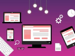
The landing page of any website is the mitochondria of it. A mitochondrion is basically the energy manufacturing part of the cell. On similar lines, the landing page serves the same function. It’s the page where all your clients land for the first time. Thus the maxim of ” First Impression is the Last Impression ” operates over here. If your customer will like your landing page, he/she will continue to avail your service too.  Thus, all you have to focus on is making your landing page in such a way, that the client is compelled to sign up. And then head to your home page.  To make your task easy, here are some tips cum hacks for you all:    Keep it Minimal This is the most important tip to keep in mind. Most often what one sees is overburdening on the page. Website creators literally put everything on Earth in it. This creates a crowd like a scene and the customers get confused. They don’t want to see a page that is ambiguous. Clarity on the page is important. Thus, keep it minimum and only put the most important details.    Make a clean page with natural navigation and no pop-ups. A good landing page provides all the necessary information needed to encourage visitors to convert, but nothing extra. Provide only the essential information that will guide visitors to your site.    Add more visuals Needless to say, any client would love to see the phone models of a website that deals with phones. Similarly, if you deal with personalized gifts, they would wish to see some of your products. This means visuals make half the task easier. A good landing page design maintains a clean and attractive visual impression while still allowing visitors to catch the required information.  Another way to add more visuals is by using videos. Videos can actively engage the viewers. So go ahead in hiring a good graphic designer. It’s usually a boon and advantage to have one.  Most of them provide unlimited graphic designing services too.    Use Header with Offer Value Now a header is very important to advertise and promote your website and products further. It’s basically an offer that is given by the company. It gets highlighted on top of the landing page. A good landing page should have a strong offer. Besides that, it should be able to explain why the offer is valuable. The most effective landing pages are the ones that confirm the offer with the headline. In order to explain the offer further, they also use the sub-heading. This only makes things authentic and clear to the customers.  The time that clients usually spend on landing pages is of a few seconds. Thus, you need to take help of professional graphic designers to plan accordingly and capture attention. Use more Trust Signals  Now some of you may ask this question- What are trust signals? Well, they are certain documents and images that provide credibility to the website and company. Good landing pages make abundant use of trust signals. They are crucial as they indicate to visitors that their offers and brand are trustworthy. There are various form of Trust signals :   Testimonials Endorsements Feedback forms  Awards  Certifications The number of followers on social media profiles like Twitter, Instagram, Facebook etc.    Make Your Page Mobile Friendly In today’s times, connecting of landing page with devices is important. Thus, your landing page should be such that it’s easily surfed on mobile. It has been shown that a mobile-friendly site can double your conversions. Thus, your landing page should look great! Rather, it needs to be par excellence. It should be easy to navigate and must be fast loading.  Then only people will be willing to check it out!    Ease the Sign-Up Process Now one thing that’s mostly present in all landing pages is a sign-up form. This is the form that the customers are expected to fill to avail further services. Try making it as easy as possible for your visitors to convert. If you ask very stupid questions or very personal questions, customers won’t sign up.  The more things you ask them to do, the less likely they are going to convert.    It is extremely important that you make users fill out as few form fields as possible. The more fields you ask a visitor to enter, the less chance you have of them filling out the form and completing the desired conversion. If your conversion requires a form, only ask the essentials of what you need. Besides that, make sure that signing up is a one-click process. Just with one click, the customer should be able to access the form. And then go-ahead to the website.    These are some of the tips that one can follow to create an effective landing page. More or less, the only deciding factor in the success of the landing page is its visual appearance. So grab a good visual designer and start creating your own landing page with best graphics!   

Read More »

Landing Page Vs. Home Page – The Correct Way To Bring In The Audience.

While dealing with digital marketing, terms like a landing page and the home page is used more often. And most of the clients try to interrogate about this specific term only.  And it’s not their fault too, because a landing page is identical to the homepage, but there are some key differences, which many of them ignore. The main objective of the homepage is to inspire the visitor to be on the website and go through almost all the pages of the site to find the information they were searching for.  However, a landing page is built to satisfy the informational need of a customer related to a single product or service.  Building a landing page is much complex, as it has to attract the eye of the viewer at very first glance, and the conversion should happen, or else it just fails!   4 Significant Difference Between Landing Page And An Homepage: Purpose and Target Audience: As mentioned previously, the main difference between both of the pages is the target audience.  As in the name itself, the landing page refers to space where someone lands after clicking on an ad. This ad might be of a shoe a person has seen in any social media. By clicking on that ad, the page on which he has landed is stated as a landing page.  This mostly happens with paid search apps. And it has been noticed by many of us, by now. Whatever we search on the search engine, at the very next moment, there are lots of ads displayed related to that product itself. For example, if you are looking for graphic designers near me, then there will be lots of ads displayed on your phone about the graphic designers in your area.  The only purpose of these digital ads is to target specific demographics, which can help with the conversion rate.  Hence, the landing page has to be tailored by the type of the audience watching it.   In landing page designing, organic traffic doesn’t really matter; what just matters is the content that would help to push the conversion rate.  In short, one can get traffic and boost sales by the landing page itself, whereas the homepage is also essential as it connects the customer to the company.    Navigation: As mentioned earlier, the landing page just has a goal to convert the traffic, whereas a home page needs to wear lots of hats.  The homepage covers a navigation bar, along with some links of social media accounts in the footer, and also links to help the visitor to interact with the website.  On the other hand, a landing page doesn’t have any navigation. It has just the primary goal to make the conversion, and just not create any distractions.    Content: The content on both the landing page and home page differs a lot. The information on the homepage might be similar to the landing page, but the landing page just promotes the product and the service.  Unlike the organic traffic of the homepage, landing page knows what search terms have brought the visitor to visit your page. Hence the landing page should be specific to those searches and ads only. For example, if a person searches for a graphic design agency near me, and clicks the agency’s ad, then they will be directed towards the landing page of that specific search and not the homepage. This landing page will cover all the essential questions like, Why are your agency is the best choice? What kind of offer do you have for specific graphics? What is the cost of graphic design? Hence a landing page covers more target audiences than the homepage!   Call To Action: The landing page is often action-oriented, and this is one of the most substantial differences between a landing page and a homepage page. In simpler words, landing pages always have some type of Call-to-Action (CTA) to encourage the viewers to do some action. This CTA may cover actionable content like, ‘call us now’ or ‘get started today’ or even ‘buy the subscription!’  Moreover, on the landing page, if there is any offer related to the search, it’s displayed there, to boost the conversion. For example, ‘buy the subscription now and get an instant 10% discount’. This makes the customer more special, and they tend to take action instantly. Whereas a homepage never really have strong CTA, they do have it, but it’s not so healthy for the conversion, and it’s absolutely okay! The website is often used as a resource for the audience as a whole.    Conclusion Home Page has lots of information, sources, and links covered in it because the company has to put all the essential information at its site as a resource to their potential customers.  Also, the landing page covers a specific message, related content; it is highly focused on a customer. The primary purpose is to convert and generate leads by increasing the sign-up, prompting calls, or initiating a chat with the targeted customer. One can even say that it is a simplified yet more concise version of a homepage along with a specific call-to-action. Hence it requires lots of patience and dedication to built both the pages. Professionally, one can take the help of agencies who have good knowledge about creating landing pages and homepages. Draftss have a team of designers working individually in building unique pages for their customers, and with tremendous success, they can be the best choice!!

Read More »
unlimited web ui ux responsive landing page design

The Biggest Problem With Web UI UX, And How You Can Fix It

There is a rapid change in the internet with the websites rapidly adjusting to any gadget and screen size to bring the client the most unique experience conceivable. From worldwide partnerships like Sony, Microsoft, and Nokia to worldwide tech stars like Salesforce to online travel monsters like Expedia, genuine players are going to responsive website architecture to walk in venture with the present patterns in and contact an even more extensive group of spectators of clients. In any case, making responsive sites has its drawbacks. The worth the site gives to the client could easily compare to ever, and style regularly assumes a lower priority while execution rules. The issue is that presentation can’t be taunted up in Photoshop, and new techniques to address plan difficulties must be embraced. So here are 10 issues with making responsive structure sites, alongside 10 potential arrangements. 1. More Problematic Visual Stage Previously, the customer needed to favour static pictures and screen captures before improvement could start. Today, structuring can be a progressively disorderly and liquid procedure of portraying and prototyping where the attention is on plan components and how they will be revamped, contingent upon various gadget measurements and goals. Fix: There are two ways to deal with responsive drawing. One methodology is making draws for a work area landing page, just as each other site page, and afterwards adjusting them for the most well-known tablet and portable screen sizes and measurements. Another methodology is utilizing paper and conveying to the customer to exhibit structure formats and how they will reflow on various screen sizes. Structuring in the program and working with HTML and CSS models begins from the get-go; making an arrangement of parts and perceiving how they can be reassembled for various designs replaces the formation of wireframes for each and every page and state. The picked technique is normally directed by the multifaceted nature of the site. 2. Navigation Prior to the responsive structure, each client knew where the route was. Despite the fact that today, the three bars at the upper left corner of the page, for the most part, speak to the true route “catch,” numerous clients still think that it’s hard to explore past the menu, particularly with regards to sites with entangled structure. Today, the entire idea of the route must be reexamined. Fix: Designers ought to invest more energy attempting to make route instinctive and clear as crystal. Considering the site’s substance and data engineering, and getting clients—how and why they peruse the site—is the best way to settle on a novel route choice. Also, testing route on whatever number items as would be prudent can enable engineers to hit the nail on the head. 3. Appearance of Background Images and Icons Pictures are significant to a client’s involvement on the web. In a responsive structure, pictures and symbols must be adaptable to enable clients to appreciate the designs on high pixel thickness gadgets, which are ending up progressively far-reaching. Ensuring the pictures don’t look foggy and inadequately scaled up is the objective of each architect and engineer. Fix: Lazy stacking pictures can help streamline program rendering and lessen the quantity of HTTP round outings by conceding the stacking of pictures that are not in the customer’s view. Making symbols adaptable (utilizing the SVG position, which keeps symbols light yet high calibre) and retina-prepared can likewise enable clients to appreciate the size without loss of value on any gadget. 4. Indicating Data on Small Screens Indicating information tables (aircraft flight timetables, for example) on little screens is a genuine issue when the tables are intricate and tangled. It doesn’t help that they are additionally regularly huge with an incredible number of lines and sections. Fix: Responsive tables are the best wagered at the present time. There are additionally different techniques: relinquishing the matrix format and making a little table that doesn’t call for flat looking over; building progressively minimal pie graphs of tables; supplanting tables with littler variants while offering a connect to the full form; concealing irrelevant components on little screens with a dropdown menu with access to the full table; rainbow tables where hues are utilized rather than segments; and notwithstanding flipping the table on its side to make it fit. 5. Making Rich Experiences that Load Fast Probably the greatest test is finding the harmony between rich client experience and the quick-paced nature of the Internet. Responsive sites once in a while gauge a ton, and in light of the fact that they pull in rush hour gridlock from the two work areas and cell phones, the experience can experience the ill effects of moderate stacking times. This implies losing business, as most of the portable clients leave following five seconds of not getting what they anticipate. Fix: The arrangement is restrictive stacking, which takes into account stacking of just what clients need when they need it. The standard guideline is this: first burden content, at that point improvements, at that point, remains. With clients so used to loads of pictures, displays, records, downloads, and so on a website, with the portable first approach, fashioners should take care to keep just the components that are totally important to pass on the message of the site. Since the expansion of cell phones is outpacing work areas, restrictive stacking is the best approach. What’s more, since in restrictive stacking numerous computerization devices for scaling and storing pictures are utilized, it rolls out future improvements to the site simpler and quicker. Additionally, expecting that the client association isn’t flawless is an absolute necessity to give elite. 6. Longer Designing, Developing, and Testing Periods Since responsive sites need to work incredibly well on numerous (altogether different) gadgets—all while flaunting rich usefulness and confusing plan components—they frequently take more time to configuration, create, and test. Typically it takes about twice as long to plan a responsive site contrasted with a standard site. Fix: The issue as of now contains an answer. Despite the fact that responsive destinations may take more time to make, they are a likewise better possibility for slow change and regular development. Rather than executing significant updates to a site, which are expensive and extensive, responsive locales can develop bit by bit, sparing proprietors a ton of time and exertion over the long haul.

Read More »