Introduction:
We all are well aware of this famous saying “First Impression is the last impression”. So now for a business how can the targeted customer group makes this impression? How can the brand or business communicate to the prospective buyer before introducing the product? Often a brand uses printed stationery design to depict professionalism by using a medium to interact with the consumer before serving them with the product.
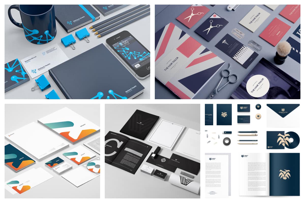
In this world of digitalization, were printed and graphically designed materials are preferred. Thus, these stationery designs can be available in a digital format, and the scope of designing also increases. Eye-catching designs and beautiful packaging materials are in trend. What are the items that can be categorized under print and stationery design? Items like business cards, brochures, flyers, premium quality pens, pencils, or notepads, and the list continue. Customized stationery designs speak a lot about your efforts and bring style to the life of the brand.
Why do we as a business need a stationery design:
Why do we as a business need these stationery designs if we can simply use the way of using emailers or newsletters? So, how do print and stationery designs have an edge over email marketing? As we have seen that how relevant information can be shared with the user in a more organized and designer way. Stationery designs are bolder and come with a package of structures. The typefaces and letterheads and everything in between is looked for by the person holding your brand in their hands.
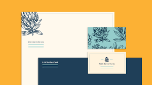
The emails are not capable enough to give a wider view. It cannot incorporate the most important information on one page. It automatically gets trimmed and a full sheet view is not provided. Hence, the importance of print and stationery designs increases. It should look more professional and impactful while creating and designing a message. In short, a clean and stylish message helps in serving all needful information at one end. Now let us look at examples of some stationery designs that can be used to enhance the short and crisp communication with the client.
Tips and tricks to enhance the process stationery design:
Examples: thank you notes, branded pens, CD covers, invoice, brochures, greeting cards, mobile phone covers/screensavers, envelopes, business cards, masks, and whatnot. Being consistent with the typefaces, colors, and logo design is a must. Techniques like embossing, foil blocking can be imparted if the printing is high. Borders and letterheads too can be customized which is used to draw a more commercial look. Additionally, the US letterhead template can be downloaded using Photoshop and Illustrator. Draftss can turn out to be a great advisor and designer of business stationery. Do check out draftss.
Now let us have a look at a few tips to keep in mind while looking for the stationery design:
The information should be complete and well-organized.

First of all, the look and feel or physical appearance of the stationery are looked for. To develop a corporate identity, each and every piece of information should be clear and to the point. Envelopes, business cards, or brochures must have a logo, phone number, email address, web address, and most importantly street address on them. Additionally, make sure that the whole information fits in the full sheet. This information and the relevant product-related details too should be incorporated. Hence, the information needs to be organized.
Finishing touches should tie the products and brand-related information properly.

To beautify the designs, color contrast can be used. This makes the designs more interesting and appealing. Any color palette other than branding colors can be used sometimes.
To use typography or to graphically design is the decision of the designers.
A touch of graphic design and typography when added provides more definition to the luxury of the brand.
No color gives a professional look vs some color makes it look minimalistic.

Any color palette can help in attracting the eyes of the consumer or the client. These days, the black and white color palette is in trend as it makes the designs look more minimal.
High-end Printing techniques make the designs more attractive.
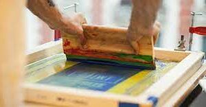
For instance, hot foil stamping and embossing techniques when used while stamping the envelope look amazing. If using high-quality offset printers, makes the stationery look more expensive.
High-resolution images provide an elegant look.

A blurred image disrupts the vision and the consistency breaks. Thus, the usage of high-resolution images also helps in attracting the client to the product. Also, it gives a professional look.
Examples of print and stationery design:
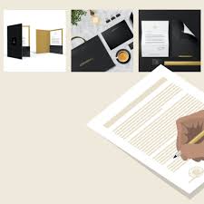
For sure, your brand will now be judged by the business print cover. Being a branding strategy, frequent changes in this stationery design can be done. Thus, to express creatively, we need to design and experiment with new print designs. A more minimalistic and modern look can be provided o the designs by using Monochromatic touches. Customized artwork exhibits how premium quality products are created.
The final verdict:
These days, every business or brand looks for customization in their stationery design. The company strives for the vision. Now in order to convey this vision, the audience needs to be served with this information using some branding tactics. Hence, using stationery design can help in building the brand reputation and visibility. If we use stationery products that can be used until wearied. For example, premium quality pens, notepads, diaries, pencils. These stationery items help the consumer remind of the brand whenever they use these items. Although, if premium quality stationery help in impressing the clients and customer group.
Drop your thoughts in the comments below.
Your email address will not be published. Required fields are marked *

