Having a strong online presence has become a quintessential thing for small businesses. Whether you are a marketing freelancer or a fashion designer or a local manufacturer, you need to focus on online marketing to attract customers and establish your brand. Your website is the zest of your online presence. Hence, you should design a website that converts: boost your sales.
If you are still thinking about how to monetize your website, check some profitable website ideas that might give you a kick to start your own business online. If you already have one, keep on reading.
Here is a quick guide to creating a website design that converts!
The Misconception
The word “Website Design” is shallowly associated with a visual appeal: font styles, background color, supreme images, and other decorations. Anyways, in actuality, it is not so! You need to create a functional website that is user-friendly and instigates them to take action. Apart from users, you should consider Google; design a website that ranks you high in relevant searches.
Answer W/H questions
Now that we have busted the myth of website design, let’s head to the prep.
Before you start seriously designing your website, ask yourself:
- Who will use this website?
- Why does a user choose you?
- What attracts the user?
- How will the website handle it?
Think from a customer point of view and answer as many questions as possible. Note down the key points. These exercises will give you clarity on what you need to do.
Fostering the Brand
The very purpose of creating a website is to display you as a brand. For that, you have embraced and reflected your brand in every element of the website. Be it the style, tone of the content, or action provisions, make sure that it embosses your brand. Rather than a website, it should be an experience. The customer should have a feel like walking into your store or meeting you.
The Design
When it comes to the basic design, 100% no comprise. Mistakes in website design are expensive. So, be proactive.
The Must Do’s
- Use high-end images
- Choose an appealing color palette and stick to it
- Deploy readable fonts
- Call for simple as well as interactive actions
- Use understandable layout
- Guide the customer with navigation
Never attempt to
- Overwhelm with way too fancy design
- Supply blunt and irrelevant content or image
- Misuse the space by too much or too little
- Kerning, leading, Tracking mistakes
- Keep the website shut to queries or slow in response
- Use excessive pop-ups, carousels, etc.
To ensure these design principles are implemented flawlessly, leveraging tools for visual testing can help identify inconsistencies or errors in layout, spacing, and responsiveness. These tools allow you to catch issues like misaligned elements, broken images, or font rendering problems before they impact the user experience. Combining visual testing with manual reviews ensures that your website maintains its appeal and functionality across all devices and browsers.
Ergonomic Layout
The availability of so many trendy options in terms of layout design is delectable. Still, you have to choose the one that is best for you and your audience.
Tips:
- Identify what your audience expects at each segment of your website.
- Keep it simple with navigation and don’t confuse them.
- Create an effective layout.

Apart, the most important thing for a website design is that double-check if it mobile-friendly. All the features that work on a pc should be able to work fine in mobile as well.
CTA
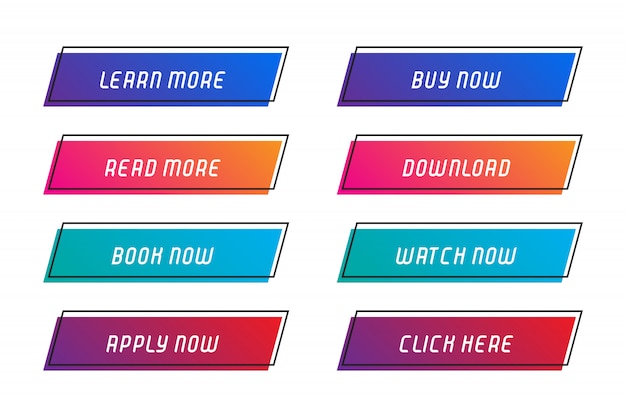
Calls-to-action is essential if you want your visitors to become customers. CTAs are strategic links, buttons, or graphics that encourage users to do a specific action.
The expert cues:
- Highlight the CTAs by surrounding them with blank space
- Choose words wisely
- Create the FOMO(Fear Of Missing Out) vibe and urgency to take actions
- Keep choices
Content
Content is crucial. Quality content is the essence of the website. It enables visitors to get a sense of your business presence. Also, it clarifies the basic questions of the visitors.
QVA mantra
Quality: Your content should have a warm and professional tone. Choose your words wisely; use words that are understood by everyone. At the same time, be original and valuable. Content is not just about writing the landing page, it takes many forms. It can be like videos, infographics, whitepapers, privacy policy, etc. Corroborate with high-quality content and design to the root level.
Volume: Creating bulk content helps you with SEO. But relevancy is the key. Don’t add content just for the sake of it.
Capacity: Your content should have the ability to put in the SEO strategies like backlinking, blog posts, likability. Persist to keep the site active by regular updates. Design content that allows search engines to crawl and distinguish your main-content.
Pro Tip: Use indexation and information architecture to ease of crawling.
Ability: Your content should have the potential to make conversions. Use the write engaging and attractive headlines, sub-headlines, descriptions, videos, etc. Urge visitors to make actions by placing innovative CTAs wherever possible. Design the content and typography in a hierarchy based on what you want to make them see first.
Tip: Highlight your Unique Selling Propositions/ your role in the market at the top of your landing page in a bigger font.
Alert: You have only 15 seconds to grab your novel visitor’s attention.
On a final note, a website that converts for small commercial businesses doesn’t happen overnight. Nor you can wait for a perfect website to go online for it will take years. All you can do is continually update the design of your website by making subtle tweaks, customizing, optimizing, and testing. With consistency and exertion, you’ll end with a site that can be commercially viable.







One Response