
Start 7 Day Free Trial Now

Limited Time Offer: 50% OFF on All Plans for 6 months. New Customers Only.



Redesign by Draftss
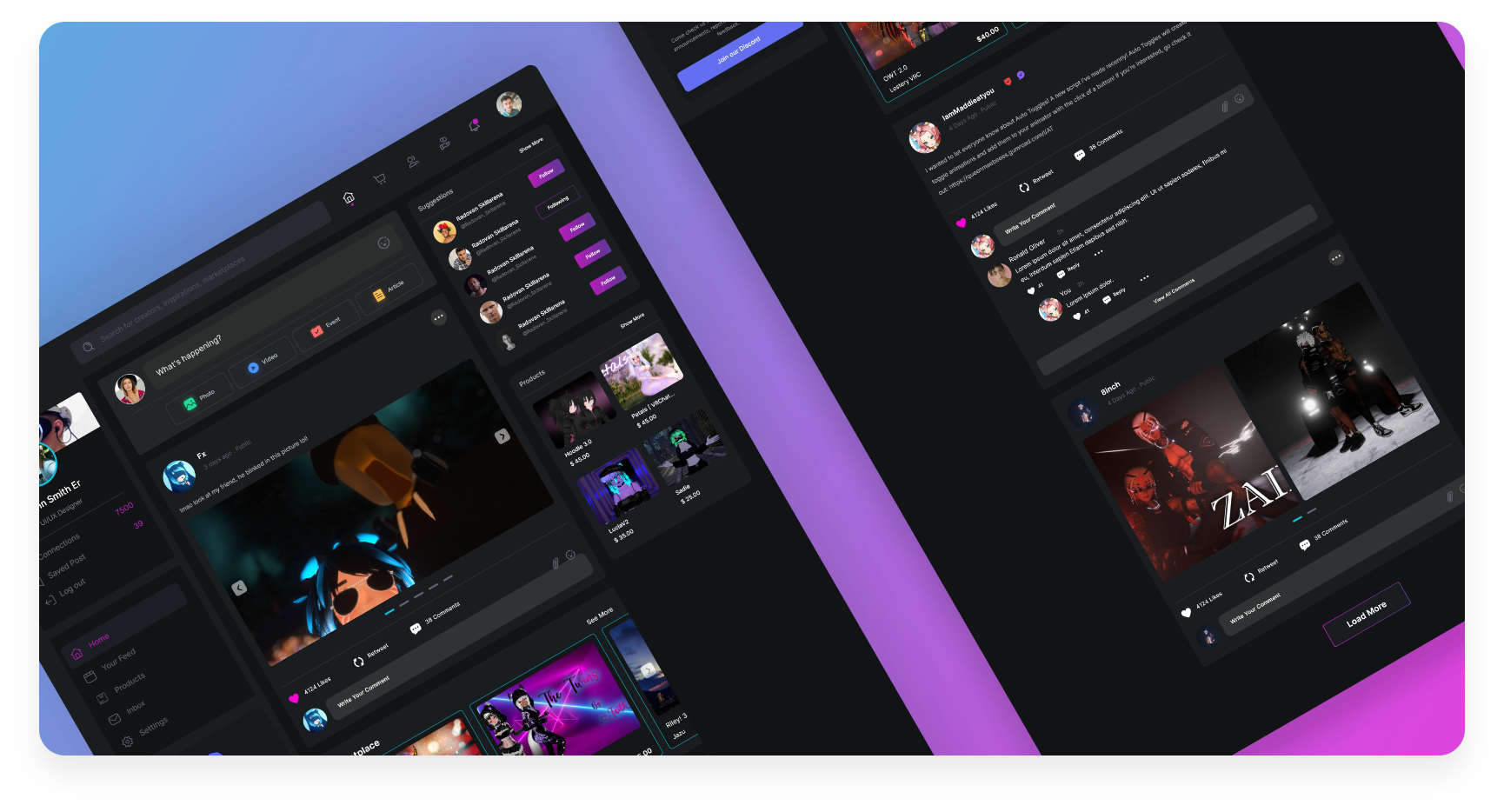
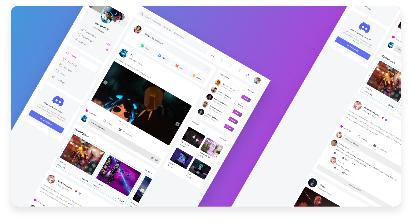
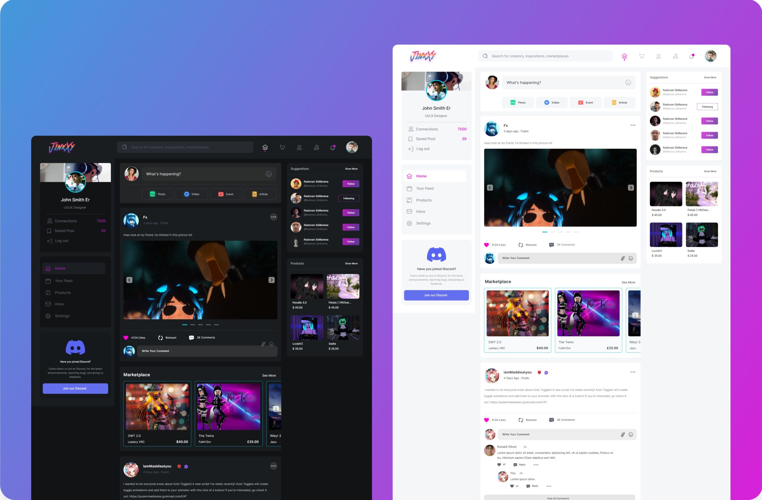
Website redesign for virtual reality metaverse. Rebuild the website's Information Architecture (IA) to increase the retention and conversion rate.
.jpg)
Jinxxy
Virtual Reality
Metaverse
The Company
Jinxxy adamantly claims to be one of the largest NFT marketplace. A broad variety of non-fungible tokens are available, including collectibles, censorship-resistant domain names, art, trading cards, sports, and virtual worlds. ERC721 and ERC1155 assets are included. Exclusive digital assets including Axies, ENS names, Crypto Kitties, Decentral, and more are available for purchase, sale, and discovery. They offer more than 700 distinct projects, such as digital art projects, trading card games, collectible games, and name systems like ENS (Ethereum Name Service).
Services
UX/UI Design
Rapid Prototyping
UI Development
Product Design
The Challenge
Jinxxy's website, didn't reflect the dynamics. Aesthetically it was a visual dumping ground which didn't do justice to the brand purpose. There was no structure to the content. It amplified confusion rather than coherency. We needed to create a system and that could logically to represent a wide breadth of content they started producing, including e.g. Virtual Reality products, Crypto etc. Also, to this it was important to come up with a modern and appealing visual style that will shine a light on the brand personality.
The Solution
We felt the website already had all the content but a little too much of it. It seemed like information was put on the website just because it was there. It needed some restructuring and a visual boost to take it to the next level. The idea behind having a dark background as it directs attention straight to the hero of the website, the product itself. The first thing we did was add some social proofing to the top end of the page. This is a matter of choice. It adds some assurance right at the start when the person is getting to know about the product.
Style Guide
Colors, Fonts & UI
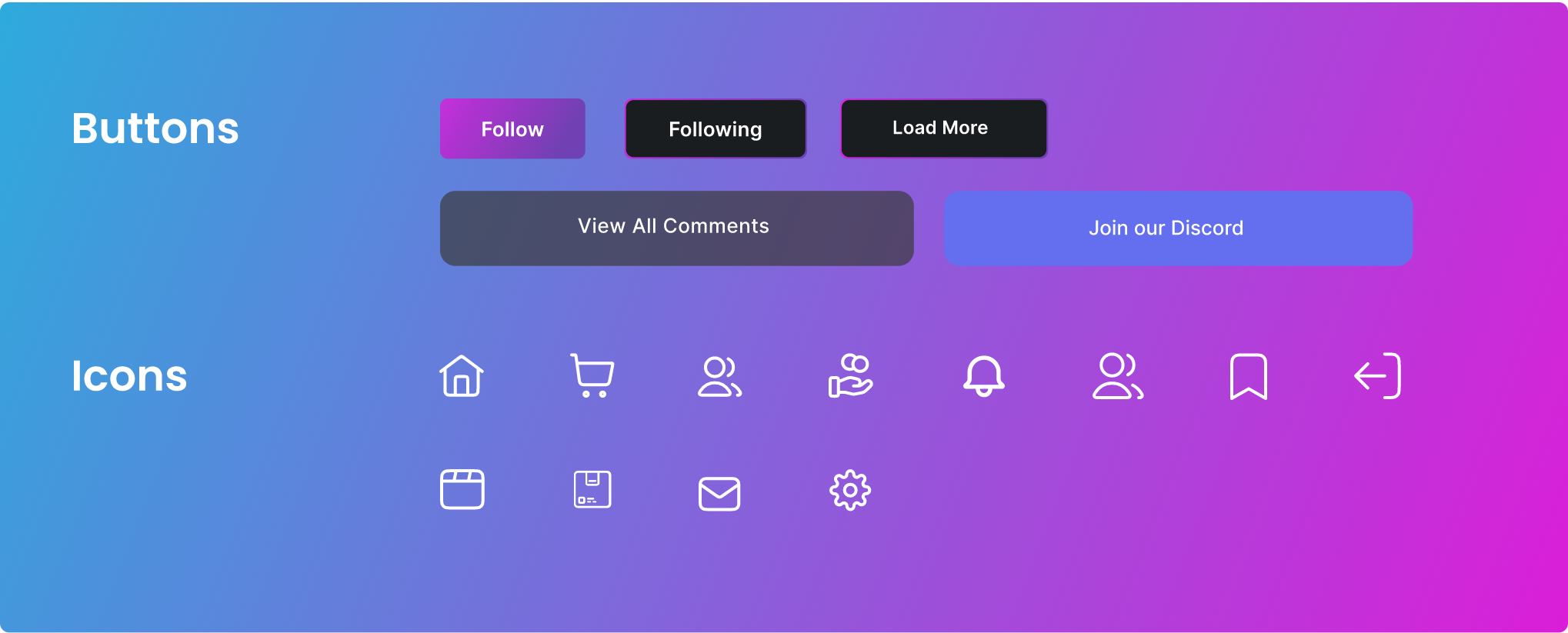
Components that we
used for the project.
Colors
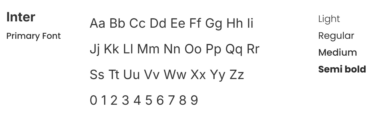
Typography
UI Components
Designs
Key Takeaways
The Search Bar should somehow inform the user on what it is capable of.
Every section was visually connected to each other yet felt apart from whole layout.
We decided to have 'Contact' as a primary CTA on the header so that it gets user attention was missing earlier.
Tried to have more impact with fewer words
User Interface For Web
Rebuild the website's Information Architecture (IA) to increase the retention and conversion rate.